
Search the Community
Showing results for tags 'videos'.
Found 20 results
-
Hello Gsap community, i'm trying to create a Website, where when I scroll through it, the Time of the Video which is permanently in the Background is connected to the Scroll. While i'am scrolling and passing certain points in the Video, different HTML Elements should appear / disappear. So for example from Second 2-6 from the video i want to display elements which explain this part of the video and so on. The Elements should not be pinned tho, because the Video itself has a scroll through like effect aswell. I unfortunatly don't have any working prototype.
-
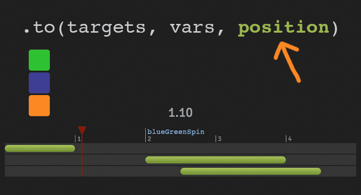 The secret to building gorgeous sequences with precise timing is understanding the position parameter which is used in many methods throughout GSAP. This one super-flexible parameter controls the placement of your tweens, labels, callbacks, pauses, and even nested timelines, so you'll be able to literally place anything anywhere in any sequence. Watch the video For a quick overview of the position parameter, check out this video from the "GSAP 3 Express" course by Snorkl.tv - one of the best ways to learn the basics of GSAP 3. Using position with gsap.to() This article will focus on the gsap.to() method for adding tweens to a Tween, but it works the same in other methods like from(), fromTo(), add(), etc. Notice that the position parameter comes after the vars parameter: .to( target, vars, position ) Since it's so common to chain animations one-after-the-other, the default position is "+=0" which just means "at the end", so timeline.to(...).to(...) chains those animations back-to-back. It's fine to omit the position parameter in this case. But what if you want them to overlap, or start at the same time, or have a gap between them? No problem. Multiple behaviors The position parameter is super flexible, accommodating any of these options: Absolute time (in seconds) measured from the start of the timeline, as a number like 3 // insert exactly 3 seconds from the start of the timeline tl.to(".class", {x: 100}, 3); Label, like "someLabel". If the label doesn't exist, it'll be added to the end of the timeline. // insert at the "someLabel" label tl.to(".class", {x: 100}, "someLabel"); "<" The start of previous animation**. Think of < as a pointer back to the start of the previous animation. // insert at the START of the previous animation tl.to(".class", {x: 100}, "<"); ">" - The end of the previous animation**. Think of > as a pointer to the end of the previous animation. // insert at the END of the previous animation tl.to(".class", {x: 100}, ">"); A complex string where "+=" and "-=" prefixes indicate relative values. When a number follows "<" or ">", it is interpreted as relative so "<2" is the same as "<+=2". Examples: "+=1" - 1 second past the end of the timeline (creates a gap) "-=1" - 1 second before the end of the timeline (overlaps) "myLabel+=2" - 2 seconds past the label "myLabel" "<+=3" - 3 seconds past the start of the previous animation "<3" - same as "<+=3" (see above) ("+=" is implied when following "<" or ">") ">-0.5" - 0.5 seconds before the end of the previous animation. It's like saying "the end of the previous animation plus -0.5" A complex string based on a percentage. When immediately following a "+=" or "-=" prefix, the percentage is based on total duration of the animation being inserted. When immediately following "<" or ">", it's based on the total duration of the previous animation. Note: total duration includes repeats/yoyos. Examples: "-=25%" - overlap with the end of the timeline by 25% of the inserting animation's total duration "+=50%" - beyond the end of the timeline by 50% of the inserting animation's total duration, creating a gap "<25%" - 25% into the previous animation (from its start). Same as ">-75%" which is negative 75% from the end of the previous animation. "<+=25%" - 25% of the inserting animation's total duration past the start of the previous animation. Different than "<25%" whose percentage is based on the previous animation's total duration whereas anything immediately following "+=" or "-=" is based on the inserting animation's total duration. "myLabel+=30%" - 30% of the inserting animation's total duration past the label "myLabel". Basic code usage tl.to(element, 1, {x: 200}) //1 second after end of timeline (gap) .to(element, {duration: 1, y: 200}, "+=1") //0.5 seconds before end of timeline (overlap) .to(element, {duration: 1, rotation: 360}, "-=0.5") //at exactly 6 seconds from the beginning of the timeline .to(element, {duration: 1, scale: 4}, 6); It can also be used to add tweens at labels or relative to labels //add a label named scene1 at an exact time of 2-seconds into the timeline tl.add("scene1", 2) //add tween at scene1 label .to(element, {duration: 4, x: 200}, "scene1") //add tween 3 seconds after scene1 label .to(element, {duration: 1, opacity: 0}, "scene1+=3"); Sometimes technical explanations and code snippets don't do these things justice. Take a look at the interactive examples below. No position: Direct Sequence If no position parameter is provided, all tweens will run in direct succession. .content .demoBody code.prettyprint, .content .demoBody pre.prettyprint { margin:0; } .content .demoBody pre.prettyprint { width:8380px; } .content .demoBody code, .main-content .demoBody code { background-color:transparent; font-size:18px; line-height:22px; } .demoBody { background-color:#1d1d1d; font-family: 'Signika Negative', sans-serif; color:#989898; font-size:16px; width:838px; margin:auto; } .timelineDemo { margin:auto; background-color:#1d1d1d; width:800px; padding:20px 0; } .demoBody h1, .demoBody h2, .demoBody h3 { margin: 10px 0 10px 0; color:#f3f2ef; } .demoBody h1 { font-size:36px; } .demoBody h2 { font-size:18px; font-weight:300; } .demoBody h3 { font-size:24px; } .demoBody p{ line-height:22px; margin-bottom:16px; width:650px; } .timelineDemo .box { width:50px; height:50px; position:relative; border-radius:6px; margin-bottom:4px; } .timelineDemo .green{ background-color:#6fb936; } .timelineDemo .orange { background-color:#f38630; } .timelineDemo .blue { background-color:#338; } .timleineUI-row{ background-color:#2f2f2f; margin:2px 0; padding:4px 0; } .secondMarker { width:155px; border-left: solid 1px #aaa; display:inline-block; position:relative; line-height:16px; font-size:16px; padding-left:4px; color:#777; } .timelineUI-tween{ position:relative; width:160px; height:16px; border-radius:8px; background: #a0bc58; /* Old browsers */ background: -moz-linear-gradient(top, #a0bc58 0%, #66832f 100%); /* FF3.6+ */ background: -webkit-gradient(linear, left top, left bottom, color-stop(0%,#a0bc58), color-stop(100%,#66832f)); /* Chrome,Safari4+ */ background: -webkit-linear-gradient(top, #a0bc58 0%,#66832f 100%); /* Chrome10+,Safari5.1+ */ background: -o-linear-gradient(top, #a0bc58 0%,#66832f 100%); /* Opera 11.10+ */ background: -ms-linear-gradient(top, #a0bc58 0%,#66832f 100%); /* IE10+ */ background: linear-gradient(to bottom, #a0bc58 0%,#66832f 100%); /* W3C */ filter: progid:DXImageTransform.Microsoft.gradient( startColorstr='#a0bc58', endColorstr='#66832f',GradientType=0 ); /* IE6-9 */ } .timelineUI-dragger-track{ position:relative; width:810px; margin-top:20px; } .timelineUI-dragger{ position:absolute; width:10px; height:100px; top:-20px; } .timelineUI-dragger div{ position:relative; width: 0px; height: 0; border-style: solid; border-width: 20px 10px 0 10px; border-color: rgba(255, 0, 0, 0.4) transparent transparent transparent; left:-10px; } .timelineUI-dragger div::after { content:" "; position:absolute; width:1px; height:95px; top:-1px; left:-1px; border-left: solid 2px rgba(255, 0, 0, 0.4); } .timelineUI-dragger div::before { content:" "; position:absolute; width:20px; height:114px; top:-20px; left:-10px; } .timelineUI-time{ position:relative; font-size:30px; text-align:center; } .controls { margin:10px 2px; } .prettyprint { font-size:20px; line-height:24px; } .timelineUI-button { background: #414141; background-image: -webkit-linear-gradient(top, #575757, #414141); background-image: -moz-linear-gradient(top, #575757, #414141); background-image: -ms-linear-gradient(top, #575757, #414141); background-image: -o-linear-gradient(top, #575757, #414141); background-image: linear-gradient(to bottom, #575757, #414141); text-shadow: 0px 1px 0px #414141; -webkit-box-shadow: 0px 1px 0px 414141; -moz-box-shadow: 0px 1px 0px 414141; box-shadow: 0px 1px 0px 414141; color: #ffffff; text-decoration: none; margin: 0 auto; -webkit-border-radius: 4; -moz-border-radius: 4; border-radius: 4px; font-family: "Signika Negative", sans-serif; text-transform: uppercase; font-weight: 600; display: table; cursor: pointer; font-size: 13px; line-height: 18px; outline:none; border:none; display:inline-block; padding: 8px 14px;} .timelineUI-button:hover { background: #57a818; background-image: -webkit-linear-gradient(top, #57a818, #4d9916); background-image: -moz-linear-gradient(top, #57a818, #4d9916); background-image: -ms-linear-gradient(top, #57a818, #4d9916); background-image: -o-linear-gradient(top, #57a818, #4d9916); background-image: linear-gradient(to bottom, #57a818, #4d9916); text-shadow: 0px 1px 0px #32610e; -webkit-box-shadow: 0px 1px 0px fefefe; -moz-box-shadow: 0px 1px 0px fefefe; box-shadow: 0px 1px 0px fefefe; color: #ffffff; text-decoration: none; } .element-box { background: #ffffff; border-radius: 6px; border: 1px solid #cccccc; padding: 17px 26px 17px 26px; font-weight: 400; font-size: 18px; color: #555555; margin-bottom:20px; } .demoBody .prettyprint { min-width:300px; } Percentage-based values As of GSAP 3.7.0, you can use percentage-based values, as explained in this video: Interactive Demo See the Pen Position Parameter Interactive Demo by GreenSock (@GreenSock) on CodePen. Hopefully by now you can see the true power and flexibility of the position parameter. And again, even though these examples focused mostly on timeline.to(), it works exactly the same way in timeline.from(), timeline.fromTo(), timeline.add(), timeline.call(), and timeline.addPause(). *Percentage-based values were added in GSAP 3.7.0 **The "previous animation" refers to the most recently-inserted animation, not necessarily the animation that is closest to the end of the timeline.
- 6 comments
-
- 4
-

-

-
- gsap
- position parameter
- (and 9 more)
-
 Note: This page was created for GSAP version 2. We have since released GSAP 3 with many improvements. This includes replacing accessing _gsTransform with gsap.getProperty(). Please see the GSAP 3 release notes for details. Have you ever wondered how to get the position, rotation or other transform-related properties that were animated with GSAP? It's actually quite simple: they're all neatly organized and updated in the _gsTransform object which GSAP attaches directly to the target element! Watch the video Let's set the rotation of the logo to 20 degrees. var logo = document.querySelector("#logo"); TweenMax.set(logo, {rotation:20}); GSAP applies that rotation via an inline style using a transform matrix (2d or 3d). If you were to inspect the element after the rotation was set you would see: <img style="transform: matrix(0.93969, 0.34202, -0.34202, 0.93969, 0, 0);" id="logo" src="..." > Not many humans would be able to discern the rotation from those values. Don't worry - the _gsTransform object has all the discrete values in human-readable form! console.log(logo._gsTransform); The console will show you an Object with the following properties and values: Object { force3D: "auto", perspective: 0, rotation: 20, rotationX: 0, rotationY: 0, scaleX: 1, scaleY: 1, scaleZ: 1, skewType: "compensated", skewX: 0, skewY: 0, svg: false, x: 0, xOffset: 0, xPercent: 0, y: 0, yOffset: 0, yPercent: 0, z: 0, zOrigin: 0 } To grab the rotation of the logo you would simply use: logo._gsTransform.rotation Click "Edit on CodePen" and open the console to see how it works See the Pen _gsTransform demo by GreenSock (@GreenSock) on CodePen. Get transform values during an animation Use an onUpdate callback to read the values during an animation: var logo = document.querySelector("#logo"); var output = document.querySelector("#output"); TweenMax.to(logo, 4, {rotationY:360, x:600, transformPerspective:800, transformOrigin:"50% 50%", onUpdate:showValues, ease:Linear.easeNone}); function showValues() { output.innerHTML = "x: " + parseInt(logo._gsTransform.x) + " rotation: " + parseInt(logo._gsTransform.rotationY); //you can also target the element being tweened using this.target //console.log(this.target.x); } The demo below illustrates how to read transform values during an animation. See the Pen _gsTransform demo: animation by GreenSock (@GreenSock) on CodePen. We strongly recommend always setting transform data through GSAP for optimized for performance (GSAP can cache values). Unfortunately, the browser doesn't always make it clear how certain values should be applied. Browsers report computed values as matrices which contain ambiguous rotational/scale data; the matrix for 90 and 450 degrees is the same and a rotation of 180 degrees has the same matrix as a scaleX of -1 (there are many examples). However, when you set the values directly through GSAP, it's crystal clear. Happy tweening!
 -
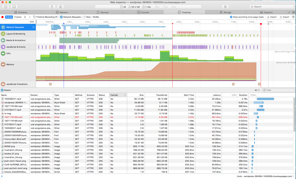
Hello everyone, since a few months I've been working on a wordpress website (with oxygen builder) hosted on digital ocean. Recently I added page transitions thanks to Barbajs and with GSAP I have a swipe up effect. On chrome I have no problem but on Safari the site is slow to load, I don't know if it's the videos that are slow or the GSAP or barba js. The website is currently protected on a private server I can't give you access but here is a piece of my js that calls barba and gsap : function video_text_animation() { let tl = gsap.timeline(); if (tl.scrollTrigger) { tl.scrollTrigger.kill(); } //////// Video Header title ////////////// var childSplit = new SplitText(".bloc_header--header", {type:"lines", linesClass: "bloc_header--header-child"}); var parentSplit = new SplitText(".bloc_header--header", { type: "lines", linesClass: "bloc_header--header-parent"}); var w = window.innerWidth; var size = w > 1366 ? "big" : "small"; if (size === "big") { tl = gsap.timeline(); tl.addLabel("animateVideo").from(childSplit.lines, { duration: 0.5, yPercent: 100, ease: "power4", stagger: 0.1 }); } return tl; } function animation_scroll_text() { gsap.registerPlugin(ScrollTrigger); let tl = gsap.timeline(); if (tl.scrollTrigger) { tl.scrollTrigger.kill(); } //////// Diptyque title ////////////// new SplitText(".dyptique__card-heading--title", {type:"lines", linesClass: "dyptique__card-heading--title-child"}); new SplitText(".dyptique__card-heading--title", {type:"lines", linesClass: "dyptique__card-heading--title-parent"}); var w = window.innerWidth; var size = w > 1366 ? "big" : "small"; if (size === "big") { gsap.utils.toArray(".dyptique__card-heading--title").forEach((section, i) => { tl = gsap.timeline({ scrollTrigger: { id: "trigger2", start: "center 80%", trigger: section, toggleActions: "play pause pause pause", }, }); tl.addLabel("animateDiptyque").from(section.querySelectorAll(".dyptique__card-heading--title-child"), { duration: 0.5, yPercent: 100, ease: "power4", stagger: 0.1 }); }); } //////// Content title ////////////// new SplitText(".bloc_contents--title", {type:"lines", linesClass: "bloc_contents--title-child"}); new SplitText(".bloc_contents--title", {type:"lines", linesClass: "bloc_contents--title-parent"}); if (size === "big") { gsap.utils.toArray(".bloc_contents--title").forEach((section, i) => { tl = gsap.timeline({ scrollTrigger: { id: "trigger3", start: "center 80%", trigger: section, toggleActions: "play pause pause pause", }, }); tl.addLabel("animateTitle").from(section.querySelectorAll(".bloc_contents--title-child"), { duration: 0.5, yPercent: 100, ease: "power4", stagger: 0.1 }); }); } return tl; } function add_scripts() { jQuery(document).ready(function ($) { "use strict"; $('head').append('<link href="https://wordpress-364904-1405009.cloudwaysapps.com/accueil/?xlink=css&ver=5.4.2" rel="stylesheet" type="text/css">'); $('head').append('<link href="https://wordpress-364904-1405009.cloudwaysapps.com/le-mag/?xlink=css&ver=5.4.2" rel="stylesheet" type="text/css">'); $('.center-title').attr({'data-aos-enable': 'true','data-aos': 'fade','data-aos-delay': '1',}); $('.title-anim').attr({'data-aos-enable': 'true','data-aos': 'slide-up','data-aos-anchor-placement': 'top-bottom','data-aos-easing': 'ease','data-aos-duration': '400','data-aos-offset': '50',}); $('.center-title2').attr({'data-aos-enable': 'true','data-aos': 'fade','data-aos-delay': '1',}); $('.title-anim-02').attr({'data-aos-enable': 'true','data-aos': 'fade',}); $('.diptyque__card').attr({'data-aos-enable': 'true','data-aos': 'fade','data-aos-anchor-placement': 'center-bottom',}); $('.bloc_contents--text').attr({'data-aos-enable': 'true','data-aos': 'fade','data-aos-delay': '200',}); $('.quadriptyque__card_1').attr({'data-aos-enable': 'true','data-aos': 'fade','data-aos-anchor-placement': 'center-bottom',}); $('.quadriptyque__card_2').attr({'data-aos-enable': 'true','data-aos': 'fade','data-aos-delay': '400','data-aos-anchor-placement': 'center-bottom',}); $('.quadriptyque__card_3').attr({'data-aos-enable': 'true','data-aos': 'fade','data-aos-anchor-placement': 'center-bottom',}); $('.quadriptyque__card_4').attr({'data-aos-enable': 'true','data-aos': 'fade','data-aos-delay': '400','data-aos-anchor-placement': 'center-bottom',}); $('.quadriptyque__card--image').attr({'data-aos-enable': 'true','data-aos': 'fade','data-aos-once': 'true',}); $('.triptyque__card_2').attr({'data-aos-enable': 'true','data-aos': 'fade','data-aos-anchor-placement': 'center-bottom','data-aos-delay': '200',}); $('.triptyque__card_3').attr({'data-aos-enable': 'true','data-aos-anchor-placement': 'center-bottom','data-aos-delay': '400','data-aos': 'fade',}); $('.triptyque__card').attr({'data-aos-enable': 'true','data-aos': 'fade','data-aos-anchor-placement': 'center-bottom',}); $('.diptyque__card2').attr({'data-aos-enable': 'true','data-aos': 'fade','data-aos-delay': '400','data-aos-anchor-placement': 'center-bottom',}); $('body').addClass('oxygen-aos-enabled'); }); AOS.init({}); window.dispatchEvent(new Event('resize')); } function delay(n) { n = n || 2000; return new Promise((done) => { setTimeout(() => { done(); }, n); }); } // Preload Animation function pageTransition_init() { var tl = gsap.timeline(); tl.set(".footer-main", {display: "none"}); tl.set(".logo-img-pre", {y:100}); tl.set(".loading-screen", {bottom: "-100%", opacity: 1}); tl.to(".loading-screen", {duration: 1.7, height: "100%", bottom: "0%", ease: "Expo.easeInOut",}); tl.to("#video_home_top video", {duration: 0, display: "block"}); tl.to(".header-main", {duration: 0, display: "block"}); tl.to(".footer-main", {duration: 0, display: "block"}); tl.to(".logo-img-pre", {duration: 0.7, delay:-0.7 , y:0, opacity:1, ease:"power4",}); tl.to(".loading-screen", {duration: 1, delay:1, height: "100%", bottom: "100%", ease: "power4",}); tl.to(".logo-img-pre", {duration: 0.3, delay:-1, opacity: 0, display:"none"}); return tl; } // Transition Functions function pageTransition() { var tl = gsap.timeline(); tl.set(".loading-screen", {bottom: "-100%", opacity: 1}); tl.to(".loading-screen", {duration: 1.2, height: "100%", bottom: "0%", ease: "Expo.easeInOut",}); tl.to(".loading-screen", {duration: 1, height: "100%", bottom: "100%", ease: "Expo.easeInOut",}); return tl; } function load_video() { const list_videos = document.getElementsByTagName("video"); for (var i = 0; i < list_videos.length; i++) { list_videos[i].load(); console.log(list_videos[i].readyState); } } jQuery(document).ready(function ($) { "use strict"; jQuery('html, body').animate({scrollTop:0}); var masterTimeline = new gsap.timeline(); masterTimeline .add(pageTransition_init()) .add(video_text_animation(), "-=1"); $(function () { barba.init({ sync: true, transitions: [ { async leave(data) { const done = this.async(); pageTransition(); await delay(1000); done(); } , enter(data) { jQuery('html, body').animate({scrollTop:0}); load_video(); var tl = gsap.timeline(); tl.set("#video_home_top video", {duration: 0, display: "block"}); tl.to(".header-main", {duration: 0, display: "block"}); tl.to(".footer-main", {duration: 0, display: "block"}); } }, ], views: [{ namespace: 'index', beforeEnter(data) { document.body.classList.add("oxy-overlay-header"); add_scripts(); switch_footer(); animation_scroll_text(); video_animation(); }, } }); }); });
-
 Note: This page was created for GSAP version 2. We have since released GSAP 3 with many improvements. While it is backward compatible with most GSAP 2 features, some parts may need to be updated to work properly. Please see the GSAP 3 release notes for details. With some animation engines it can be frustrating trying to get something to rotate in a specific direction. With GSAP you can explicitly set the direction or let GSAP figure out the shortest distance. Watch the video Interactive demo See the Pen DirectionalRotation Visualizer by GreenSock (@GreenSock) on CodePen. Check out the DirectionalRotation Plugin docs for more info.
 -
 Note: This page was created for GSAP version 2. We have since released GSAP 3 with many improvements. While it is backward compatible with most GSAP 2 features, some parts may need to be updated to work properly. Please see the GSAP 3 release notes for details. You may be surprised by how much work GSAP does under the hood to make animating transforms intuitive and performant. This video explains the top 10 reasons you should be using GSAP to animate transform-related values like scale, rotation, x, y, etc. Watch the video Independent control of each component (x, y, scaleX, scaleY, rotation, etc.) Physics-based animations and dragging, plus advanced easing like Elastic and Bounce Snap to any increment or set of values Query values anytime with _gsTransform Relative values ("+=" and "-=") Directional rotation (clockwise, counter-clockwise, or shortest) Two different skew types ("compensated" and "simple") Consistency across browsers, especially with SVG Animate along a path Sequencing and on-the-fly controls All of these features are baked into CSSPlugin (which is included inside TweenMax). See the docs for more information. Happy tweening!
 -
 Note: This page was created for GSAP version 2. We have since released GSAP 3 with many improvements. This includes removing skewType. Please see the GSAP 3 release notes for details. By default, CSSPlugin uses a skewType of "compensated" which affects the skewX/skewY values in a slightly different (arguably more intuitive) way because visually the object isn't stretched. For example, if you set transform:skewX(85deg) in the browser via CSS, the object would become EXTREMELY long (stretched) whereas with skewType:"compensated", it would look more like it sheared in 3D space. This was a purposeful design decision because this behavior is more likely what animators desire. If you prefer the uncompensated behavior, you can set CSSPlugin.defaultSkewType = "simple" which affects the default for all skew tweens, or for an individual tween you can set the special property skewType:"simple". Watch the video Demo: skewType compensated vs simple See the Pen GSAP skewType comparison by GreenSock (@GreenSock) on CodePen. Remember, if you hit the 360 button you could crash your browser as explained in the video.
 -
 Note: This page was created for GSAP version 2. We have since released GSAP 3 with many improvements. While it is backward compatible with most GSAP 2 features, some parts may need to be updated to work properly. Please see the GSAP 3 release notes for details. This course from Egghead.io will walk you through the features of Greensock, including how to: animate an element, manually control an animation, and animate between CSS classes. https://egghead.io/courses/create-amazing-animations-with-greensock
 -

Tween the progress() and timeScale() of an animation
GreenSock posted a blog post in Learning Center
 Note: This page was created for GSAP version 2. We have since released GSAP 3 with many improvements. While it is backward compatible with most GSAP 2 features, some parts may need to be updated to work properly. Please see the GSAP 3 release notes for details. Did you know you can tween a tween? What does that even mean? Well, tweens (and timelines) are JavaScript objects that have their own getter-setter methods that allow you to either get or set values. If you make a tween or timeline the target of a tween you can then tween its progress() and timeScale() just like you would the opacity of a DOM element! The video below explains how this works and also shows you how to tween getter setter methods in your own JavaScript objects. Watch the video Demo 1: Tween progress() See the Pen Tween a tween (video) by GreenSock (@GreenSock) on CodePen. Demo 2: Tween timeScale() See the Pen Tween timeScale() of a Timeline by GreenSock (@GreenSock) on CodePen.
 -
 Note: This page was created for GSAP version 2. We have since released GSAP 3 with many improvements. While it is backward compatible with most GSAP 2 features, some parts may need to be updated to work properly. Please see the GSAP 3 release notes for details. Did you know that you can use Draggable on SVG elements? In fact, Draggable normalizes behavior for typical DOM elements and SVG elements across all browsers. Watch how easy it is to make multiple SVG elements draggable, implement hit-testing for a drop area, and animate them with only a few lines of code! Demo See the Pen Draggable SVG Icons (video) by GreenSock (@GreenSock) on CodePen. Watch the video Feature Summary Touch-enabled - works great on tablets, phones, and desktop browsers. Incredibly smooth - GPU-accelerated and requestAnimationFrame-driven for ultimate performance. Compared to other options out there, Draggable just feels far more natural and fluid, particularly when imposing bounds and momentum. Momentum-based animation - if you have ThrowPropsPlugin loaded, you can simply set throwProps:true in the config object and it'll automatically apply natural, momentum-based movement after the mouse/touch is released, causing the object to glide gracefully to a stop. You can even control the amount of resistance, maximum or minimum duration, etc. Impose bounds - tell a draggable element to stay within a container element as in bounds:"#container" or define bounds as coordinates like bounds:{top:100, left:0, width:1000, height:800} or specific maximum/minimum values like bounds:{minRotation:0, maxRotation:270}. Complex snapping made easy - snap to points within a certain radius (see example), or feed in an array of values and it'll select the closest one, or implement your own custom logic in a function. Ultimate flexibility. You can have things live-snap (while dragging) or only on release (even with momentum applied, thanks to ThrowPropsPlugin)! Sense overlaps with hitTest() - see if one element is overlapping another and even set a tolerance threshold (like at least 20 pixels or 25% of either element's total surface area) using the super-flexible Draggable.hitTest() method. Feed it a mouse event and it'll tell you if the mouse is over the element. See a simple example. Define a trigger element - maybe you want only a certain area to trigger the dragging (like the top bar of a window) - it's as simple as trigger:"#topBar". Drag position, rotation, or scroll - lots of drag types to choose from: "x,y" | "top,left" | "rotation" | "scroll" | "x" | "y" | "top" | "left" | "scrollTop" | "scrollLeft" Lock movement along a certain axis - set lockAxis:true and Draggable will watch the direction the user starts to drag and then restrict it to that axis. Or if you only want to allow vertical or horizontal movement, that's easy too using the type ("top", "y" or "scrollTop" only allow vertical movement; "x", "left", or "scrollLeft" only allow horizontal movement). Rotation honors transform origin - by default, spinnable elements will rotate around their center, but you can set transformOrigin to something else to make the pivot point be elsewhere. For example, if you call TweenLite.set(yourElement, {transformOrigin:"top left"}) before dragging, it will rotate around its top left corner. Or use % or px. Whatever is set in the element's css will be honored. Rich callback system and event dispatching - onPress, onDragStart, onDrag, onDragEnd, onRelease,, onLockAxis, and onClick. Inside the callbacks, "this" refers to the Draggable instance itself, so you can easily access its "target". Even works in transformed containers! Got a Draggable inside a rotated/scaled container? No problem. No other tool handles this properly that we've seen. Auto-scrolling, even in multiple containers! - set autoScroll:1 for normal-speed auto scrolling, or autoScroll:2 scrolls twice as fast, etc. The closer you move toward the edge, the faster scrolling gets. See a demo here Sense clicks when the element moves less than 3 pixels - a common challenge is discerning if a user intends to click/tap an object rather than drag it, so if the mouse/touch moves less than 3 pixels from its starting position, it will be interpreted as a "click" without actually moving the element. You can define a different threshold using minimumMovement config property. All major browsers are supported. View Draggable Docs Codepen Collection
 -
 Note: This page was created for GSAP version 2. We have since released GSAP 3 with many improvements. We recommend using GSAP 3's motionPath instead of the approach outlined here. Please see the GSAP 3 release notes for details. GSAP's BezierPlugin enables you to animate any object along a complex bezier curve. However, it isn't simple for most people to generate the exact coordinates of all the anchor and control points needed to describe a Cubic or Quadratic bezier curve. MorphSVGPlugin to the rescue MorphSVGPlugin's main responsibility is morphing SVG paths and in order to do that, it converts SVG path data internally into bezier curves. We thought it would be convenient to allow users to tap into that functionality. MorphSVGPlugin.pathDataToBezier() converts SVG <path> data into an array of cubic Bezier points that can be fed into a BezierPlugin tween (basically using it as a motion guide)! Watch the video Demo Aren't there other tools that do this? Sure, you could find some github repos or dusty old WordPress blogs that have some tools that move objects along a path. The problem is, what do you do when you need to incorporate one of these animations with other effects? Before long you're loading 5 different tools from different developers and none of the tools can "talk to each other". Choreographing a complex animation becomes a nightmare. What happens when you need to pause or reverse an animation from one of these "free" tools? Chances are you'll be spending dozens of hours trying to make it all work. With GSAP, all our plugins work seamlessly together. Any animation you create using any plugin can be synchronized with hundreds of others. Suppose your client comes to you with a small project with the following requirements: Morph a hippo into an elephant Progressively reveal a curved path Animate the elephant along the path Display captions for each animation Make sure you can play, pause, and reverse the entire sequence Sounds silly, but something like this should be a breeze. How many hours are you going to spend just looking for the tools you need? With GSAP you can build it all in under an hour, with less than a dozen lines of code. See the Pen Sequence of Bonus Plugins by GreenSock (@GreenSock) on CodePen. The demo above uses MorphSVG, DrawSVG and ScrambleText which are available to Club GreenSock members. For more information check out the many benefits of joining Club GreenSock.
-
- 1
-
-
- tips
- svg animation
- (and 5 more)
-
 Before jumping into Club GreenSock for the super-cool bonus plugins, perhaps you're plagued by questions like: Will the bonus plugins work well for my project? How difficult is the API to work with? Will they play nicely with my other tools? Will they work in Edge? Firefox? ... That's why we created special versions of the plugins that can be used on CodePen anytime...for FREE! The video below shows how to get up and running fast. Video Demo with quick-copy URLs See the Pen Try Club GreenSock Bonus Plugins FREE on Codepen by GreenSock (@GreenSock) on CodePen. Template (fork this): See the Pen GreenSock Bonus Starter Template by GreenSock (@GreenSock) on CodePen. Of course we offer a money-back satisfaction guarantee with Club GreenSock anyway, but hopefully this helps give you even more confidence to sign up. CodePen is an online, browser-based editor that makes it easy to write and share front-end code. If you need help using CodePen check out their interactive editor tour.
 -
 When you animate the value of a CSS variable you can affect any element that uses that variable in any of its styles. Instead of having a DOM element as the target of your tween, you will use the rule that defines your CSS variable. Check out the video and demo below to see exactly how it works. Video Code CSS html { --myColor: green; } .wrapper { border: 1px solid var(--myColor); border-radius: 10px; margin-right:10px; } h2, strong { color:var(--myColor); } .cool { display:inline-block; padding:10px; color:white; border-radius:8px; background-color:var(--myColor); } JavaScript gsap.to("html", {"--myColor": "orange", duration: 1, yoyo: true, repeat: 20}); Demo Support for CSS variables was added in GSAP 1.20.0
 -
 You can specify an ease for the yoyo (backwards) portion of a repeating animation. Set it to a specific ease like yoyoEase: "power2" or to flip the existing ease, use the shortcut yoyoEase:true. GSAP is smart enough to automatically set yoyo:true if you define a yoyoEase, so there's less code for you to write. Score! Video Code //this tween has a different ease in each direction gsap.to(".green", { duration: 2, x:700, ease: "bounce.out", yoyoEase: "power2.out", repeat:10, repeatDelay:0.1}); //setting yoyoEase:true flips the bounce so that you have a "bounce.out" in both directions gsap.to(".orange", { duration: 2, x:700, ease: "bounce.out", yoyoEase: true, repeat:10, repeatDelay:0.1}); Demo See the Pen yoyoEase demo by GreenSock (@GreenSock) on CodePen. yoyoEase is available in version 1.20.0 and higher.
-
- 1
-
-
- reverse ease
- yoyoease
- (and 4 more)
-
 Note: This page was created for GSAP version 2. We have since released GSAP 3 with many improvements. While it is backward compatible with most GSAP 2 features, some parts may need to be updated to work properly. Please see the GSAP 3 release notes for details. If you've ever coded an animation that's longer than 10 seconds with dozens or even hundreds of choreographed elements, you know how challenging it can be to avoid the dreaded "wall of code". Worse yet, editing an animation that was built by someone else (or even yourself 2 months ago) can be nightmarish. Our article on CSS-Tricks, Writing Smarter Animation Code, will show you how to keep your code manageable and speed up your workflow. Here's just a taste of what's covered: Benefits of timelines Nesting timelines Creating functions that return timelines Using GSDevTools to super-charge your workflow This article contains what we consider to be two of our most important videos. Definitely watch them both. We're confident these tips will truly revolutionize how you approach your complex animations. Read Writing Smarter Animation Code.
-
- 1
-
-
- functions that return timelines
- nested timelines
- (and 4 more)
-
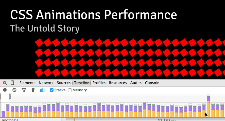 Note: This page was created for GSAP version 2. We have since released GSAP 3 with many improvements. While it is backward compatible with most GSAP 2 features, some parts may need to be updated to work properly. Please see the GSAP 3 release notes for details. There are some interesting (and surprising) performance implications of using CSS animations that aren't widely known. I stumbled across a few of them while running tests for a customer in the advertising industry who is pushing to have GSAP adopted as the standard, so I recorded a screencast explaining what I found. I figured it was worth sharing: Summary Timeline recordings in Chrome Dev Tools don't show the overhead involved with CSS animation of transforms, so people often misinterpret the [lack of] data. Recordings look "clean" with CSS and "dirty" with JS which leads to faulty conclusions about performance. CSS animations of transforms used twice as much CPU compared to JS according to Chrome's task manager. CSS animations caused the main thread to bog down more than using JavaScript animations. User interaction is typically handled on the main thread, making things feel sluggish to the user. It is especially costly if you animate transforms along with almost any other property at the same time. Webkit browsers have synchronization problems. JavaScript was faster than CSS animations on every device that I ran this test on – the only exception was animating transforms in Webkit browsers (and then there's that heavy cost on the main thread and sync problems). In order to independently control the timing/easing of transform components (rotation, scale, skew, position) in CSS, you must create a DOM node for each which negatively impacts performance. With JavaScript, no such workarounds are necessary. (see note below) I love Dev Tools - I'm not knocking it at all. These things are just tough to measure. Do your own tests! Don't put too much faith in Dev Tools or my tests. Use your eyes because ultimately perception is what matters to end users. Smooth movement and responsive UI are both important. Links Raw Codepen test Google's Paul Lewis addresses CSS vs. JS Animations A great article about hardware accelerated CSS by Ariya Hidayat Why GSAP? - a practical developer's guide UPDATE: After recording the video, I did some more tests that showed that one of the biggest contributors to the slowdowns in the pure CSS version was the fact that multiple elements had to be nested in order to accomplish the independent transform component controls. In other words, staggering the start/end times (or easing) of rotation, scale, and position is practically impossible in pure CSS unless you nest things like that, but there's a relatively significant performance tradeoff. When nesting could be avoided, pure CSS animation of only transforms did appear smoother on webkit browsers under heavy pressure and it was basically indistinguishable from optimized JS animations under all other levels of pressure.
 -
 Note: This page was created for GSAP version 2. We have since released GSAP 3 with many improvements. While it is backward compatible with most GSAP 2 features, some parts may need to be updated to work properly. Please see the GSAP 3 release notes for details. This video walks you through some common problems that professional animators face every day and shows you how GSAP’s TimelineLite tackles these challenges with ease. Although GSAP is very powerful and flexible, the API is beginner-friendly. In no time you will be creating TimelineLite animations that can bend and adapt to the needs of the most demanding clients and art directors. Watch the video and ask yourself, "Can my current animation toolset do this?" Enjoy. Video Highlights Tweens in a TimelineLite naturally play one-after-the-other (the default insertion point is at the end of the timeline). No need to specify or update the delay of each tween every time the slightest timing changes are made. Tweens in a TimelineLite don't need to play in direct sequence; you can overlap them or easily add gaps. Multiple tweens can all start at the same time or slightly staggered. Easily to rearrange the order in which tweens play. Jump to any point of the timeline to finesse a particular animation. No need to watch the whole animation each time. Add labels anywhere in the timeline to mark where other tweens should be added, or use them for navigation. Control the speed of the timeline with timeScale(). Full control over every aspect of playback: play, pause, reverse, resume, jump to any label or time, and much more. Unlike jQuery.animate() or other JS libraries that allow you to chain together multiple animations on a particular object, GSAP’s TimelineLite lets you sequence multiple tweens on multiple objects. It's a radically different and more practical approach that allows for precise synchronization and flexibility. If you are still considering CSS3 animations or transitions for robust animation after watching this video, please watch it again Check out this Pen! If you are wondering what "autoAlpha" refers to in the code above, its a convenience feature of CSSPlugin that intelligently handles "opacity" and "visibility" combined. Recommended reading: Main GSAP JS page Jump Start: GSAP JS Speed comparison Cage matches: CSS3 transitions vs GSAP | jQuery vs GSAP jQuery.animate() with GSAP: get the jquery.gsap.js plugin! 3D Transforms & More CSS3 Goodies Arrive in GSAP JS
 -
 Note: This page was created for GSAP version 2. We have since released GSAP 3 with many improvements. While it is backward compatible with most GSAP 2 features, some parts may need to be updated to work properly. We encourage you to use the updated "Getting Started" page . The GreenSock Animation Platform (GSAP) animates anything JavaScript can touch (CSS properties, SVG, React, canvas, generic objects, whatever) and solves countless browser inconsistencies, all with blazing speed (up to 20x faster than jQuery). See "Why GSAP?" to learn why it's used by over 8,000,000 sites and every major brand. Hang in there through the learning curve and you'll discover how addictive animating with code can be. We promise it's worth your time. Quick links Loading GSAP Tweening Basics CSSPlugin 2D and 3D transforms Easing Callbacks Sequencing with Timelines Timeline control Getter / Setter methods Club GreenSock We'll cover the most popular features here but keep the GSAP docs handy for all the details. First, let's talk about what GSAP actually does... GSAP as a property manipulator Animation ultimately boils down to changing property values many times per second, making something appear to move, fade, spin, etc. GSAP snags a starting value, an ending value and then interpolates between them 60 times per second. For example, changing the x coordinate of an object from 0 to 1000 over the course of 1 second makes it move quickly to the right. Gradually changing opacity from 1 to 0 makes an element fade out. Your job as an animator is to decide which properties to change, how quickly, and the motion's "style" (known as easing - we'll get to that later). To be technically accurate we could have named GSAP the "GreenSock Property Manipulator" (GSPM) but that doesn't have the same ring. DOM, SVG, <canvas>, and beyond GSAP doesn't have a pre-defined list of properties it can handle. It's super flexible, adjusting to almost anything you throw at it. GSAP can animate all of the following: CSS: 2D and 3D transforms, colors, width, opacity, border-radius, margin, and almost every CSS value (with the help of CSSPlugin). SVG attributes: viewBox, width, height, fill, stroke, cx, r, opacity, etc. Plugins like MorphSVG and DrawSVG can be used for advanced effects. Any numeric value For example, an object that gets rendered to an HTML5 <canvas>. Animate the camera position in a 3D scene or filter values. GSAP is often used with Three.js and Pixi.js. Once you learn the basic syntax you'll be able to use GSAP anywhere JavaScript runs. This guide will focus on the most popular use case: animating CSS properties of DOM elements. (Note: if you're using React, read this too.) If you're using any of the following frameworks, these articles may help: React Vue Angular What's GSAP Exactly? GSAP is a suite of tools for scripted animation. It includes: TweenLite - the lightweight core of the engine which animates any property of any object. It can be expanded using optional plugins. TweenMax - the most feature-packed (and popular) tool in the arsenal. For convenience and loading efficiency, it includes TweenLite, TimelineLite, TimelineMax, CSSPlugin, AttrPlugin, RoundPropsPlugin, BezierPlugin, and EasePack (all in one file). TimelineLite & TimelineMax - sequencing tools that act as containers for tweens, making it simple to control entire groups and precisely manage relative timing (more on this later). Extras like easing tools, plugins, utilities like Draggable, and more Loading GSAP CDN The simplest way to load GSAP is from the CDN with a <script> tag. TweenMax (and all publicly available GSAP files) are hosted on Cloudfare's super-fast and reliable cdnjs.com. <script src="https://cdnjs.cloudflare.com/ajax/libs/gsap/2.1.3/TweenMax.min.js"></script> Banner Ad CDNs Every major ad network excludes GSAP from file size limits when you load it from their CDN! Contact your ad network for their URLs. For example, Google hosts TweenMax at: //AdWords and DoubleClick ads only "https://s0.2mdn.net/ads/studio/cached_libs/tweenmax_2.1.2_min.js" NPM npm install gsap See the NPM Usage page in the docs for a full guide including how to import things (ES modules or UMD format), tree shaking, Webpack, how to get bonus plugins into a build system, etc. Downloading GSAP Download a zip directly from our home page or your account dashboard. If you're logged in as a Club GreenSock member this zip will include your bonus plugins. GitHub View the source code on GitHub. Tweening Basics Let's start with TweenMax, GSAP's most popular tool. We'll use CodePen demos so that you can easily fork and edit each example right in your browser. TweenMax.to() To create an animation, TweenMax.to() needs 3 things: target - the object you are animating. This can be a raw object, an array of objects, or selector text like ".myClass". duration (in seconds) vars - an object with property/value pairs that you're animating to (like opacity:0.5, rotation:45, etc.) and other optional special properties like onComplete. For example, to move an element with an id of "logo" to an x position of 100 (same as transform: translateX(100px)) over the course of 1 second: TweenMax.to("#logo", 1, {x:100}); Note: Remember that GSAP isn't just for DOM elements, so you could even animate custom properties of a raw object like this: var obj = {prop:10}; TweenMax.to(obj, 1, { prop:200, //onUpdate fires each time the tween updates; we'll explain callbacks later. onUpdate:function() { console.log(obj.prop); //logs the value on each update. } }); Demo: TweenMax.to() Basic Usage See the Pen TweenMax.to() Basic Usage by GreenSock (@GreenSock) on CodePen. If you would like to edit the code and experiment with your own properties and values, just hit the Edit on CodePen button. Notice that the opacity, scale, rotation and x values are all being animated in the demo above but DOM elements don't actually have those properties! In other words, there's no such thing as element.scale or element.opacity. How'd that work then? It's the magic of CSSPlugin. Before we talk about that, let's explain how plugins work in general. Plugins Think of plugins like special properties that get dynamically added to GSAP in order to inject extra abilities. This keeps the core engine small and efficient, yet allows for unlimited expansion. Each plugin is associated with a specific property name. Among the most popular plugins are: CSSPlugin*: animates CSS values AttrPlugin*: animates attributes of DOM nodes including SVG BezierPlugin*: animates along a curved Bezier path MorphSVGPlugin: smooth morphing of complex SVG paths DrawSVGPlugin: animates the length and position of SVG strokes *loaded with TweenMax CSSPlugin In the previous example, CSSPlugin automatically noticed that the target is a DOM element, so it intercepted the values and did some extra work behind the scenes, applying them as inline styles (element.style.transform and element.style.opacity in that case). Be sure to watch the "Getting Started" video at the top of this article to see it in action. CSSPlugin Features: normalizes behavior across browsers and works around various browser bugs and inconsistencies optimizes performance by auto-layerizing, caching transform components, preventing layout thrashing, etc. controls 2D and 3D transform components (x, y, rotation, scaleX, scaleY, skewX, etc.) independently (eliminating order-of-operation woes) reads computed values so you don't have to manually define starting values animates complex values like borderRadius:"50% 50%" and boxShadow:"0px 0px 20px 20px red" applies vendor-specific prefixes (-moz-, -ms-, -webkit-, etc.) when necessary animates CSS Variables handles color interpolation (rgb, rgba, hsl, hsla, hex) normalizes behavior between SVG and DOM elements (particularly useful with transforms) ...and lots more Basically, CSSPlugin saves you a ton of headaches. Because animating CSS properties is so common, GSAP automatically senses when the target is a DOM element and adds a css:{} wrapper. So internally, for example, {x:100, opacity:0.5, onComplete:myFunc} becomes {css:{x:100, opacity:0.5}, onComplete:myFunc}. That way, CSS-related values get routed to the plugin properly and you don't have to do any extra typing. You're welcome. ? To understand the advanced capabilities of the CSSPlugin read the full CSSPlugin documentation. 2D and 3D transforms CSSPlugin recognizes a number of short codes for transform-related properties: GSAP CSS x: 100 transform: translateX(100px) y: 100 transform: translateY(100px) rotation: 360 transform: rotate(360deg) rotationX: 360 transform: rotateX(360deg) rotationY: 360 transform: rotateY(360deg) skewX: 45 transform: skewX(45deg) skewY: 45 transform: skewY(45deg) scale: 2 transform: scale(2, 2) scaleX: 2 transform: scaleX(2) scaleY: 2 transform: scaleY(2) xPercent: 50 transform: translateX(50%) yPercent: 50 transform: translateY(50%) GSAP can animate any "transform" value but we strongly recommend using the shortcuts above because they're faster and more accurate (GSAP can skip parsing computed matrix values which are inherently ambiguous for rotational values beyond 180 degrees). The other major convenience GSAP affords is independent control of each component while delivering a consistent order-of-operation. Performance note: it's much easier for browsers to update x and y (transforms) rather than top and left which affect document flow. So to move something, we recommend animating x and y. Demo: Multiple 2D and 3D transforms See the Pen Multiple 2D and 3D Transforms by GreenSock (@GreenSock) on CodePen. Additional CSSPlugin notes Be sure to camelCase all hyphenated properties. font-size should be fontSize, background-color should be backgroundColor. When animating positional properties such as left and top, its imperative that the elements you are trying to move also have a css position value of absolute, relative or fixed. vw/vh units aren't currently supported natively, but it's pretty easy to mimic using some JS like x: window.innerWidth * (50 / 100) where 50 is the vw. Just ask in the forums for some help. from() tweens Sometimes it's amazingly convenient to set up your elements where they should end up (after an intro animation, for example) and then animate from other values. That's exactly what TweenMax.from() is for. For example, perhaps your "#logo" element currently has its natural x position at 0 and you create the following tween: TweenMax.from("#logo", 1, {x:100}); The #logo will immediately jump to an x of 100 and animate to an x of 0 (or whatever it was when the tween started). In other words, it's animating FROM the values you provide to whatever they currently are. Demo: TweenMax.from() with multiple properties See the Pen TweenMax.from() tween by GreenSock (@GreenSock) on CodePen. There is also a fromTo() method that allows you to define the starting values and the ending values: //tweens from width 0 to 100 and height 0 to 200 TweenMax.fromTo("#logo", 1.5, {width:0, height:0}, {width:100, height:200}); Special properties (like onComplete) A special property is like a reserved keyword that GSAP handles differently than a normal (animated) property. Special properties are used to define callbacks, delays, easing and more. A basic example of a special property is delay: TweenMax.to("#logo", 1, {x:100, delay:3}); This animation will have a 3-second delay before starting. Other common special properties are: onComplete - a callback that should be triggered when the animation finishes. onUpdate - a callback that should be triggered every time the animation updates/renders ease - the ease that should be used (like Power2.easeInOut) Easing If your animation had a voice, what would it sound like? Should it look playful? Robotic? Slick? Realistic? To become an animation rock star, you must develop a keen sense of easing because it determines the style of movement between point A and point B. The video below illustrates the basics. An "ease" controls the rate of change during a tween. Below is an interactive tool that allows you to visually explore various eases. Note: you can click on the underlined parts of the code at the bottom to change things.
 -
 Note: This page was created for GSAP version 2. We have since released GSAP 3 with many improvements. While it is backward compatible with most GSAP 2 features, some parts may need to be updated to work properly. Please see the GSAP 3 release notes for details. Have you ever tried getting a realistic wiggle effect or tweaking just how bouncy an ease is? What about adding squash and stretch to a bounce? These are not easy tasks. Well, until now. Even though CustomEase, lets you create literally any easing effect that you can imagine (bounces, wiggles, elastic effects, whatever) by drawing them, it's difficult to plot a complex wiggle or bounce while making sure all the points are spaced correctly. Wouldn't it be nice if you could just set a few parameters (like number of wiggles or bounciness) and have that complex easing curve created for you? Wish granted. CustomWiggle CustomWiggle extends CustomEase (think of it like a wrapper that creates a CustomEase under the hood based on the variables you pass in), allowing you to not only set the number of wiggles, but also the type of wiggle (there are 5 types; see demo below). Advanced users can even alter the plotting of the wiggle curves along either axis using amplitudeEase and timingEase special properties (see the docs for details). Demo: CustomWiggle Types See the Pen CustomWiggle Demo : resized by GreenSock (@GreenSock) on CodePen. Options wiggles (Integer) - number of oscillations back and forth. Default: 10 type (String) "easeOut" | "easeInOut" | "anticipate" | "uniform" | "random" - the type (or style) of wiggle (see demo above). Default: "easeOut" amplitudeEase (Ease) - provides advanced control over the shape of the amplitude (y-axis in the ease visualizer). You define an ease that controls the amplitude's progress from 1 toward 0 over the course of the tween. Defining an amplitudeEase (or timingEase) will override the "type" (think of the 5 "types" as convenient presets for amplitudeEase and timingEase combinations). See the example codepen to play around and visualize how it works. timingEase (Ease) - provides advanced control over how the waves are plotted over time (x-axis in the ease visualizer). Defining an timingEase (or amplitudeEase) will override the "type" (think of the 5 "types" as convenient presets for amplitudeEase and timingEase combinations). See the example codepen to play around and visualize how it works. How do you control the strength of the wiggle (or how far it goes)? Simply by setting the tween property values themselves. For example, a wiggle to rotation:30 would be stronger than rotation:10. Remember, an ease just controls the ratio of movement toward whatever value you supply for each property in your tween. Sample code //Create a wiggle with 6 oscillations (default type:"easeOut") CustomWiggle.create("myWiggle", {wiggles:6}); //now use it in an ease. "rotation" will wiggle to 30 and back just as much in the opposite direction, ending where it began. TweenMax.to(".class", 2, {rotation:30, ease:"myWiggle"}); //Create a 10-wiggle anticipation ease: CustomWiggle.create("funWiggle", {wiggles:10, type:"anticipate"}); TweenMax.to(".class", 2, {rotation:30, ease:"funWiggle"}); Wiggling isn't just for "rotation"; you can use it for any property. For example, you could create a swarm effect by using just 2 randomized wiggle tweens on "x" and "y", as demonstrated here. CustomBounce GSAP always had the tried-and-true Bounce.easeOut, but there was no way to customize how "bouncy" it was, nor could you get a synchronized squash and stretch effect during the bounce because: The "bounce" ease needs to stick to the ground momentarily at the point of the bounce while the squashing occurs. Bounce.easeOut offers no such customization. There was no way to create the corresponding [synchronized] scaleX/scaleY ease for the squashing/stretching. CustomEase solves this now, but it'd still be very difficult to manually draw that ease with all the points lined up in the right spots to match up with the bounces. With CustomBounce, you can set a few parameters and it'll create BOTH CustomEases for you (one for the bounce, and one [optionally] for the squash/stretch). Again, think of CustomBounce like a wrapper that creates a CustomEase under the hood based on the variables you pass in. Options strength (Number) - a number between 0 and 1 that determines how "bouncy" the ease is, so 0.9 will have a lot more bounces than 0.3. Default: 0.7 endAtStart (Boolean) - if true, the ease will end back where it started, allowing you to get an effect like an object sitting on the ground, leaping into the air, and bouncing back down to a stop. Default: false squash (Number) - controls how long the squash should last (the gap between bounces, when it appears "stuck"). Typically 2 is a good number, but 4 (as an example) would make the squash longer in relation to the rest of the ease. Default: 0 squashID (String) - the ID that should be assigned to the squash ease. The default is whatever the ID of the bounce is plus "-squash" appended to the end. For example, CustomBounce.create("hop", {strength:0.6, squash:2}) would default to a squash ease ID of "hop-squash". How do you get the bounce and the squash/stretch to work together? You'd use two tweens; one for the position ("y"), and the other for the scaleX/scaleY, with both running at the same time: //Create a custom bounce ease: CustomBounce.create("myBounce", {strength:0.6, squash:3, squashID:"myBounce-squash"}); //do the bounce by affecting the "y" property. TweenMax.from(".class", 2, {y:-200, ease:"myBounce"}); //and do the squash/stretch at the same time: TweenMax.to(".class", 2, {scaleX:140, scaleY:60, ease:"myBounce-squash", transformOrigin:"center bottom"}); See the Pen CustomBounce from GreenSock by GreenSock (@GreenSock) on CodePen. Where can I get it? CustomWiggle and CustomBounce are membership benefits of Club GreenSock ("Shockingly Green" and "Business Green" levels). It's our way of saying "thanks" to those who support GreenSock's ongoing efforts. Joining Club GreenSock gets you a bunch of other bonus plugins and tools like MorphSVGPlugin as well, so check out greensock.com/club/ for details and sign up today.
 -
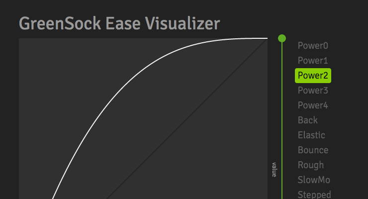 The ease-y way to find the perfect ease Easing allows us to add personality and intrigue to our animations. It's the magic behind animation, and a mastery of easing is essential for any skilled animator. Use this tool to play around and understand how various eases "feel". Some eases have special configuration options that open up a world of possibilities. If you need more specifics, head over to the docs. Notice that you can click the underlined words in the code sample at the bottom to make changes. Quick Video Tour of the Ease Visualizer Take your animations to the next level with CustomEase CustomEase frees you from the limitations of canned easing options; create literally any easing curve imaginable by simply drawing it in the Ease Visualizer or by copying/pasting an SVG path. Zero limitations. Use as many control points as you want. CustomEase is NOT in the public downloads. To get access, create a FREE GreenSock account. Once you're logged in, download the zip file from your account dashboard (or anywhere else on the site that has a download button). Club GreenSock members even get access to a private NPM repo to make installation easier in Node environments.
- 4 comments
-
- 6
-
-
- features
- steppedease
- (and 13 more)


