Search the Community
Showing results for tags 'js.timelinelite'.
Found 4 results
-
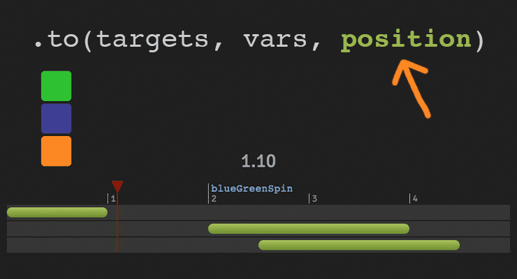 The secret to building gorgeous sequences with precise timing is understanding the position parameter which is used in many methods throughout GSAP. This one super-flexible parameter controls the placement of your tweens, labels, callbacks, pauses, and even nested timelines, so you'll be able to literally place anything anywhere in any sequence. Watch the video For a quick overview of the position parameter, check out this video from the "GSAP 3 Express" course by Snorkl.tv - one of the best ways to learn the basics of GSAP 3. Using position with gsap.to() This article will focus on the gsap.to() method for adding tweens to a Tween, but it works the same in other methods like from(), fromTo(), add(), etc. Notice that the position parameter comes after the vars parameter: .to( target, vars, position ) Since it's so common to chain animations one-after-the-other, the default position is "+=0" which just means "at the end", so timeline.to(...).to(...) chains those animations back-to-back. It's fine to omit the position parameter in this case. But what if you want them to overlap, or start at the same time, or have a gap between them? No problem. Multiple behaviors The position parameter is super flexible, accommodating any of these options: Absolute time (in seconds) measured from the start of the timeline, as a number like 3 // insert exactly 3 seconds from the start of the timeline tl.to(".class", {x: 100}, 3); Label, like "someLabel". If the label doesn't exist, it'll be added to the end of the timeline. // insert at the "someLabel" label tl.to(".class", {x: 100}, "someLabel"); "<" The start of previous animation**. Think of < as a pointer back to the start of the previous animation. // insert at the START of the previous animation tl.to(".class", {x: 100}, "<"); ">" - The end of the previous animation**. Think of > as a pointer to the end of the previous animation. // insert at the END of the previous animation tl.to(".class", {x: 100}, ">"); A complex string where "+=" and "-=" prefixes indicate relative values. When a number follows "<" or ">", it is interpreted as relative so "<2" is the same as "<+=2". Examples: "+=1" - 1 second past the end of the timeline (creates a gap) "-=1" - 1 second before the end of the timeline (overlaps) "myLabel+=2" - 2 seconds past the label "myLabel" "<+=3" - 3 seconds past the start of the previous animation "<3" - same as "<+=3" (see above) ("+=" is implied when following "<" or ">") ">-0.5" - 0.5 seconds before the end of the previous animation. It's like saying "the end of the previous animation plus -0.5" A complex string based on a percentage. When immediately following a "+=" or "-=" prefix, the percentage is based on total duration of the animation being inserted. When immediately following "<" or ">", it's based on the total duration of the previous animation. Note: total duration includes repeats/yoyos. Examples: "-=25%" - overlap with the end of the timeline by 25% of the inserting animation's total duration "+=50%" - beyond the end of the timeline by 50% of the inserting animation's total duration, creating a gap "<25%" - 25% into the previous animation (from its start). Same as ">-75%" which is negative 75% from the end of the previous animation. "<+=25%" - 25% of the inserting animation's total duration past the start of the previous animation. Different than "<25%" whose percentage is based on the previous animation's total duration whereas anything immediately following "+=" or "-=" is based on the inserting animation's total duration. "myLabel+=30%" - 30% of the inserting animation's total duration past the label "myLabel". Basic code usage tl.to(element, 1, {x: 200}) //1 second after end of timeline (gap) .to(element, {duration: 1, y: 200}, "+=1") //0.5 seconds before end of timeline (overlap) .to(element, {duration: 1, rotation: 360}, "-=0.5") //at exactly 6 seconds from the beginning of the timeline .to(element, {duration: 1, scale: 4}, 6); It can also be used to add tweens at labels or relative to labels //add a label named scene1 at an exact time of 2-seconds into the timeline tl.add("scene1", 2) //add tween at scene1 label .to(element, {duration: 4, x: 200}, "scene1") //add tween 3 seconds after scene1 label .to(element, {duration: 1, opacity: 0}, "scene1+=3"); Sometimes technical explanations and code snippets don't do these things justice. Take a look at the interactive examples below. No position: Direct Sequence If no position parameter is provided, all tweens will run in direct succession. .content .demoBody code.prettyprint, .content .demoBody pre.prettyprint { margin:0; } .content .demoBody pre.prettyprint { width:8380px; } .content .demoBody code, .main-content .demoBody code { background-color:transparent; font-size:18px; line-height:22px; } .demoBody { background-color:#1d1d1d; font-family: 'Signika Negative', sans-serif; color:#989898; font-size:16px; width:838px; margin:auto; } .timelineDemo { margin:auto; background-color:#1d1d1d; width:800px; padding:20px 0; } .demoBody h1, .demoBody h2, .demoBody h3 { margin: 10px 0 10px 0; color:#f3f2ef; } .demoBody h1 { font-size:36px; } .demoBody h2 { font-size:18px; font-weight:300; } .demoBody h3 { font-size:24px; } .demoBody p{ line-height:22px; margin-bottom:16px; width:650px; } .timelineDemo .box { width:50px; height:50px; position:relative; border-radius:6px; margin-bottom:4px; } .timelineDemo .green{ background-color:#6fb936; } .timelineDemo .orange { background-color:#f38630; } .timelineDemo .blue { background-color:#338; } .timleineUI-row{ background-color:#2f2f2f; margin:2px 0; padding:4px 0; } .secondMarker { width:155px; border-left: solid 1px #aaa; display:inline-block; position:relative; line-height:16px; font-size:16px; padding-left:4px; color:#777; } .timelineUI-tween{ position:relative; width:160px; height:16px; border-radius:8px; background: #a0bc58; /* Old browsers */ background: -moz-linear-gradient(top, #a0bc58 0%, #66832f 100%); /* FF3.6+ */ background: -webkit-gradient(linear, left top, left bottom, color-stop(0%,#a0bc58), color-stop(100%,#66832f)); /* Chrome,Safari4+ */ background: -webkit-linear-gradient(top, #a0bc58 0%,#66832f 100%); /* Chrome10+,Safari5.1+ */ background: -o-linear-gradient(top, #a0bc58 0%,#66832f 100%); /* Opera 11.10+ */ background: -ms-linear-gradient(top, #a0bc58 0%,#66832f 100%); /* IE10+ */ background: linear-gradient(to bottom, #a0bc58 0%,#66832f 100%); /* W3C */ filter: progid:DXImageTransform.Microsoft.gradient( startColorstr='#a0bc58', endColorstr='#66832f',GradientType=0 ); /* IE6-9 */ } .timelineUI-dragger-track{ position:relative; width:810px; margin-top:20px; } .timelineUI-dragger{ position:absolute; width:10px; height:100px; top:-20px; } .timelineUI-dragger div{ position:relative; width: 0px; height: 0; border-style: solid; border-width: 20px 10px 0 10px; border-color: rgba(255, 0, 0, 0.4) transparent transparent transparent; left:-10px; } .timelineUI-dragger div::after { content:" "; position:absolute; width:1px; height:95px; top:-1px; left:-1px; border-left: solid 2px rgba(255, 0, 0, 0.4); } .timelineUI-dragger div::before { content:" "; position:absolute; width:20px; height:114px; top:-20px; left:-10px; } .timelineUI-time{ position:relative; font-size:30px; text-align:center; } .controls { margin:10px 2px; } .prettyprint { font-size:20px; line-height:24px; } .timelineUI-button { background: #414141; background-image: -webkit-linear-gradient(top, #575757, #414141); background-image: -moz-linear-gradient(top, #575757, #414141); background-image: -ms-linear-gradient(top, #575757, #414141); background-image: -o-linear-gradient(top, #575757, #414141); background-image: linear-gradient(to bottom, #575757, #414141); text-shadow: 0px 1px 0px #414141; -webkit-box-shadow: 0px 1px 0px 414141; -moz-box-shadow: 0px 1px 0px 414141; box-shadow: 0px 1px 0px 414141; color: #ffffff; text-decoration: none; margin: 0 auto; -webkit-border-radius: 4; -moz-border-radius: 4; border-radius: 4px; font-family: "Signika Negative", sans-serif; text-transform: uppercase; font-weight: 600; display: table; cursor: pointer; font-size: 13px; line-height: 18px; outline:none; border:none; display:inline-block; padding: 8px 14px;} .timelineUI-button:hover { background: #57a818; background-image: -webkit-linear-gradient(top, #57a818, #4d9916); background-image: -moz-linear-gradient(top, #57a818, #4d9916); background-image: -ms-linear-gradient(top, #57a818, #4d9916); background-image: -o-linear-gradient(top, #57a818, #4d9916); background-image: linear-gradient(to bottom, #57a818, #4d9916); text-shadow: 0px 1px 0px #32610e; -webkit-box-shadow: 0px 1px 0px fefefe; -moz-box-shadow: 0px 1px 0px fefefe; box-shadow: 0px 1px 0px fefefe; color: #ffffff; text-decoration: none; } .element-box { background: #ffffff; border-radius: 6px; border: 1px solid #cccccc; padding: 17px 26px 17px 26px; font-weight: 400; font-size: 18px; color: #555555; margin-bottom:20px; } .demoBody .prettyprint { min-width:300px; } Percentage-based values As of GSAP 3.7.0, you can use percentage-based values, as explained in this video: Interactive Demo See the Pen Position Parameter Interactive Demo by GreenSock (@GreenSock) on CodePen. Hopefully by now you can see the true power and flexibility of the position parameter. And again, even though these examples focused mostly on timeline.to(), it works exactly the same way in timeline.from(), timeline.fromTo(), timeline.add(), timeline.call(), and timeline.addPause(). *Percentage-based values were added in GSAP 3.7.0 **The "previous animation" refers to the most recently-inserted animation, not necessarily the animation that is closest to the end of the timeline.
- 6 comments
-
- 4
-

-

-
- gsap
- position parameter
- (and 9 more)
-
 Note: This page was created for GSAP version 2. We have since released GSAP 3 with many improvements. While it is backward compatible with most GSAP 2 features, some parts may need to be updated to work properly. Please see the GSAP 3 release notes for details. Learn how to make a simple play / pause toggle button to control any GSAP animation (tweens or timelines). Same concepts apply to toggling the reversed() state of an animation too. Watch the video Explore the demo See the Pen Toggle Play Pause by GreenSock (@GreenSock) on CodePen. Core code tl.pause() // pauses the animation tl.paused() // gets paused state, returns true or false tl.paused(true) // sets paused state to true tl.paused(!tl.paused()) // sets paused state to inverse of current paused state. // reverse methods tl.reverse() // reverses the animation tl.reversed() // gets reversed state, returns true or false tl.reversed(true) // sets reversed state to true tl.reversed(!tl.reversed()) // sets reversed state to inverse of current reversed state.
 -
 See the Pen GreenSock Home Page Animation by GreenSock (@GreenSock) on CodePen. Here is the demo we use on our homepage. Although it incorporates a few advanced techniques, at its core it is just a bunch of timelines nested inside a master timeline. This technique of nesting timelines is actually quite simple and with a little practice you'll be doing the same.