Search the Community
Showing results for tags 'responsive'.
Found 45 results
-
Hi everyone! I was wondering if someone could help me with a scaling problem I'm having. I have five sections inside a div and every section is the width of the window. The div is the width * 5. When pressing the next buttons inside a section the div translates X the width of the page to show the next section (see codepen URL). I have this function in a window.resize but I don't know how to change the position of the current section so that it always fits and centers the window width. Any help would be much appreciated! - Helle
-
Hi bro, I need to make responsive on my project. It isn't easy. To be honest, i am done with basic solution. I make multi version for each break-point. Example: one version for min-width:1100px. One version for min-width:750px and max-width:1099px. It's working now. Please, have a check : http://codepen.io/bqhieu/pen/mPqmZO But my code is quite messy with this solution. Also, it isn't good for performance. Do you have any good idea? Please, have a check my clean code which is working for just desktop in here: http://codepen.io/bqhieu/pen/ZWPJKN How can i make it responsive? Thank you in advance for your helping!
-
Hi GreenSock Guys, I am stuck in making my TweenMax animation responsive, don't know how to make it. here it is http://codepen.io/sareer/pen/ZWqmaz Thanks as always
-
Hai What i am trying to achieve is to infinite loop the scroll animation. I tried with some basic looping. But is it the right way of doing this. Also it is having responsive issues and there is a delay when after every slide starting. I tried as much as i can to make it working.
-
Hi, sorry if my question not clever. Can I using bezier path (css left, top), set square path for my dot ? Or how can I do motion along square path another way (with on time duration)? The square should be responsive.
-
Hi I'm a big GSAP newbie here. Im using the angularjs framework and I fetch data from a REST service, also flexbox as a layout grid manager, I have a container div with a loading image inside of it. When the data is loaded I ng-hide the loading image and show the data. But is it possible to animate the containers div height as soon as the data is available? So first the div has the height of the loading image, and afterwards the height of the text data returned from the rest service. I dont know the height untill the data is returned so im kind of puzzled here. Any tips on how to handle this? Grts, Ryan
-
Can anyone point me to a tutorial or codepen demo that shows how to make an entire Greensock project in a div scale uniformly on a resize or load event, preserving aspect ratio and relative positions of all elements within a container div? I've used Greensock within Edge Animate, and it works well. However, when building a GSAP project from scratch within a container div on a web page, nested elements do not scale with the parent container. I'm looking for the most efficient approach for achieving this.
-
I've been at this for a few days now (starting with Skrollr and now ScrollMagic), and I just can't figure it out: If I create an SVG animation - it completes 100% on my laptop screen. If I view the animation on a larger screen (with more viewport height), the animation doesn't complete (unless I allow the viewport to go beyond the footer, creating blank space). My question is this: how should I use ScrollMagic trigger points in a responsive design where the height of the viewport changes? I initially thought that I could trigger them on the percentage that the actual scrollbar has been scrolled - thus keeping everything in proportion (ie, fire SVG line when the scrollbar has been scrolled 50%), but it seems like this is not the case. If anyone could provide clarification on this, I would REALLY appreciate it! ps, I can create a CodePen if needed - though this is quite a general question that will be applied to animations throughout the site.
-

-
Hello, I made a codepen page to illustrate my issue. Basically, I have a black box that tweens its' width and height properties, then tweens down Y 150px and tweens its' width and height again. However, when I resize the page, I need to change the Y and width and height coordinates. How can I do this when it's written in the script? Can I save the coordinates as variables and somehow change them when the browser resizes? Thanks!
-
I'm trying to figure out why my right column doesn't expand properly when "hide" button is clicked. Both left and right columns are floating left; left column ranges from 20% width to 0 %; right column ranges from 80% width to 100% respectively. Looks great when "show" is clicked, but there seems to be a floating/width issue when "hide" is clicked. This seems like it should be simple, but I can't figure out what I'm doing wrong... Thanks a trillion. BC
-
I am using GSAP along with a ScrollMagic plugin to time my animations using the user scroll. Everything works great on desktop, animations are smooth and look nice. But when I load the site on tablet and mobile issues start to show up. I have an iPad and a Galaxy S4, and the galaxy is performing much better than the iPad is. On scroll for the Galaxy there is a short jump at the start, past that the animations are a bit slow but work in general. When it comes to the iPad, the animations are nonexistant... on scroll everything locks up and moves for the scroll, then it seems to reload and moves everything to where they should be instantly. There is no tweening or easing happening and creates a very poor experience on tablet. Im looking for a way to improve performence on mobile / tablet and allow tweening and easing to happen at all on tablet. Thank you
-
Hi all, I have to build a responsive full width (not height) tabbed slider with GSAP. Anyone has tried this kind of project? Any ideas will be appreciated. Thanks! neuhaus3000
-
Hi everyone. Just wondering, if It is possible something like: Draggable.create("#myObject", {type:"xPercent,yPercent"}); or Draggable.create("#myObject", {type:"leftPercent, topPercent"}); Simply said, my goal in both cases is a percentage output. Is this possible with current version of GreenSock Draggable?
-
I have spent several days creating a very nice banner for a website. The main feature of this is a row of buttons which when clicked uses TimeLineMax to move the background image of the main panel to particular pixel-specified positions in a large background image. I have now installed the banner into the page, and found that making it responsive is not as easy as I anticipated. I had assumed that I would be able to make the content scale with the bounding box, but I've discovered that CSS can't do that. I am now looking for an option that doesn't involve me doing an extensive rework of the banner. One option I have looked at if putting it in an iframe - a bit of a kludge, but it does look as if it will work. Is there a better way to do this? Thanks, James (I have now used greensock on a couple of projects, and I like it)
-
Hi All! I am in the process of building a simple slider with the GSAP's Draggable inside a responsive(ish) site — only one breakpoint. Basically what the slider does is — as it is being dragged it updates its' position to the span above. Essentially letting the user know how much percentage they are on the bar. Note: The draggable's initial starting position is provided by an outside AngularJS service, but in the CodePen test is set to fixed 50%. After initializing Draggable(s), we convert that % value into pixel values, and use TweenMax.set() to set the new value. This was done, because because for some reason the Draggable initializes back to left: 0px and drags form there if the % value is left. Kind of jarring. When the user stops dragging, then the value is calculated back to the % value, so that when the site is resized then I can keep the draggable relative to it's parent bounds. Before the drag is started again... onPress: I reconvert the percentage value back to pixel, and then we can start the drag... Issue (#4): Number 4 in the list above is where I currently have an issue. The draggable is restarting its' drag position from 0px again even though the left value has already been recalculated back to pixel based value...I basically have to "click" the draggable with full release THEN I can drag without it restarting from left: 0px, and if I just press and then drag it starts from 0px... Any ideas as to what is causing this issue? Or maybe I'm missing something. I've thrown an almost exact copy of my code inside the CodePen below.
-
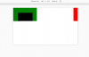
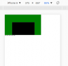
Hi, I'm trying to find a way to dynamically resize elements that are placed in a responsive bootstrap grid system without the resized element 'pushing' other elements while being resized. Such a grid is simply a set of DIVs which dynamically relocate and resize depending on the size of the viewport, e.g.: example. The main point here is that for the responsive bootstrap grid to work properly the elements' positioning should be set to 'absolute'; however, if I do not set the element's position as 'absolute', when I resize one element, all of it's following DOM siblings are automatically moved. This can be seen as the right thing to happen and as the natural behavior of non-absolute elements, but it leads to a situation where dynamic resizing of elements in a responsive bootstrap grid system affects elements that should remain unaffected. I was wondering if there is a possibility that when one element resizes all other elements, which are positioned as 'relative', will automatically relocate their position so that they remain in the same location as before the resize? In the linked codepen, perhaps it is possible for the red box to resize without moving the blue box downwards when both of them are positioned as 'relative'? This possibility seems necessary for dynamic resizing to work properly when elements need to be positioned in a responsive layout. I will be happy to hear of other possibilities for creating a responsive layout with dynamically resized elements. Thanks very much ! Elior
-
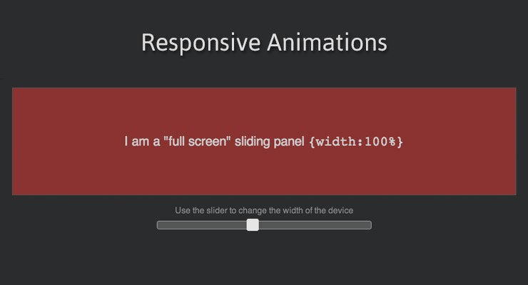 Note: This page was created for GSAP version 2. We have since released GSAP 3 with many improvements. While it is backward compatible with most GSAP 2 features, some parts may need to be updated to work properly. Please see the GSAP 3 release notes for details. Percentage-based transforms (great for responsive animation) Have you ever had to Google "vertically center a div with CSS"? Maybe you used a bunch of jQuery code that measures the width and height of a bunch of elements so that you can center them based on half-width and half-height? Ever used an onresize event to painstakingly recalculate the size and position of multiple elements that you need for a full-screen, responsive animation? We have very good news for you. CSSPlugin recognizes two new special properties: xPercent and yPercent which can be combined with regular x and y transforms to deliver unprecedented positional control. And yes, since these are transforms, they can be GPU-accelerated for outstanding performance. Example: using xPercent for responsive fullscreen sliders / carousels With the new xPercent property you can easily create fullscreen sliders that don't require lots of costly calculations when screens change size, nor do you have to create separate animations for different devices. Notice how in the demo below you can change the width of the black container and the animation seamlessly adjusts. No code trickery behind the scenes, the TimelineMax animation is built only once. See the Pen xPercent / basic by GreenSock (@GreenSock) on CodePen. To achieve this type of centered layout you could use the following simplified approach //CSS to place origin of all elements in the center or their parent .myClass { position:absolute; left:50%; top:50%; } //JS //center all .myClass elements around their origins TweenLite.set(".myClass", {xPercent:-50, yPercent:-50});//handles all vendor prefixes of translateX(-50%) translateY(-50%) //now we can animate myElement's x/y such that its center is 100px,200px from the origin TweenLite.to(myElement, 1, {x:100, y:200}); CSSPlugin accomplishes this under the hood by prepending a translate(x,y) to the normal matrix() or matrix3d() that it sets on the element. <div class="myClass" style="transform: translate(-50%, -50%) translate3d(150px, 0px, 0px);"></div> As a convenience, if you set the regular x or y to a percent-based value like 50%", GSAP will recognize that and funnel that value to xPercent or yPercent property for you, but we recommend using xPercent/yPercent directly. Thanks to Gary Chamberlain for prompting this feature. Better RequireJS/AMD/Browserify/Node/CommonJS compatibility We have received quite a few requests to make GSAP work with module/dependency tools like RequireJS, Browserify, etc. and we're happy to announce that as of version 1.13.1, that wish has been granted. So, for example, with Browserify you can require("./TweenLite.js") and it'll work. If you're a RequireJS user, snag a super simple example set of files here. A special thanks to David Hellsing for his assistance. Save kb by skipping jQuery. Default selector: document.querySelectorAll() Probably the most common reason that developers load jQuery is to leverage it as a selector engine but all modern browsers support document.querySelectorAll(), so as of version 1.13.1, GSAP uses that as a fallback (after attempting to detect a selector engine like jQuery). That means that you can do something like this, for example: TweenLite.to("li:first-child, li:last-child", 1, {opacity:0.5}); Without loading jQuery. And more Several minor bugs have been squashed too, so make sure you snag the latest files to make sure you're rockin' buttery smooth 60fps animations. Recommended reading: Main GSAP JS page lagSmoothing() and other performance improvements in 1.12.0 Myth Busting: CSS Animations vs JavaScript Why GSAP? A practical guide for developers
 -
Hi Greensock guys, Know this topic has been covered a little in some other posts, was reading about using media queries and 'resize' functions here and here, but I wanted to double-check something with you in regards to responsive animations. I've just put together a quick landing page for my portfolio, found here (and big thanks to the GS guys for helping me nut out questions I had along the way with it), and I'm using an if/else statement after the $(document).ready to fire differently scaled animations depending on the browser width. I had put in a window resize event handler in my script but I noticed it was screwing with the animations, they would still be stuck on a particular width's animation even though it had resized. Plus, I was essentially just repeating the same code all over again to get it to work, was thinking there must be a better way to call responsive animations than this. So I'm guessing to make these kinds of responsive animations work we'd need to kill the currently running ones first right? And is there a better/cleaner way of doing this than just repeating functions over when a browser resizes, say for instance if I just made the if/else media queries a function of their own, then recalled that function when a resize fired? Apologies if this is actually simpler than I've figured, I just wanted to clarify this in case any other devs needed a simplified answer to this too, am finding myself having to do a lot of these responsive animations lately and I thought it would be wise to get a more definitive approach to it Thanks as always guys.
-
I just started to get into using the TweenMax JS animation library, and I have to say that it is pretty sweet. I've gone through and started doing test, and such, and tested the bezier plugin ,which is pretty awesome in itself. My question with the bezier plugin is whether or not it would handle responsive design, such as when the user rescales down their browser window? Currently I have this tween, that is set to animate when the item comes into view. var atween = TweenMax.to('.arrow-test', 2, { bezier:[ {left:100, top:250, alpha: 0}, {left:300, top:0, alpha: 0.5}, {left:500, top:400, alpha:1} ], ease:Power1.easeInOut, paused: true }); My CSS is as follows: .arrow-test-wrapper { position: relative; } .arrow-test { position: relative; top: 0; left: 0; } Does animating on bezier curves support responsive design? Or is there something that I am missing in my code? Thanks!


