Search the Community
Showing results for tags 'css'.
-
Hi there guys, I am very confused. I have a design with lots of lines(roads) which are connected to sections through out the page like on the image on this image given below. Am i able to add those like exactly on the picture with help of gsap and animate the truck on them while scrolling ?
-
I have a circle which is supposed to be transformed in the direction of the cursor all time. node.addEventListener("mousemove", e => { const {x, y, width, height} = blob.current.getBoundingClientRect(); gsap.timeline() .to(blob.current, { duration: 10, x: e.clientX - (x + width / 2), y: e.clientY - (y + height / 2), force3D: true, overwrite: "auto", ease: Linear.easeNone }, 0) }) This is fine, but includes unwanted behavior: when being further away from the circle and rapidly changing direction and distance from the circle, there obviously will be a change in speed since the distance for the circle to travel in this 10 seconds gets shorter/longer. How can I ensure the same travel speed all the time, no matter where the cursor is?
-
Hi - I'm not sure why but I can't get a simple color tween working, and I can't seem to find anything in the documentation that explains it. I've created a codepen here with what I feel should be the proper implementation. https://codepen.io/heaversm/pen/poyXmXg
-
So I have a simple GSAP timeline to move an element with the direction of the mouse' event: node.addEventListener("mousemove", e => { const x = e.clientX / 10; const y = e.clientY / 10; gsap.timeline() .to(blurRef.current, { yPercent: -30, x, y, duration: 1 }, 0) }) It works fine, but I want to add an infinite bounce effect which happens simultaneous to the mouse animation. I've done the bounce effect only before with pure css, but this makes GSAP stop working (mouse effect won't work). Is there a way to handle both simultaneously? Is there an equivalent for the CSS with GSAP? .blur { animation: bounce 2s infinite ease-in-out; } @keyframes bounce { 0% { transform: translateY(-10px) } 50% { transform: translateY(15px) } 100% { transform: translateY(-10px) } }
-
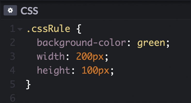 Allows GSAP to animate the raw style sheet rules which affect all objects of a particular selector rather than affecting an individual DOM element's style (that's what the CSSPlugin is for). For example, if you have a CSS class named ".myClass" that sets background-color to "#FF0000", you could tween that to a different color and ALL of the objects on the page that use ".myClass" would have their background color change. Typically it is best to use the regular CSSPlugin to animate css-related properties of individual elements so that you can get very precise control over each object, but sometimes it can be useful to tween the global rules themselves instead. For example, pseudo elements (like :after, :before, etc. are impossible to reference directly in JavaScript, but you can animate them using CSSRulePlugin as shown below. See the Pen CSSRulePlugin by GreenSock (@GreenSock) on CodePen. Learn more in the CSSRulePlugin documentation. To learn how to include the CSSRulePlugin into your project, see the GSAP install docs.
 -
Hi all. After some digging I found that CSS grid elements cannot have animation when they are moved around within the grid, so I was wondering if there could be a JS solution to this. I posted this on Reddit first and someone directed me here. Basically what I want is, on a class change on the parent that has display: grid, the child elements will change position using grid-column-start and grid-row-start. I figured out this part, but not quite sure how to animate that change in position. What could be a JS way to achieve this since this is most likely not possible with CSS? Please correct me if I am wrong. My implementation minus the animation: https://codepen.io/sadmansh/full/VweEZqL The dots will move when you click the button up top.
-
<!doctype html> <html lang="en"> <head> <meta charset="UTF-8"> <meta name="viewport" content="width=device-width, user-scalable=no, initial-scale=1.0, maximum-scale=1.0, minimum-scale=1.0"> <meta http-equiv="X-UA-Compatible" content="ie=edge"> <title>Document</title> </head> <style> .loading{ background: orangered; position: absolute; top: 0; bottom: 0; right: 0; height: 100%; width: 100%; z-index: -99; } button{ padding: 10px 30px; background:#323232; color: white; outline: none; border: none; position: absolute; z-index: 9; top: 45%; left: 45%; cursor: pointer; } </style> <body> <div class="loading"> </div> <div class="btn"> <button>CLick</button> </div> <script src="https://cdnjs.cloudflare.com/ajax/libs/jquery/3.4.1/jquery.min.js "></script> <script src="https://cdnjs.cloudflare.com/ajax/libs/gsap/3.2.6/gsap.min.js "></script> <script> const ld_gray = gsap.timeline({paused: true}); ld_gray.from('.loading', {duration: 1, delay: 0.5, scaleX: 0, transformOrigin: 'left', ease: "expo.out",}); ld_gray.to('.loading', {duration: 1, delay: 1, scaleX: 0, transformOrigin: 'right', ease: "expo.in",} ); $('button').click(function () { ld_gray.restart(); }); </script> </body> </html>
-
How can I animate height from 0 to auto using the Tweenmax Timeline? I do a lot of research and see some solutions with CSS. But I have already something dynamic with Gsap where I need to animate height from 0px to auto on clicking the item. I didn't find any solution to gsap documentation and any example where I can achieve it. Here is my code to animate on GSAP. import { TimelineMax, Power4, Expo, TweenMax } from 'gsap/all'; const loginSection = document.querySelector('.login-form'); const loginForm = document.querySelector('.login-form form'); const tl = new TimelineMax({ paused: true }) TweenMax.set(loginSection, { height: 0 }) tl.addLabel('start') .set(loginForm, { opacity: 0, x: 50 }) .to(loginSection, 0.7, { height: 'auto', ease: Power4.easeOut }, 'start') .to(loginForm, 0.7, { opacity: 1, x: 0, ease: Power4.easeOut }, 'start+=0.4') when I click on the element rather than it expanding it renders immediately without any animation. But when I use px instead of auto it's working. But it's not my goal. Your suggestion or solution appreciated.
-
hi guys, i want to achieve https://dexternavy.com like hover effect. i have tried it using this cdn 'https://cdnjs.cloudflare.com/ajax/libs/gsap/1.18.0/TweenLite.min.js' but it not work as i thought and i am stuck here. Any help would be greatly appreciated.
-
Hi, I creating a website and i using TweenMax. I've created line animation like this; Its connected with scroll. Animation is like that; First left long line going down then bottom line goes to right then right line starts from bottom to top finally top line start from right and goes to left and animation is ends. At the end we had this image. But there is something it will drive me crazy. At the start of animation lines goes normal (fast). But when its ending its very slow down like smoothing. Example at the start of animation i scrolling 1 click, lines with changes between 0 - 30px but the end of animation i scroll 1 click again and lins with changing between 0 - 10px. Why it like that? I want line is always change same pixel when i scroll same long. In other words i want to close this smoothing.
-
I am trying to integrate CSS animation with GSAP. @keyframes animation1 { from { transform: translateX(0); } to { transform: translateX(30px); } } @keyframes animation2 { from { transform: translateY(0); } to { transform: translateY(30px); } } @keyframes animation3 { from { transform: translateY(0); } to { transform: translateY(50px); } } Above code can be achieved directly through Tweenmax, but what I need is to integrate the animation keyframes with the Tweenmax methods. In CSS, the animation3 will overwrite the translate() of animation1 and animation2 which is undesirable. I hope the properties are sequenced when combined with GSAP methods. Something like tweenmax.to { animation1, delay1, animation2, delay2, animation3, delay3 } The behaviour in CSS can also be seen here: http://jsfiddle.net/Manojkr/0z2ehwhd/1/
-
With CSS 3 I am able to use keyframes, which makes animating objects really flexible. For example, with keyframes I can change a object opacity from 0 to 1 at 50% of the animation and then back to 0 at 100% of the animation... that creates a smooth fadein and fadeout. I am trying to accomplish the same with gsap. With TweenMax I can set a fromTo... but how, would I go about doing a fromTofrom? I tried doing something like this: var mydiv = new TimelineMax() .add(TweenMax.fromTo($(".mydiv"), 1, {opacity:0, scale:0}, {opacity:1, scale:1})) .add(TweenMax.fromTo($(".mydiv"), 1, {opacity:1, scale:1}, {opacity:0, scale:2})); However, when using "add", there's a very small delay between the first and the second add. How do I go about removing that delay? Or, is there another way of doing chained animations?
-
Hello Guys, I've been looking around the internet and this forum for some time and I could not find a fix whatsoever. I am currently working on my finals project and I've come across this white-space problem which seems to only occur on mobile devices. (In my case: iPhone 11) I included a codepen (https://codepen.io/benvi/pen/KKwbzON) on which you can see the problem yourself. On a PC or Laptop, there will be no whitespace on the right side, however if you inspect this codepen on your mobile device you will notice while the animation hasn't finished playing, you can scroll all the way to the right like 1000px or something and as soon as all the elements that came in animated are finished with their animation, the whitespace somehow magically disappears and you can no longer swipe to the right. I am not quite sure how this affects a mobile device but not a pc or laptop. I am fairly new to GSAP and I am sorry if this has already been answered somewhere. Could you possibly teach me to properly position elements off the screen (to animate them in later) without causing excessive amounts of whitespace? Thank you guys!
-
Image is getting called multiple times in network section of dev tools. when i am using BezierPlugin GSAP 2.1.2 and assigning image as css background issue.zip
-
I've been working on reproducing one of my favorite card games in JavaScript and I'm having some problems getting the 3d rotations to work the way I'd like. I'm using TweenLite to flip the cards' divs with rotationX and rotationY, but I can't figure out how to tell when I need to swap out the front and back of the card. Is there a way to detect which side of the card is visible? I've seen it done with CSS like this: http://davidwalsh.name/css-flip, but 'backface-visibility: hidden' doesn't seem to affect objects that are rotated with TweenLite.
-
Hey all, This is my first time posting here, so let me know if i've given too much / too little detail! I'm having an issue with some css on safari, essentially I have a series of elements, positioned along the Z-axis with transform: translateZ, in order to achieve a parallax effect, however, I would also like to apply a mix blend mode to some of the elements on the page. This works fine on Chrome and FireFox, and displays as expected, however it completely breaks the site on Safari with the content appearing extremely zoomed in, i'm not sure what to try to rectify the issue, i've tried attaching prefixes to everything however this doesn't seem to make any difference, I have attached an image bellow of what the page looks like when viewed in Safari. Any help would be really appreciated thanks!

-
 Hello, I have a problem not related to GSAP, I don't find any solution, I asked on 3 forums (+stackoverflow) and didn't find any answer. I already used GSAP on my webpage for a small animation and I was wondering if it could help me with this problem or if it would be overkill to use GSAP (performance/ressources). I tried to document my problem on stackoverflow (if someone want to read more details) : https://stackoverflow.com/questions/57784926/why-using-opacity-or-an-absolute-position-ruin-my-transform-rotatey180deg I made a card that can rotate on Y when it's mouse hovered (everything with CSS). the problem is that when I use css to change the opacity (svg flag) or the position of an element (text in my situation) on the back of the card, the rotate animation is buggy and got a delay of +/-1sec to display the back of the card. /!\ the bug occur only once, the first time the rotateY is used; to do it again, you need to reload the page (F5). The bug only apear in Chrome (work perfectly on firefox). If I use GSAP to do the rotation instead of css, should it fix the problem or is the problem from chrome and would still be here with GSAP ? (what would be more logic using GSAP for the rotation on Y or for opacity/text position?) I made a codepen with the problem : https://codepen.io/Demky/pen/pozWZKM -> if you remove the css classes .bottom-right and .changeOpacity there is no more delay. As I said on stackoverflow, if you use the template from w3school and just add an opacity to an element from the back of their card (exemple .flip-card-back), it does the same delay problem so I don't think the error is from my code : https://www.w3schools.com/howto/tryit.asp?filename=tryhow_css_flip_card What would you do in my situation ? I can't believe it's impossible to customise the back of a card that rotate ? I don't really know if I can post my question here but I don't know where to search a solution Let me know if something isn't clear. ---------------------- Edit : looking to test it with gsap to see if it work; found this thread, will try it soon ;
 -
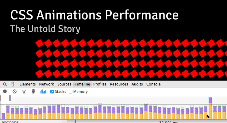 Note: This page was created for GSAP version 2. We have since released GSAP 3 with many improvements. While it is backward compatible with most GSAP 2 features, some parts may need to be updated to work properly. Please see the GSAP 3 release notes for details. There are some interesting (and surprising) performance implications of using CSS animations that aren't widely known. I stumbled across a few of them while running tests for a customer in the advertising industry who is pushing to have GSAP adopted as the standard, so I recorded a screencast explaining what I found. I figured it was worth sharing: Summary Timeline recordings in Chrome Dev Tools don't show the overhead involved with CSS animation of transforms, so people often misinterpret the [lack of] data. Recordings look "clean" with CSS and "dirty" with JS which leads to faulty conclusions about performance. CSS animations of transforms used twice as much CPU compared to JS according to Chrome's task manager. CSS animations caused the main thread to bog down more than using JavaScript animations. User interaction is typically handled on the main thread, making things feel sluggish to the user. It is especially costly if you animate transforms along with almost any other property at the same time. Webkit browsers have synchronization problems. JavaScript was faster than CSS animations on every device that I ran this test on – the only exception was animating transforms in Webkit browsers (and then there's that heavy cost on the main thread and sync problems). In order to independently control the timing/easing of transform components (rotation, scale, skew, position) in CSS, you must create a DOM node for each which negatively impacts performance. With JavaScript, no such workarounds are necessary. (see note below) I love Dev Tools - I'm not knocking it at all. These things are just tough to measure. Do your own tests! Don't put too much faith in Dev Tools or my tests. Use your eyes because ultimately perception is what matters to end users. Smooth movement and responsive UI are both important. Links Raw Codepen test Google's Paul Lewis addresses CSS vs. JS Animations A great article about hardware accelerated CSS by Ariya Hidayat Why GSAP? - a practical developer's guide UPDATE: After recording the video, I did some more tests that showed that one of the biggest contributors to the slowdowns in the pure CSS version was the fact that multiple elements had to be nested in order to accomplish the independent transform component controls. In other words, staggering the start/end times (or easing) of rotation, scale, and position is practically impossible in pure CSS unless you nest things like that, but there's a relatively significant performance tradeoff. When nesting could be avoided, pure CSS animation of only transforms did appear smoother on webkit browsers under heavy pressure and it was basically indistinguishable from optimized JS animations under all other levels of pressure.
 -
![More information about "CSS Animations: Workflow Issues Exposed [Includes Videos]"](https://gsap.com/community/uploads/monthly_2014_01/535684648_201401blog-CSSWorkflow.jpg.1f90c672fe87c2148eb04653fef395b2.jpg) Note: This page was created for GSAP version 2. We have since released GSAP 3 with many improvements. While it is backward compatible with most GSAP 2 features, some parts may need to be updated to work properly. Please see the GSAP 3 release notes for details. A post by Carl Schooff, GreenSock's "Geek Ambassador" Hot on the heels of the CSS Myth-Busting article, I'm going to take a deeper look into CSS Animations and how they fit (or don't fit) into a modern animator's workflow. This isn't about simple fades or basic transitions (CSS is great for those); Developers who use animation to tell a story or deliver rich interactivity require a very different workflow than those who are simply doing UI transitions. I'm going to show you exactly where some of the pain points are for a typical project and how they can bring your workflow to a grinding halt. Even relatively simple animations like the one below can become surprisingly cumbersome with CSS. Example of a Simple, "Story-Telling" Animation See the Pen GSAP: Full Version Complete by GreenSock (@GreenSock) on CodePen. Seriously, You guys are beating up on CSS Animations again? Really, I'm not trying to be negative for the sake of being negative. It's just that so many developers are looking for animation tools that accommodate their real-world projects and the industry seems to scream "use CSS!" even though the API doesn't adequately serve the workflow of modern animators who are building immersive experiences or animations that "tell a story". Too many people are being led down a path that results in utter frustration, or at least a lot of wasted time. And no, CSS Animations aren't "evil". In fact, sometimes they're perfectly appropriate (see the CSS Myth-Busting article for details). There are CSS fans who craft animations and proudly shout "Pure CSS! No JS!" as if the grueling effort necessary is a badge of honor. The accomplishment is indeed admirable, and we tip our hats to them. But WOW it's a lot of work and doesn't exactly lend itself to experimentation or easy edits. Quite simply, we aim to change the tide with tools like GSAP. The majority of the GSAP API has been shaped by feedback from real developers in the trenches over the course of many years. The process of animation should be fun and inspiring. Challenge! Still not convinced that GSAP is better suited for professional animators? I'm very interested to see how this animation can be built more effectively. Are you in the CSS-Purist camp? Do you prefer to trigger animations with JavaScript setTimeouts? Maybe you have another library that blows GSAP away. Dig in and build the animation I've been using with your own choice of tools. Below are some resources that should make it easy to get started. When you're done, just drop us a line in the comments or in the forums. Full storyboard showing css values for each key frame: http://codepen.io/GreenSock/pen/DzHBs Starter Pen: http://codepen.io/GreenSock/pen/EsAvF Recommended reading: Myth Busting: CSS Animations vs JavaScript (css-tricks.com guest post) Main GSAP page Jump Start: GSAP JS Cage matches: CSS3 transitions vs GSAP | jQuery vs GSAP 3D Transforms & More CSS3 Goodies Arrive in GSAP JS
Note: This page was created for GSAP version 2. We have since released GSAP 3 with many improvements. While it is backward compatible with most GSAP 2 features, some parts may need to be updated to work properly. Please see the GSAP 3 release notes for details. A post by Carl Schooff, GreenSock's "Geek Ambassador" Hot on the heels of the CSS Myth-Busting article, I'm going to take a deeper look into CSS Animations and how they fit (or don't fit) into a modern animator's workflow. This isn't about simple fades or basic transitions (CSS is great for those); Developers who use animation to tell a story or deliver rich interactivity require a very different workflow than those who are simply doing UI transitions. I'm going to show you exactly where some of the pain points are for a typical project and how they can bring your workflow to a grinding halt. Even relatively simple animations like the one below can become surprisingly cumbersome with CSS. Example of a Simple, "Story-Telling" Animation See the Pen GSAP: Full Version Complete by GreenSock (@GreenSock) on CodePen. Seriously, You guys are beating up on CSS Animations again? Really, I'm not trying to be negative for the sake of being negative. It's just that so many developers are looking for animation tools that accommodate their real-world projects and the industry seems to scream "use CSS!" even though the API doesn't adequately serve the workflow of modern animators who are building immersive experiences or animations that "tell a story". Too many people are being led down a path that results in utter frustration, or at least a lot of wasted time. And no, CSS Animations aren't "evil". In fact, sometimes they're perfectly appropriate (see the CSS Myth-Busting article for details). There are CSS fans who craft animations and proudly shout "Pure CSS! No JS!" as if the grueling effort necessary is a badge of honor. The accomplishment is indeed admirable, and we tip our hats to them. But WOW it's a lot of work and doesn't exactly lend itself to experimentation or easy edits. Quite simply, we aim to change the tide with tools like GSAP. The majority of the GSAP API has been shaped by feedback from real developers in the trenches over the course of many years. The process of animation should be fun and inspiring. Challenge! Still not convinced that GSAP is better suited for professional animators? I'm very interested to see how this animation can be built more effectively. Are you in the CSS-Purist camp? Do you prefer to trigger animations with JavaScript setTimeouts? Maybe you have another library that blows GSAP away. Dig in and build the animation I've been using with your own choice of tools. Below are some resources that should make it easy to get started. When you're done, just drop us a line in the comments or in the forums. Full storyboard showing css values for each key frame: http://codepen.io/GreenSock/pen/DzHBs Starter Pen: http://codepen.io/GreenSock/pen/EsAvF Recommended reading: Myth Busting: CSS Animations vs JavaScript (css-tricks.com guest post) Main GSAP page Jump Start: GSAP JS Cage matches: CSS3 transitions vs GSAP | jQuery vs GSAP 3D Transforms & More CSS3 Goodies Arrive in GSAP JS -
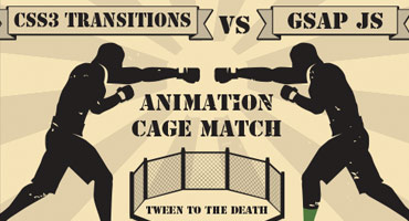 Note: This page was created for GSAP version 2. We have since released GSAP 3 with many improvements. While it is backward compatible with most GSAP 2 features, some parts may need to be updated to work properly. Please see the GSAP 3 release notes for details. Update: don't miss our guest post on css-tricks.com, Myth Busting: CSS Animations vs. JavaScript which provides some additional data, visual examples, and a speed test focused on this topic. Ever since CSS3 "transitions" and "animations" were introduced, they have been widely lauded as the future of animation on the web. It often seems like all the "cool kids" are talking about them. Should you jump on the bandwagon? Is JavaScript animation headed for extinction? How does the new GreenSock Animation Platform (GSAP) fare when it steps into the ring and faces off against the hyped-up tag-team of CSS3 transitions & animations? Does GSAP have the chops to hold its own? Let's find out. Ready...FIGHT! Performance One of the most common arguments in favor of CSS3 animations has been that they're hardware accelerated, thus outperform any JavaScript-based equivalent. The theory is that if you define your transitions/animations directly in css, the browser can worry about all the calculations behind the scenes and tap into hardware and native code to execute them. Sounds awesome. Unfortunately it's not quite that clean. Only certain properties are hardware-accelerated (like 3D transforms and opacity - mostly ones that don't affect document flow) and different browsers handle things differently. Plus every comparison we saw on the web pitted CSS3 transitions against jQuery, but GSAP is up to 20 times faster than jQuery. In our real-world tests, we saw drastic differences in performance among the various browsers and when tested head-to-head against GSAP, CSS3 animations were usually slower! Weird. As expected, however, 3D transforms were indeed faster under heavy stress although in most situations you'd never notice a difference. GSAP is extremely optimized. UPDATE (2015-01-05): There are some interesting (and surprising) performance implications of using CSS animations that aren't widely known. Here's a screencast that shows how Dev Tools doesn't report the overhead involved with CSS animations, some synchronization problems, and how they can drag down the main thread performance more than JS. To see a simple comparison for yourself, select the "Zepto" engine in the speed comparison because it uses CSS3 transitions for its animations, and then compare it to GSAP. Beware that the fps (frames per second) counter in the lower right corner isn't always accurate in some browsers (like recent versions of Safari) when using CSS3 transitions because requestAnimationFrame events [incorrectly] get dispatched even when the screen is clearly not being updated. So the animation may actually be running at a very jerky 10fps, yet 50+ requestAnimationFrame cycles are being triggered by the browser! This exposes another flaw in CSS3 transitions - there's no way to know when updates truly occur. There's only a "complete" event fired at the end of the transition/animation. If anyone knows how to get a more accurate fps counter in Safari while using CSS3 transitions, please let us know. Another performance issue to note in the speed comparison is the clumping that occurs with many engines (including Zepto) under heavy stress, where the stars begin pulsing out in rings instead of a nicely dispersed field. Even though GSAP was faster than CSS3 transitions in the majority of our real-world tests, it's still true that 3D transforms and opacity tweens are faster with CSS3 transitions and it's possible that browsers will be able to further tap into hardware acceleration in the future, so we'll call this round a tie. Feel free to build your own tests to see how things compare in your workflow. Performance winner: TIE Controls This is one of the major weak spots for CSS transitions (its "glass jaw" of sorts). Let's say you invest the time in writing a bunch of css for a whiz-bang animation and then you need to control the whole thing - good luck with that. It is virtually impossible. GSAP's object oriented architecture allows you to pause, resume, reverse, restart, or seek to any spot in any tween. Even adjust timeScale on the fly for slow motion or fastforward effects. Place tweens in a timeline with precise scheduling (including overlaps or gaps) and then control the whole thing just like it's a single tween. All of the easing and effects remain perfectly intact as you reverse, adjust timeScale, etc. (with CSS transitions, easing flip-flops upon reverse). You can even kill individual portions of a tween anytime (like if a tween is controlling both "top" and "left" properties, you can kill "left" while "top" continues). Put labels in a timeline to mark important spots and seek() to them anytime. Imagine trying to build the example below using CSS transitions. It would be virtually impossible. With GSAP, it's easy. In fact, all of the animation is done with 2 lines of code. Drag the scrubber, click the buttons below, and see how easy it is to control the sequenced animation. Controls winner: GSAP Tweenable Properties Both competitors can animate transforms (2D and 3D), colors, borderRadius, boxShadow, and pretty much every important property, but there's one key shortcoming of CSS - you cannot animate individual transforms distinctly! For example, try rotating an object and then halfway through that animation, start scaling it with a different ease and finish at a different time. Since all transforms (scaleX, scaleY, rotation, rotationX, rotationY, skewX, skewY, x, y, and z) are all mashed into one "transform" property, it's virtually impossible to handle them distinctly. GSAP not only works around this limitation, but it also allows you to do advanced things like animate along Bezier paths or do momentum-based motion (with ThrowPropsPlugin) or relative tweens or animate the scroll position or do directional rotation or physics-based motion, etc. Plus GSAP can animate any numeric property of any object, not just DOM elements. Do you really want to use one toolset (CSS) for animating DOM elements and then have to switch to a completely different toolset and syntax when you do canvas-based animation? GSAP handles both consistently. CSS transitions and animations just can't compete here. Tweenable properties winner: GSAP Workflow When you're creating fun and interesting animations, workflow is critical. You need to be able to quickly build sequences, stagger start times, overlap tweens, experiment with eases, leverage various callbacks and labels, and create concise code. It would be great to modularize your code by creating functions that each spit back an animation object (tween or timeline) which can be inserted into another timeline at a precise time. You need a flexible, powerful system that lets you experiment without wasting hours. GSAP wipes the floor with CSS transitions in this round. Anyone who has attempted an ambitious project with CSS3 transitions/animations will attest to the fact that they tend to get very cumbersome and verbose. Experimenting with timing and fine-tuning details can get extremely tedious especially when dealing with all the browser prefixes. GSAP CSS3 transitions = supported = unsupported Flexible object-oriented architecture that allows animations to be nested inside other animations as deeply as you want Supported Unsupported Concise code that doesn't require vendor prefixes Supported Unsupported Create sequences (even with overlapping animations) that auto-adjust as you insert/remove/change intermediate pieces of animation (makes experimenting MUCH easier) Supported Unsupported Accommodate virtually any ease including Bounce, Elastic, SlowMo, RoughEase, SteppedEase, etc. Supported Unsupported Animate things into place (backwards) with convenience methods like from() and staggerFrom() Supported Unsupported Callbacks for when an animation starts, updates, completes, repeats, and finishes reversing, plus optionally pass any number of parameters to those callbacks Supported Unsupported Place labels at specific times in a sequence so that you can seek() there (and/or insert animations there) Supported Unsupported Animate any numeric property of any JavaScript object, not just DOM elements (great for canvas-based animation). Supported Unsupported Workflow winner: GSAP Compatibility CSS transitions simply don't work in older browsers, even Internet Explorer 9. GSAP works in all browsers (although some particular features may be disabled, like 3D transforms in IE8). Once again, this round was no contest. GSAP can even do 2D transforms like rotation, scaleX, scaleY, x, y, skewX, and skewY all the way back to IE6 including transformOrigin functionality! Plus it works around scores of other browser issues so that you can focus on the important stuff. Safari's 3D transformOrigin bug? No problem. Firefox's flashing 3D elements bug? No worries. Inconsistency in IE's backgroundPosition values? GSAP has you covered. Vendor prefixes? Nah, GSAP adds 'em for you when necessary. Compatibility winner: GSAP Popularity CSS3 transitions have been talked about (and used) for years all over the web whereas GSAP is relatively new. It can't match CSS3 transitions' popularity. As clients start pushing for more aggressive animations and HTML5 games proliferate and operating systems become very JavaScript-friendly, the balance may very well shift quickly. For now, though, this round goes squarely to CSS transitions. Popularity winner: CSS3 transitions Conflict management What happens if a particular set of properties (like "left" and "top") are animating and then you need to redirect one of those to a different value (like "left" to 100px instead of 300px) using a different ease and duration? With CSS transitions, it's a very complex process. With GSAP, it's simple and automatic. In fact, there are several overwrite modes you can choose from. Conflict management winner: GSAP Support There are numerous places on the web where you can ask the community your CSS transitions-related questions, but GSAP has dedicated support forums where there's rarely a question that remains unanswered for more than 24 hours. GreenSock's forums are manned by paid staff (including the author of the platform), so you're quite likely to get solid answers there. Add to that the fact that GreenSock has a track record of being much more agile in terms of squashing bugs and releasing updates than browsers do for CSS3 transitions, so GSAP gets the upper hand here. Support winner: GSAP Expandability GSAP employs a plugin architecture, making it relatively easy to add features and custom animation properties but CSS transitions have no such equivalent. You're stuck with what the browsers decide to offer. In addition to CSSPlugin, GSAP already has plugins like ScrollToPlugin for scrolling to specific window or div scroll positions, BezierPlugin for animating along Bezier curves, ThrowPropsPlugin for momentum-based motion, and RaphaelPlugin, EaselPlugin, and KineticPlugin for those libraries (Raphael, EaselJS, and KineticJS). Plus there are physics-based plugins like Phyics2DPlugin and PhysicsPropsPlugin as well as a fun ScrambleTextPlugin for Club GreenSock members. More plugins are on their way, and you can create your own too. Expandability winner: GSAP Learning resources Again, the popularity of CSS3 transitions trumps anything GSAP could throw at it right now. There are lots of tutorials, videos, and articles about CSS3 transitions whereas GSAP is new to the game. GreenSock is being aggressive about putting together solid resources (like the Jump Start tour) and the community is crankin' out some great articles and videos too, but CSS3 transitions score the win in this round. Learning resources winner: CSS3 TRANSITIONS Price & license Both CSS3 transitions and GSAP are completely free for almost every type of usage. GSAP allows you to edit the raw source code to fix bugs (if that's something you need to do), but there's no way to edit the source code that drives CSS3 transitions. Then again, there's no special license required to use them either. If you plan to use GSAP in a product/app/site/game for which a fee is collected from multiple customers, you need the commercial license that comes with "Business Green" Club GreenSock memberships (one-off commercial projects don't require the special license). It's actually a more business-friendly license in many ways than a typical open source license that offers no warranties or backing of any kind or imposes code sharing or credit requirements. GreenSock's licensing model provides a small funding mechanism that benefits the entire user base because it empowers continued innovation and support, keeping it free for the vast majority of users. See the licensing page for details. Although there are some clear benefits of GreenSock's model, we'll give this round to CSS3 transitions because using them is technically "free" in more scenarios than GSAP. Price & license winner: CSS3 TRANSITIONS File size This is a tricky round indeed because GSAP requires inclusion of at least 1 JavaScript file whereas CSS3 transitions leverage native code in the browser, but the code you'd have to write to accomplish the same thing in CSS3 animations or transitions is often far more verbose, offsetting the kb savings. For example, let's take a relatively simple sequenced animation (see codepen or jsfiddle? GSAP code: var tl = new TimelineLite(); tl.staggerFrom('.box', 0.5, {opacity:0, scale:0, rotation:-180}, 0.3) .staggerTo('.box', 0.3, {scale:0.8}, 0.3, 0.7); This type of thing is impossible with CSS3 transitions, but it can be done with CSS3 animations as long as we give each element its own class name or ID. Let's take a look at the CSS code (see codepen or jsfiddle? Equivalent CSS3 Animation: .animated { -webkit-animation-fill-mode: both; -moz-animation-fill-mode: both; animation-fill-mode: both; -webkit-animation-duration: 1s; -moz-animation-duration: 1s; animation-duration: 1s; } @-webkit-keyframes introAnimation { 0% { -webkit-transform: scale(0) rotate(-180deg) ; opacity: 0; } 50% { -webkit-transform: scale(1) rotate(0deg) ; opacity: 1; } 70% { -webkit-transform: scale(1) rotate(0deg); } 100% { -webkit-transform: scale(0.8) rotate(0deg); } } @-moz-keyframes introAnimation { 0% { -moz-transform: scale(0) rotate(-180deg); opacity: 0; } 50% { -moz-transform: scale(1) rotate(0deg); opacity: 1; } 70%{ -moz-transform: scale(1) rotate(0deg); } 100% { -moz-transform: scale(0.8) rotate(0deg); } } @keyframes introAnimation { 00% { transform: scale(0) rotate(-180deg); opacity: 0; } 50% { transform: scale(1) rotate(0deg); opacity: 1; } 70%{ transform: scale(1) rotate(0deg); } 100% { transform: scale(0.8) rotate(0deg); } } .introAnimation { -webkit-backface-visibility: visible !important; -webkit-animation-name: introAnimation; -moz-backface-visibility: visible !important; -moz-animation-name: introAnimation; backface-visibility: visible !important; animation-name: introAnimation; } .two { -webkit-animation-delay: 0.3s; -moz-animation-delay: 0.3s; animation-delay: 0.3s; } .three { -webkit-animation-delay: 0.6s; -moz-animation-delay: 0.6s; animation-delay: 0.6s; } .four { -webkit-animation-delay: 0.9s; -moz-animation-delay: 0.9s; animation-delay: 0.9s; } .five { -webkit-animation-delay: 1.2s; -moz-animation-delay: 1.2s; animation-delay: 1.2s; } .six { -webkit-animation-delay: 1.5s; -moz-animation-delay: 1.5s; animation-delay: 1.5s; } .seven { -webkit-animation-delay: 1.8s; -moz-animation-delay: 1.8s; animation-delay: 1.8s; } .eight { -webkit-animation-delay: 2.1s; -moz-animation-delay: 2.1s; animation-delay: 2.1s; } .nine { -webkit-animation-delay: 2.4s; -moz-animation-delay: 2.4s; animation-delay: 2.4s; } As you can see, the CSS3 code is more than 10 times longer! And what if you want to have the entire sequence repeat 3 times? Good luck with that in CSS - you can set an animation-iteration-count but it only applies to each individual element, so it doesn't give us the effect we're after. And what if you want to experiment with the easing or offsets/delays or rotational values? It is quite cumbersome to say the least, even if you use sass or something like that. With GSAP, it's simple. If you only need very simple animations/transitions, CSS3 would deliver smaller file sizes, but once you start getting more aggressive and expressive with your animations, the scales shift quickly and GSAP becomes more economical. The other thing to keep in mind is that GSAP's JS file(s) are typically cached by the browser, so the savings page-to-page is much larger since the code you write on each page is far more concise. In other words, think of how much js/css the browser must actually request from the server over the course of your users' multi-page visit to your site. File size winner: TIE Flexibility Let's face it: basic tweening is pretty straightforward for any system, but it's really the details and advanced features that make a robust platform shine. GSAP crushes CSS3 transitions and animations when it comes to delivering a refined, professional-grade tool set that's truly flexible. Here are just a few of the conveniences baked into GSAP: Tween any numeric property of any object. Optionally round values to the nearest integer to make sure they're always landing on whole pixels/values. Animate along Bezier curves, even rotating along with the path or plotting a smoothly curved Bezier through a set of points you provide (including 3D!). GSAP's Bezier system is super flexible in that it's not just for x/y/z coordinates - it can handle ANY set of properties. Plus it will automatically adjust the movement so that it's correctly proportioned the entire way, avoiding a common problem that plagues Bezier animation systems. You can define Bezier data as Cubic or Quadratic or raw anchor points. Animate any color property of any JavaScript object (not just DOM elements). Define colors in any of the common formats like #F00 or #FF0000 or rgb(255,0,0) or rgba(255,0,0,1) or hsl(30, 50%, 80%) or hsla(30, 50%, 80%, 0.5) or "red". Set a custom fps (frames per second) for the entire engine (the default is 60fps). All tweens are perfectly synchronized (unlike many other tweening engines). Use the modern requestAnimationFrame API to drive refreshes or a standard setTimeout (the default is requestAnimationFrame with a fallback to setTimeout) Tons of easing options including proprietary SlowMo, RoughEase, and SteppedEase along with all the industry standards Animate css style sheet rules themselves with CSSRulePlugin Animate the rotation of an object in a specific direction (clockwise, counter-clockwise, or whichever is shortest) by appending "_cw", "_ccw", and "_short" to the value. You can tween getter/setter methods, not just properties. For example, myObject.getProp() and myObject.setProp() can be tweened like TweenLite.to(myObject, 1, {setProp:10}); and it will automatically recognize that it's a method and call getProp() to get the current value when the tween starts. Same for jQuery-style getters/setters that use a shared method like myObject.prop(). You can even tween another tween or timeline! For example, TweenLite.to(otherTween, 1, {timeScale:0.5}) would animate otherTween.timeScale to 0.5 over the course of 1 second. You can even scrub the virtual playhead of one tween/timeine with another tween by animating its "time". Flexibility winner: GSAP Conclusion Despite the hype surrounding CSS3 transitions and animations, they just aren't well-suited for professional-grade animation tasks. They did manage to win a few rounds in this match but ultimately GSAP man-handled them, sending them running from the ring like scared sissies. Of course we're slightly biased, but check out the facts for yourself. Kick the tires. Audition GSAP on your next project. See how it feels once you get past the initial learning curve. If you only need simple fades or very basic animation in modern browsers, CSS3 transitions are probably just fine. However, what happens when your client wants to do something more expressive? What if browser compatibility becomes an issue? Why not build on a solid foundation to begin with so that you don't find yourself having to rewrite all your animation code? If you want professional-grade scripted animation, look no further. To get started fast, check out our Jump Start tour. Recommended reading: Main GSAP JS page Why GSAP? A practical guide for developers Jump Start: GSAP JS jQuery vs GSAP: cage match 3D Transforms & More CSS3 Goodies Arrive in GSAP JS Speed comparison Explanation of CSS3 transitions, transforms and animations P.S. A rant about where animation logic belongs: We can't put this post to bed without mentioning a beef we've got with the whole concept of putting all your animation logic in css. Ever since the <blink> tag, there has been this tendency for browser vendors to offer developers these nifty "conveniences" that end up encouraging them to mix markup and/or style rules with behavioral logic. Is that really a good idea? One of the wonderful things about the modern web is that we've got this lovely separation between markup, presentation/styling, and behavioral logic (at least that's the goal). Should we be blurring the line like this? Isn't JavaScript the logic layer that should be handling state changes, application logic, reaction to user interaction (which often includes animation), etc.? Some may claim "But putting animation in css is great because that way if the user has JavaScript disabled, the animations still work!" Do you really think users of the modern web can turn off JavaScript and expect to browse the web with great results? Is that who you're targeting for a rich experience? And if they turned off JavaScript, might they have done so specifically to avoid annoying animations? Is it really helping to shift animation logic into css where they can't turn it off? In the web of yesteryear, animations were quite simplistic; fade this, slide that. Done. Anything more aggressive was relegated to a plugin like Flash which afforded incredible richness and complexity in terms of animation. But today, clients want that sort of expressiveness directly in the browser. It needs to work on mobile devices. It's no longer about simple fade-ins or sliding an image across the screen. CSS3 transitions fit the old mentality well, but not the new one. CSS3 animations technically provide more flexibility but they fall miserably short and they still force behavioral logic into the style layer. And to use them effectively, we still need JavaScript to at least swap classes and trigger things. From a development and debugging standpoint, when I apply a class to an element how would I know if that will trigger an animation or transition or neither? Should I have to keep bouncing back and forth between css and JS to manage behavioral logic related to animations? Maybe we're just ill-informed and there are some fantastic reasons for putting behavioral logic like animation into the css layer, but one thing seems pretty clear: the current way that developers have to build all but the simplest css animation leaves a LOT to be desired. The API is terribly limiting and clunky. Let's move the web forward. Let's make animation fun and flexible. Let's keep behavioral logic and style rules distinct. Let's leverage the incredible flexibility of JavaScript. If we've misrepresented anything here or if you want to weigh in with your opinion about where behavioral logic like animation belongs, feel free to post your comment below. If you're someone who has attempted an aggressive animation task with CSS3 transitions/animations as well as GSAP, we'd love to hear how you felt they compared.
 -
 Note: This page was created for GSAP version 2. We have since released GSAP 3 with many improvements. While it is backward compatible with most GSAP 2 features, some parts may need to be updated to work properly. We encourage you to use the updated "Getting Started" page . The GreenSock Animation Platform (GSAP) animates anything JavaScript can touch (CSS properties, SVG, React, canvas, generic objects, whatever) and solves countless browser inconsistencies, all with blazing speed (up to 20x faster than jQuery). See "Why GSAP?" to learn why it's used by over 8,000,000 sites and every major brand. Hang in there through the learning curve and you'll discover how addictive animating with code can be. We promise it's worth your time. Quick links Loading GSAP Tweening Basics CSSPlugin 2D and 3D transforms Easing Callbacks Sequencing with Timelines Timeline control Getter / Setter methods Club GreenSock We'll cover the most popular features here but keep the GSAP docs handy for all the details. First, let's talk about what GSAP actually does... GSAP as a property manipulator Animation ultimately boils down to changing property values many times per second, making something appear to move, fade, spin, etc. GSAP snags a starting value, an ending value and then interpolates between them 60 times per second. For example, changing the x coordinate of an object from 0 to 1000 over the course of 1 second makes it move quickly to the right. Gradually changing opacity from 1 to 0 makes an element fade out. Your job as an animator is to decide which properties to change, how quickly, and the motion's "style" (known as easing - we'll get to that later). To be technically accurate we could have named GSAP the "GreenSock Property Manipulator" (GSPM) but that doesn't have the same ring. DOM, SVG, <canvas>, and beyond GSAP doesn't have a pre-defined list of properties it can handle. It's super flexible, adjusting to almost anything you throw at it. GSAP can animate all of the following: CSS: 2D and 3D transforms, colors, width, opacity, border-radius, margin, and almost every CSS value (with the help of CSSPlugin). SVG attributes: viewBox, width, height, fill, stroke, cx, r, opacity, etc. Plugins like MorphSVG and DrawSVG can be used for advanced effects. Any numeric value For example, an object that gets rendered to an HTML5 <canvas>. Animate the camera position in a 3D scene or filter values. GSAP is often used with Three.js and Pixi.js. Once you learn the basic syntax you'll be able to use GSAP anywhere JavaScript runs. This guide will focus on the most popular use case: animating CSS properties of DOM elements. (Note: if you're using React, read this too.) If you're using any of the following frameworks, these articles may help: React Vue Angular What's GSAP Exactly? GSAP is a suite of tools for scripted animation. It includes: TweenLite - the lightweight core of the engine which animates any property of any object. It can be expanded using optional plugins. TweenMax - the most feature-packed (and popular) tool in the arsenal. For convenience and loading efficiency, it includes TweenLite, TimelineLite, TimelineMax, CSSPlugin, AttrPlugin, RoundPropsPlugin, BezierPlugin, and EasePack (all in one file). TimelineLite & TimelineMax - sequencing tools that act as containers for tweens, making it simple to control entire groups and precisely manage relative timing (more on this later). Extras like easing tools, plugins, utilities like Draggable, and more Loading GSAP CDN The simplest way to load GSAP is from the CDN with a <script> tag. TweenMax (and all publicly available GSAP files) are hosted on Cloudfare's super-fast and reliable cdnjs.com. <script src="https://cdnjs.cloudflare.com/ajax/libs/gsap/2.1.3/TweenMax.min.js"></script> Banner Ad CDNs Every major ad network excludes GSAP from file size limits when you load it from their CDN! Contact your ad network for their URLs. For example, Google hosts TweenMax at: //AdWords and DoubleClick ads only "https://s0.2mdn.net/ads/studio/cached_libs/tweenmax_2.1.2_min.js" NPM npm install gsap See the NPM Usage page in the docs for a full guide including how to import things (ES modules or UMD format), tree shaking, Webpack, how to get bonus plugins into a build system, etc. Downloading GSAP Download a zip directly from our home page or your account dashboard. If you're logged in as a Club GreenSock member this zip will include your bonus plugins. GitHub View the source code on GitHub. Tweening Basics Let's start with TweenMax, GSAP's most popular tool. We'll use CodePen demos so that you can easily fork and edit each example right in your browser. TweenMax.to() To create an animation, TweenMax.to() needs 3 things: target - the object you are animating. This can be a raw object, an array of objects, or selector text like ".myClass". duration (in seconds) vars - an object with property/value pairs that you're animating to (like opacity:0.5, rotation:45, etc.) and other optional special properties like onComplete. For example, to move an element with an id of "logo" to an x position of 100 (same as transform: translateX(100px)) over the course of 1 second: TweenMax.to("#logo", 1, {x:100}); Note: Remember that GSAP isn't just for DOM elements, so you could even animate custom properties of a raw object like this: var obj = {prop:10}; TweenMax.to(obj, 1, { prop:200, //onUpdate fires each time the tween updates; we'll explain callbacks later. onUpdate:function() { console.log(obj.prop); //logs the value on each update. } }); Demo: TweenMax.to() Basic Usage See the Pen TweenMax.to() Basic Usage by GreenSock (@GreenSock) on CodePen. If you would like to edit the code and experiment with your own properties and values, just hit the Edit on CodePen button. Notice that the opacity, scale, rotation and x values are all being animated in the demo above but DOM elements don't actually have those properties! In other words, there's no such thing as element.scale or element.opacity. How'd that work then? It's the magic of CSSPlugin. Before we talk about that, let's explain how plugins work in general. Plugins Think of plugins like special properties that get dynamically added to GSAP in order to inject extra abilities. This keeps the core engine small and efficient, yet allows for unlimited expansion. Each plugin is associated with a specific property name. Among the most popular plugins are: CSSPlugin*: animates CSS values AttrPlugin*: animates attributes of DOM nodes including SVG BezierPlugin*: animates along a curved Bezier path MorphSVGPlugin: smooth morphing of complex SVG paths DrawSVGPlugin: animates the length and position of SVG strokes *loaded with TweenMax CSSPlugin In the previous example, CSSPlugin automatically noticed that the target is a DOM element, so it intercepted the values and did some extra work behind the scenes, applying them as inline styles (element.style.transform and element.style.opacity in that case). Be sure to watch the "Getting Started" video at the top of this article to see it in action. CSSPlugin Features: normalizes behavior across browsers and works around various browser bugs and inconsistencies optimizes performance by auto-layerizing, caching transform components, preventing layout thrashing, etc. controls 2D and 3D transform components (x, y, rotation, scaleX, scaleY, skewX, etc.) independently (eliminating order-of-operation woes) reads computed values so you don't have to manually define starting values animates complex values like borderRadius:"50% 50%" and boxShadow:"0px 0px 20px 20px red" applies vendor-specific prefixes (-moz-, -ms-, -webkit-, etc.) when necessary animates CSS Variables handles color interpolation (rgb, rgba, hsl, hsla, hex) normalizes behavior between SVG and DOM elements (particularly useful with transforms) ...and lots more Basically, CSSPlugin saves you a ton of headaches. Because animating CSS properties is so common, GSAP automatically senses when the target is a DOM element and adds a css:{} wrapper. So internally, for example, {x:100, opacity:0.5, onComplete:myFunc} becomes {css:{x:100, opacity:0.5}, onComplete:myFunc}. That way, CSS-related values get routed to the plugin properly and you don't have to do any extra typing. You're welcome. ? To understand the advanced capabilities of the CSSPlugin read the full CSSPlugin documentation. 2D and 3D transforms CSSPlugin recognizes a number of short codes for transform-related properties: GSAP CSS x: 100 transform: translateX(100px) y: 100 transform: translateY(100px) rotation: 360 transform: rotate(360deg) rotationX: 360 transform: rotateX(360deg) rotationY: 360 transform: rotateY(360deg) skewX: 45 transform: skewX(45deg) skewY: 45 transform: skewY(45deg) scale: 2 transform: scale(2, 2) scaleX: 2 transform: scaleX(2) scaleY: 2 transform: scaleY(2) xPercent: 50 transform: translateX(50%) yPercent: 50 transform: translateY(50%) GSAP can animate any "transform" value but we strongly recommend using the shortcuts above because they're faster and more accurate (GSAP can skip parsing computed matrix values which are inherently ambiguous for rotational values beyond 180 degrees). The other major convenience GSAP affords is independent control of each component while delivering a consistent order-of-operation. Performance note: it's much easier for browsers to update x and y (transforms) rather than top and left which affect document flow. So to move something, we recommend animating x and y. Demo: Multiple 2D and 3D transforms See the Pen Multiple 2D and 3D Transforms by GreenSock (@GreenSock) on CodePen. Additional CSSPlugin notes Be sure to camelCase all hyphenated properties. font-size should be fontSize, background-color should be backgroundColor. When animating positional properties such as left and top, its imperative that the elements you are trying to move also have a css position value of absolute, relative or fixed. vw/vh units aren't currently supported natively, but it's pretty easy to mimic using some JS like x: window.innerWidth * (50 / 100) where 50 is the vw. Just ask in the forums for some help. from() tweens Sometimes it's amazingly convenient to set up your elements where they should end up (after an intro animation, for example) and then animate from other values. That's exactly what TweenMax.from() is for. For example, perhaps your "#logo" element currently has its natural x position at 0 and you create the following tween: TweenMax.from("#logo", 1, {x:100}); The #logo will immediately jump to an x of 100 and animate to an x of 0 (or whatever it was when the tween started). In other words, it's animating FROM the values you provide to whatever they currently are. Demo: TweenMax.from() with multiple properties See the Pen TweenMax.from() tween by GreenSock (@GreenSock) on CodePen. There is also a fromTo() method that allows you to define the starting values and the ending values: //tweens from width 0 to 100 and height 0 to 200 TweenMax.fromTo("#logo", 1.5, {width:0, height:0}, {width:100, height:200}); Special properties (like onComplete) A special property is like a reserved keyword that GSAP handles differently than a normal (animated) property. Special properties are used to define callbacks, delays, easing and more. A basic example of a special property is delay: TweenMax.to("#logo", 1, {x:100, delay:3}); This animation will have a 3-second delay before starting. Other common special properties are: onComplete - a callback that should be triggered when the animation finishes. onUpdate - a callback that should be triggered every time the animation updates/renders ease - the ease that should be used (like Power2.easeInOut) Easing If your animation had a voice, what would it sound like? Should it look playful? Robotic? Slick? Realistic? To become an animation rock star, you must develop a keen sense of easing because it determines the style of movement between point A and point B. The video below illustrates the basics. An "ease" controls the rate of change during a tween. Below is an interactive tool that allows you to visually explore various eases. Note: you can click on the underlined parts of the code at the bottom to change things.
 -
 Hello There , Swedish London based Rich Media Banner Developer & Designer, with over a decade of experience of building banners for a wide range of clients. Canvas or no canvas? No problem. Greensock or Pixie? Can do. Story-boarding needed? Yes. Video? You bet! Interactive Javascript or image slider? Consider it done! Can work over Zeplin or WeTransfer, whatever you prefer. A codepen sample of my work: https://codepen.io/ThomasJames/pen/RXQrzp Some of the companies I worked with: WWF, Wunderman Ogilvy Gamesys, TBWA\Copenhagen, MRM Meteorite, McCann, The Two Marias, NKD Learning, DOOH, York Press, TAG Worldwide Ad banner platforms I work with: Google Studio, Google Campaign Manager, Flashtalking, Celtra, Sizmek, Adform, Admeto, +Yours (Send me the specs!) Contact me at hello@thomasthorstensson.co.uk for more samples of recent work and a discussion of what you need done!
-
- 1
-

-
- javascript
- pixie
- (and 11 more)
-
Hello folks, For a school project I am creating an analog clock and animating it using GSAP. For now, I've got it moving in the way I want, but part of the functionality of a clock is that it actually shows the current time. So my hence my question, how do I get the arms to show the current hours, minutes and seconds?
-
So for a school product I really want to recreate something like this, but the example here is using jQuery. One of the conditions of the challenge was to use the GSAP libraries, so jQuery is not allowed. Is there an easy way to make this kind of clock using GSAP? Is there fast way to replace jQuery with GSAP withing my js files? I'm a beginner so all the tips are welcome!
-
Hello, I am having a problem in creating a hover dropdown using GSAP animations to stagger in links after the container fades and drops in. After the user hovers off, it does another timeline in reverse. However, if a user were to go back and forth too quickly there are partial or full loops of the animations over and over depending on the swipes across the trigger. I am wondering if there is a way GSAP knows and animations are playing and will not allow another set to run if another is playing. Something along the lines of if tl starts and the user hovers off then it finish before starting timeLine's animation...? Thanks in Advance!


