Search the Community
Showing results for tags '3d'.
Found 67 results
-
Hi everybody, I used to work with Greensock API inside Flash (swf), Edge Animate, and, now, in Hype Pro since Edge has been abandonned by Adobe this year. I try to extend Hype features with a GSAP Tweenmax API. But, I cannot obtain 3D real perspective with imbricated symbols. I could get this inside Edge. Why is there a problem with Hype Pro ? I send you the Hype pro file to check it. Thanks for your help. I wrote this code : CSSPlugin.defaultTransformPerspective=700; var wall = document.getElementById("wall"); TweenMax.set(wall,{rotationY:45, transformPerspective:200, transformStyle:"preserve-3d", force3D:true}); TweenMax.to(wall,4,{rotationX:180}); TweenMax.to(".square",4,{rotationY:720}); imbrication3D.hype.zip
-
-

-
Please, could You explain me why the rotationX params doesn't fit like rotationY & rotationZ in my 3D cube test?
-
Hello, how do i change an effect when scrolling to next slide? I was trying to find some effect options in this codepen - http://codepen.io/bassta/pen/kDvmC but I didnt succeed. For example something similiar to this - http://www.bistroagency.cz/ They use some transitions between each slide, It kinda looks 3d. Thank you!
-
Having trouble understanding 3D transformations. I took a look at this page: https://greensock.com/css3/, but while they provide great demos, the code isn't shown so I can analyze and learn from it. In my pen demo ( ), I'm struggling to understand why my transforms do not animate smoothly to a 90 degree rotationY. When the animation starts it jumps and then animates the rest of the way...of course not the intended effect. Any assistance is appreciated. UPDATE: Ok, so I figured out I guess the parent container needed a perspective set. Now they animate smoothly, but at 90 degrees I'd expect them to disappear and I can still see them on an angle?
-
I'm trying to make a simple cube made from 6 divs for the faces and a div to contain it. Seems to work ok at first, but when I apply a tween to the container div it flattens the contents rather than applying transforms to the faces individually. It's hard to explain but you can see what's going on in the codepen here: http://codepen.io/insomniagfx/pen/PqWPRZ/ Is this approach viable, or do I need to rotate all six sides independently to get the effect I'm going for?
-
Since that draggable could be used to drag and rotate one element in 2d platform, I'm wondering that is it possible to control the element to rotate in 3d? I've found that there's a codepen http://codepen.io/MAW/pen/doPLME showing how to make one element both draggable and rotatable in 2d, but I can't find any way to expend this method to 3d rotation. I know that I can setup two sliders to control X rotation angle and Y rotation angle, but what I want most is some sort of "control point" to make the 3d rotation happen. Could you please give me some advices? Thanks!
-
Hi everyone! Pretty simple question here, is there any way to tween a transform-rotate more then 360º. For anyone not super familiar with 3d transforms: Simply put, the limitations of matrix3d means you cant rotate more then 360º by passing values more then 1 or less then -1. Because of this you need to loop from states -1 to 1 if you wish to rotate multiple times. Is there any built in functionality for this? or is there an easy way to loop through the transform rotation? Thanks, Daniel Example of the 360º transforms I have been using: var tiltX = function(x){ return "matrix3d(1,0,0,0" + ",0,"+ Math.cos(x) +","+ -Math.sin(x) + ",0" + ",0," + Math.sin(x) +","+ Math.cos(x) +",0," + "0,0,0,1)"; }; TweenLite.fromTo($(".subdiv"),2, {css:{transform: tiltX(3.1415)}} , {css:{transform: tiltX(-3.14159)}} ); OR TweenLite.fromTo($(".subdiv"),2, {css:{transform:"rotateX(-179.99deg)"}} , {css:{transform:"rotateX(180deg)"}});
-
Hi, Have very strange behaviour that is not working only in Google Chrome but works in Firefox. I need to make it work in Chrome, can you help me with a hint? I have a cube with only side pages (without top and bottom) - so I have 4 pages and I rotate them for 90 degrees left and right. Here is the the LIVE example (everything is in a page - libraries are taken from CDN, CSS is inline, no images): http://www.cloomo.com/problem How to simulate the error: Start Google Chrome and go to http://www.cloomo.com/problem Go to the Page 3 (it has green background) and you will see that links "Back 2" and "Page 4" are not working and their text can not even beselected with a mouse. You can come to Page 3 by clicking on "Page 2" > "Page 3" or "Left" > "Left" Can you help me to make these links clickable? Is there an error in CSS styles or in GreeSock library? I can not find it. Another question: Is it possible to make it more smooth? Thanks Alex
-
https://dl.dropboxusercontent.com/u/34687130/work/kynan/tiles/index.html On Safari (or iOS Safari) notice how one tile is over the top of another when it shouldn't be. When I disable perspective, this issue does not occur. I have tried changing the zindex at the correct place, as well as the Z 3D property. Nothing seems to work. Is this a known issue? Thanks.
-
I cant for the life of me get a simple 3d rotation working in iOS Safari right now. It works from the Codepen for me, but not with all the same code in a simple html file (attached). This tells me I am probably doing something dumb. But basically it works correctly from desktop, but from my phone the rotated div disappears as it rotates. Please help. http://codepen.io/anon/pen/raYMwR index.html
-
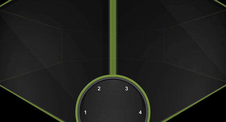 Note: This page was created for GSAP version 2. We have since released GSAP 3 with many improvements. While it is backward compatible with most GSAP 2 features, some parts may need to be updated to work properly. Please see the GSAP 3 release notes for details. The following is a guest post by Chris Gannon. Chris is the leading authority on using GSAP with Edge Animate. A veteran of the Flash world, Chris has been applying his animation and design skills to many cutting-edge HTML5 projects. We asked Chris to explain to our audience some of the techniques that he uses in his client work and top-selling components on CodeCanyon.net. The concepts he describes have many practical applications and can serve to radically transform how you approach complex projects. Be sure to explore the demos and study the source code. This is not intended to be a step-by-step tutorial. .wide .content p { font-size:20px; } I love 3D stuff and I'm always trying out interesting ways to add depth to my projects. In this article I'll talk about how the CubeDial below was made, the concepts surrounding its underlying mechanism and how some of the solutions I employ overcome some common issues. Ok, so let's get going. Explore the CubeDial demo In the demo below, spin the dial. Notice that spinning the dial spins the cube. You can also swipe the cube and the dial will spin. Both the cube and the dial spin using momentum-based physics. If you are really clever, you may notice that the cube isn't really a cube, as it has 6 front-facing sides. See the Pen Gannon - Cube / Dial by GreenSock (@GreenSock) on CodePen. What's it using under the hood? The core functionality is handled by the GreenSock Animation Platform (GSAP). I always load TweenMax because it includes all the things I need in one script load: TweenLite, CSSPlugin, EasePack, timeline sequencing tools, etc. I use TweenMax all over the place not only to immediately set CSS properties (using TweenMax.set() but also to delay the setting of them, to tween them, and to trigger events not only when they start or stop but crucially whilst they're animating too. Next up is Draggable - a very useful and flexible utility that I use in practically all of my projects now as most UIs need something dragged or moved. Finally we add in ThrowPropsPlugin (and couple it up to Draggable) for that flick/throw/physics/inertia that we have all become so used to on our mobile devices. So the three main GreenSock tools I will be using are: Draggable, TweenMax and ThrowPropsPlugin. The Cube's Structure A lot of you reading this will be visually led developers so below is a diagram of what's going on with the cube (ok it's a hexahedron I think as it has 6 sides). Each face of the 3D object is a <div> with a background image. Each <div> has its Z transformOrigin point set a fair bit away from the actual face (behind it) so that when its rotationY is animated it pivots left to right in perspective. This diagram illustrates the 6 faces - their transformOrigin X and Y are simply set to the middle of the faces (50% 50%) but the crucial part is the transformOrigin Z position which is -200px. In the actual code I dynamically work out what that distance should be based on the number of faces but to keep the diagram simple, I use -200px. The dotted center is that value (-200px) and once that's set each face will appear to swing around a point 200px behind itself when you tween its rotationY. By spinning each face around the same point, we achieve the illusion of the entire cube spinning around its center. To programmatically figure out the rotational offset of each face I use this equation: rotationY: (360/numFaces) * i; What wizardry is used to make a 6-sided object look like a cube? There's a simple answer to this and to demonstrate what's going on I have coded it so that all the faces become slightly transparent when you drag the cube. Try dragging and then holding it halfway through a drag - you'll see the other faces are distorted behind (see sceenshot on left). That's because the transformPerspective on each face is set fairly low (meaning exaggerated) in order to 'bend' the other faces behind. I've also added a slider to help illustrate this in the demo at the top of the page. As you drag the slider, the faces' transformPerspective is set higher and higher to the point where if the slider is fully to the right the perspective is so flat that the cube looks more like an infinite slide show. Try dragging it halfway then spinning the dial or the cube. Creating the dial In simple terms, the dial is just a png with some divs with some numbers in them. I do a little loop based on the number of sides in the cube to generate those divs and position them over the dial image. To make the dial "spin-able" literally takes one line of code using GSAP's Draggable. myDialDraggable = Draggable.create(dial, { type:'rotation', throwProps:true // for momentum-based animation }) That's really all you need to spin something. Amazing. However, the dial I use for this project is a little more advanced. I've isolated some of the dial's code in the demo below. Take note of how the numbers stay vertically oriented as the dial spins. Spin the dial See the Pen Gannon - Dial Only by GreenSock (@GreenSock) on CodePen. Using this method keeps everything in sync and it allows for multiple UI inputs - the null object is always controlled by user interaction and its X position is used to determine the rotation value of the dial (if the cube is dragged) and rotationY value(s) of the faces (if the dial is dragged). You can also use it to work out which face is at the front and because Draggable has the brilliant snap function you can ensure that when you release your drag/throw on either the 3D element or the dial it will always animate the null (and consequently all dependent objects) to a position where a face is flat on. Once it's come to rest you can also fire an onComplete event and have something happen - you might want the active/front face to load an iframe or animate its content. Or maybe you'd like a sound to play or you might want to perform a calculation based on the X position of null. Examples of using onComplete to trigger an animation when the spin is complete can be seen in demos for EdgeRotater and EdgeDial. Interacting with the 3D cube Unlike the simplified 2D demo above, grabbing and throwing the cube is a little more involved. The secret here is that you aren't directly touching the cube at all. In fact it would be literally impossible to effectively drag the cube by a face as the face would eventually disappear in to the distance of 3D space and overlap with other faces. It would be extremely difficult to assess which face receives the touch / mouse input for dragging. To solve this issue a Draggable instance is created that has the null object as its target and uses the <div> that contains the faces of the cube as its trigger. In simple terms this means that any time you click and drag on the div containing the cube it controls the x position of the null object, which in turn sets the rotation of each face of the cube and the rotation of the dial. Its sort of like interacting with a touch screen. There is a piece of glass between you and the UI elements you tap. Where you tap on the screen dictates which UI elements respond to your input. In the CubeDial, the div that contains the cube is like the glass screen of your phone. As you move your finger over the container, the app tracks your motion and applies the new values to the null object. Wrap up Ok that's enough of the complexities - it's hopefully not that complicated when you play around with it and adjust some values and see how things react. And if you're not already familiar with this kind of mechanism, once you've got your head around it you'll probably find you use it everywhere as it can be applied in pretty much all of your interactive projects. So that's all for now - I hope you found some (if not all) of this article interesting and/or informative. Admittedly it introduces the concept of null objects using a fairly complex example but it really doesn't have to be complex (or 3D). The 2D null object demo above might be a great place to start if all of this is pretty new to you as it uses a null object at its most basic level. Dive into the entire source code of the CubeDial Demo. My first draft of this article was peppered with gushing compliments regarding GSAP and I was told to tone it down a bit and maybe leave them until the end. So here it is (it's toned down a bit because I'm quite an excitable person!). GSAP rocks my world and the world of all my clients. If you aren't using it yet you are potentially missing out on one of the best (if not the best) animation platforms for JavaScript/CSS3. Its flexibility, ease of use and performance is light years ahead of anything else and if you're not using it and are curious then I heartily recommend you dive in and see for yourself. Jack has created amazing tools for designers and developers like us and Carl does an extraordinary job of explaining how they work in a simple, relevant and, most importantly, usable way. Happy tweening!
 -
Newbie here. When using transformPerspective + fromTo and setting alpha:0 to alpha:1 tween never happens. But if alpha value is never set or alpha is 1 to 1 everything works just fine . This is only in FF.
-
Hello, I'm trying to create an effect that several boxes that overlap are rotated and then each one expands from the other in a 3D way. The only way I found that does that is by modifying the transformOrigin property. But unfortunately that property does not animate and simply goes into position. Is there a better way to achieve this? (the codepen sample should illustrate the animation that I'm describing) Thanks. Here's the codepen again: http://codepen.io/netgfx/pen/EaKPdP
-
Hello there, As a beginner I'm i went into an issue early and I'm still unable to solve it. Maybe can you help me with it. I'm trying to achieve a card flip effect with my navigation bar, here's a small example of what I try to achieve but I'm unable to make this working. It seems to be a z-index related issue. I really hope you can help me achieving this effect. Kind regards. EDIT /// I tried at one point to achieve this effect with 2 menu div with all my buttons one over the second and it was working fine, but I needed to animate both object directly at the same time, which caused a lot of complicated handling of the animation.
-
I have found some code on SnorkleTV that performed a 3D Flip of a page, and I was trying to use it. But in my use of it the object is being rotated from the left margin, but what I need is for it to be rotated by the x axis center of the object. The following is the code that I am using for the first step in the Flip. var flipSpeed:Number = 0.5; var tl:TimelineMax = new TimelineMax({paused:true}); tl.append(TweenMax.to(currentView, flipSpeed, {rotationY:90, visible:false, ease:Linear.easeNone})) The example given on SnorkleTV was extraordinary. I hope to get it right. Gary
-
Hi guys, At the moment I'm working on a rotator that rotates between 3 tabs with a 3D perspective (middle tab in the front and 2 on the sides that are in the back). It's all working fine on the platforms and browsers I've tried except for Chrome (both Windows and Mac). The problem there is that one of the side tabs is not rendering on the Z axis while if you inspect it in dev tools the overlay shows the tab in the right position. Here is how it is supposed to look: http://puu.sh/bAamR/98bab7014e.png Here is how it actually looks: http://puu.sh/bAaod/da2a27ac77.png And here is a working demo file I've put online: http://lwigchert.nl/test/demo_issue.html It might be an issue with the z-index because when you play around with that the tabs seem to switch. If there is anything else needed that may help, let me know!
-
Has anyone done any work with Greensock 3D transforms to create dynamic perspective shadows with CSS3? I was thinking this morning that it would most likely not be that difficult, but my 3D math/trigonometry skills are somewhat dormant. What I mean is shadows that will fall on a flat horizontal plane ("the ground") behind the object, as at sunset, and will, as the object moves in x and z directions (not y, as that seems complicated). The shadows would respond to a central light point (perhaps the center of the screen) Something like this image — Thanks for any way forward —
-
Hi, I’ve spent the last day building a working rubix cube demo using TweenMax to position and animate the objects accordingly. Draggable is being used to rotate the cube X/Y and throwProps is used too. Firefox is displaying some very odd, back-face type display issues that I can't seem to resolve, can anybody suggest a work-around or fix to correct this problem? IE10 is simply flattening the whole object onto a 2D plane and not allowing any z-depth. The demo will auto rotate 20 times before allowing user interaction by "swiping" a side to rotate it, or dragging the background to rotate in the cube in 3D space. Any help would be gratefully appreciated. View the demo here: http://www.rogueinteractive.net/rogueiOS/rubix.html Pete
-
I am attempting to create more 'depth' in a 3d transform to match a CSS transform I currently use. The current greensock transform renders more as a flat card flip than a cube rotate. I have set up a CodePen sample of both the CSS transform and corresponding GreenSock transform side by side. I'm looking to make the greensock version have the same depth as the css version. I'm thinking I need to get some 'skew' properties involved but I am getting no where. Any ideas? Thanks in advance.. (note: I've only have this pen set up for FF to simplify the code) http://codepen.io/stevenmross/pen/jkwHq
-
I'm using the greensock animation library to animate the translateZ property of an image. This is my code: $("<img />") .attr({ src: piece, class: "pieces" }) .hover(function() { tl.to($(this), 1, {transform:"translateZ(1px)"})}, function() { tl.fromTo($(this), 1, {transform: "translateZ(0px)"}) }) .load(function () { _stageElement.append($(this)); }) } But instead of stopping at 5px it flies completely off the screen. Does anyone know what's happening here and why? Also if it's important after the image flies off the screen, it comes back to its original location, but the hover property doesn't have any effect anymore. I'm not sure if this is a greensock issue or a jquery issue. Here's an example to see what I mean http://richbaird.net/3dFlip/fip.html
-
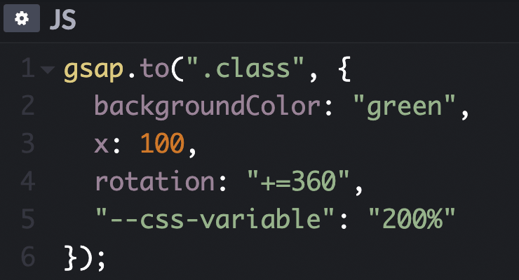 With the help of the CSSPlugin, GSAP can animate almost any CSS-related property of DOM elements including the obvious things like width, height, margin, padding, top, left, and more plus more interesting things like transforms (rotation, scaleX, scaleY, skewX, skewY, x, y, rotationX, and rotationY), colors, opacity, and lots more. Because animating DOM elements in the browser is so common, GSAP automatically checks to see if the target is a DOM element and if it is (and you haven't already defined a "css" object in the vars parameter), the engine creates that css object for you and shifts any properties that aren't reserved (like onComplete, ease, delay, etc. or plugin keywords like scrollTo, morphSVG, pixi, etc.) into that css object when the tween renders for the first time. We recommend using the more concise style that omits the css:{} object but be aware that either style is acceptable. Learn more in the CSSPlugin documentation.
