Search the Community
Showing results for tags 'hover effect'.
Found 11 results
-
 Hello, I've seen this effect on few websites -> cursor has a transparent radius around itself, that when it hovers over a text, the part of text that is "inside" the radius loses it's fill color and only outline remains. I am a somewhat of a beginner, and I am very curious how this works because I'd love to implement it myself. If there is someone that could atleast point me in right direction, to help me figure this out I'd be very thankful. I've also found codepen that is kinda similiar but the principle is a bit different, to my understanding it can only be used on a flat color background, but on the websites that are linked below, this effect is used with picture/photos as background. Here are some websites that are utilizing this effect: https://maxilla.jp/ https://www.alexthery.com/
 -
 Hello, I have a question about how to replicate the hover effect in boxes like this site (https://www.vovi.studio/). My question is how to have the box background changed to black but in a smooth way like the example website and split the text. I managed to do something with the code below, but it wasn't as smooth as on the example site. // react box component import { useRef } from 'react'; import gsap from 'gsap'; import { ArrowCircleRight } from 'phosphor-react'; import { Flex, SplitElement } from '@/components'; import * as S from './styles'; import { DefaultTheme } from '@/styles'; interface IGridBoxProps { alignWrapper?: 'center' | 'flex-end'; justifyChildren?: 'center' | 'space-between'; } const GridBox = ({ alignWrapper = 'center', justifyChildren = 'space-between' }: IGridBoxProps) => { const splitElementRef = useRef<HTMLDivElement>(null); const gridBoxRef = useRef<HTMLDivElement>(null); const tl = gsap.timeline({ defaults: { duration: 0.2, ease: 'power1.inOut' } }); const onEnter = () => { if (splitElementRef.current && gridBoxRef.current) { const splitChildren = gsap.utils.toArray( splitElementRef.current.children ); tl.to(gridBoxRef.current, { background: DefaultTheme.colors.text.heading, duration: 0.3, stagger: -0.05 }); tl.to(splitChildren, { yPercent: -100, stagger: -0.05 }); } }; const onLeave = () => { if (splitElementRef.current && gridBoxRef.current) { const splitChildren = gsap.utils.toArray( splitElementRef.current.children ); tl.to(splitChildren, { yPercent: 0 }); tl.to(gridBoxRef.current, { background: DefaultTheme.colors.white, duration: 0.15 }); } }; return ( <S.GridBoxWrapper align={alignWrapper} ref={gridBoxRef} onMouseEnter={onEnter} onMouseLeave={onLeave} > <Flex align="flex-end" justify={justifyChildren} style={{ width: '100%' }} > <SplitElement firstChild="firstChild" lastChild="lastChild" ref={splitElementRef} /> <ArrowCircleRight size={20} weight="bold" /> </Flex> </S.GridBoxWrapper> ); }; export default GridBox; //styles box component import styled, { css } from 'styled-components'; import { Flex } from '..'; export const GridBoxWrapper = styled(Flex)` ${({ theme }) => css` width: 100%; height: 200px; border: 1px solid ${theme.colors.gray[50]}; padding: 3.2rem; svg { color: ${theme.colors.gray[200]}; } `} `; //react split component import { ForwardRefRenderFunction, HTMLAttributes, ReactNode, forwardRef } from 'react'; import * as S from './styles'; type SlitWrapperDivType = HTMLAttributes<HTMLDivElement>; interface ISplitElementProps extends SlitWrapperDivType { firstChild: ReactNode; lastChild: ReactNode; } const SplitElement: ForwardRefRenderFunction< HTMLDivElement, ISplitElementProps > = ({ firstChild, lastChild, ...props }, ref) => { return ( <S.SplitWrapper {...props} ref={ref}> <S.SplitChildren>{firstChild}</S.SplitChildren> <S.SplitChildren>{lastChild}</S.SplitChildren> </S.SplitWrapper> ); }; export default forwardRef(SplitElement); //styles split component import styled, { css } from 'styled-components'; export const SplitWrapper = styled.div` width: fit-content; height: 2em; overflow: hidden; display: flex; flex-direction: column; justify-content: flex-start; align-items: flex-start; `; export const SplitChildren = styled.span` ${({ theme }) => css` color: ${theme.colors.gray[200]}; font-size: 2em; line-height: 1; cursor: pointer; display: flex; align-items: center; justify-content: center; `} `; Can anyone help me improve this gsap code and make the animation as smooth as possible? Thank you all very much in advance. Gravação de Tela 2023-10-17 às 18.51.17.mov
 -
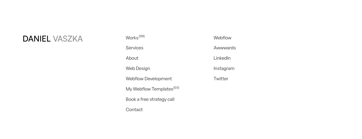
Hello, I would like help understanding how to create a hover effect in the text similar to the footer of this site (https://danielvaszka.com/). Can someone help me?
-
Hey there! First of all, I'm quite new to GSAP in combination with React. For the current project I'm using NextJs. And what I want to achieve is, when hovering over a link, a line animates. Right now, I'm using modular styles for the styling. That's the structure. What I want to achieve is, that when the user is hovering over the linkWrapper class, the linkLine animates from a width of 0% to a width of 100%. Unfortunately I don't know how to achieve this with NextJS & GSAP. <div className={styles.linkWrapper} onMouseEnter={onEnter} onMouseLeave={onLeave}> <Link href="#">V.1.1 / Y2023</Link> <div className={styles.linkLine}></div> </div>
-
Hi there, I am a newbie web-developer student. Recently I have started exploring the powers of GSAP !! I would really appreciate if somebody could let me know how I can make this as a Mouse Hover effect? I have searched literally everywhere, but didn't get what I was looking for. Thanks in advance!!
-
Hello Guys, I want to know to get this effect. Many websites have these. When we hover on a piece of text, images pop-up and when we move away from text, they disapper. Well, the major drawback for me is that I don't know the javascript at all! But I'm great at html&css. I just want a simple effect, image pop-up and move along as we move the cursor on text. I'm sharing the websites which have these effects. I'm including a codepen which has this effect but the problem is, when implement that javascript into my website, it has a part, this on const image = document.querySelector('img') This select all the img tag and I don't even why it has an empty img tag in the beginnning of html. It would be great, if you can help me in any way. https://www.craig-reynolds.com/ https://normal.studio/en/ Thanks & Have a great day!
-
Hi. I need some basic help with gsap.timeline() in a react environment. See my code below: import React, { useRef, useEffect } from 'react' import gsap, { TweenMax, Linear } from 'gsap'; import { ReactComponent as Twitter } from '../assets/svg/social/twitter.svg' const NavBar = () => { let twitterIcon = useRef(null); const tl = gsap.timeline() // this is the hover effect, making it glow green (all attributes are correct) const glowAnimation = (icon) => { tl.to(icon, 0.3, {attr: {style: "fill: rgb(48,223,171)"}, ease: Linear}) } // This just sets the initial colour of the black svg to white useEffect(() => { TweenMax.set(twitterIcon, {attr: {"style": "fill: rgb(255,255,255)"}}) }) return ( <div className="navbar"> <a title="Twitter" target="_blank" rel="noopener noreferrer" // onMouseEnter={ glowAnimation({twitterIcon}) } // onMouseLeave={ something? reverse of tl } href="redacted"> <Twitter // This is an SVG imported as ReactComponent className="navbar__icon" title="Twitter" ref={el => {twitterIcon = el}} /> </a> </div> ) } export default NavBar The basic premise of this is that it is part of my header. It has only one twitter icon (svg) right now. I want to be able to add more icons in the future (e.g. facebook, github) hence why I want to be able to pass in some reference to an icon into a single gsap timeline to describe the hover animation (defined as glowAnimation function) when mouse over an icon, and reverse that timeline when mouse leaves that icon. So I created a function with that timeline. But I'm unsure how to pass the twitterIcon reference (made using useRef) into the onMouseEnter attribute. What am I doing wrong? And also, what can I put in the onMouseLeave attribute to reverse the glowAnimation function? Sorry if this is stupid
-
I was trying to create a simple button hover effect using the jQuery(this) on the button. When you swipe your mouse over the button real fast the hover out animation triggers and does not allow the hover in animation to finish. This causes the button to get smaller and smaller and causes the text to stack up. I've seen solutions for this problem but none of them allow me to use jQuery(this) in the timeline. Any help would be much appreciated. ?
-
Hi everyone! I am trying to make simple hover 3d tilt effect with GSAP. All seems fine, but one buggy thing - on initial page load, when you first hover on card, there's super fast transformation happens, and I don't understand why this is happening? How to fix it? I tryed to put CSS `transition` on whole card, and this "glitch" is now animating. But what cause it in first place? Here I made repro (duration is super slow, so you can see this initial jerking): https://codepen.io/bdrtsky/pen/wNxpVW
-
Hello everyone, I hope this topic finds you all well. I would like know if it is possible to change the colour of one of the buttons on mouseenter(while is paused). The two buttons are in sync and I have noticed that on mouse leave the button I was hover snaps to sync with the other button. Is there any chance I could make that transition smoother? I hope this is clear. You can check the project on my codepen link http://codepen.io/aleguitar77/pen/gMaRNm Thanks in advance. Alex
-
Hello everyone, I hope this topic finds you all well. I would like know if it is possible to change the colour of one of the buttons on mouseenter(while is paused). The two buttons are in sync and I have noticed that on mouse leave the button I was hover snaps to sync with the other button. Is there any chance I could make that transition smoother? I hope this is clear. You can check the project on my codepen link http://codepen.io/al...ar77/pen/gMaRNm Thanks in advance. Alex