Search the Community
Showing results for tags 'position'.
Found 39 results
-
Hi All, Is there a way to make a smooth transition when changing from position absolute to position relative. You can see the jump in the demo.
-
I can get position values during a drag (using Draggable). But can I get position values during a Throw (using throwProps)?
-
Hi guys, I have recreated the problem as the title states. I have a div that has a zoom and a Draggable item inside it. On zoom = 1 everything works great but if you change the zoom the Draggable position is out. While using jQuery-UI Draggable I was able to fix the issue by the following code: var zoom = $("#main").css("zoom"); $('svg').draggable({ drag: function(evt,ui) { // zoom fix ui.position.top = Math.round(ui.position.top / zoom); ui.position.left = Math.round(ui.position.left / zoom); } }); As the x and y properties on the Draggable object are [read-only] how can this be done to fix position with GSAP Draggable? Will appreciate some help. Cheers, Praney
-
Hello! 1) div moves to 200 pixels to the right and takes the position 300px - it's ok 2) and next div moves to 50 pixels to the left - why? I thought it was specified the absolute position (left:50px) And how I can move the block to the absolute position (left:50px) at the second tween (if the first tween use "x:..." ) var logo = document.getElementById("elem"); new TweenMax(logo, 2, {x:200}); new TweenMax(logo, 2, {css:{left:"50px"}}).delay(2); ...... <div style="left: 100px; top: 100px; position:absolute;" id="elem">blablabla</div>
-
Hello, I'm facing performance issues when tweening SVG <image> elements x and y position. I'm animating using the attr x and y value. The performance is great on IE,FF and Safari, but very bad on Chrome. Does anyone have a cross browser solution or an explanation why this happends? Thanks! Jonas
-
Hi everyone. Just wondering, if It is possible something like: Draggable.create("#myObject", {type:"xPercent,yPercent"}); or Draggable.create("#myObject", {type:"leftPercent, topPercent"}); Simply said, my goal in both cases is a percentage output. Is this possible with current version of GreenSock Draggable?
-
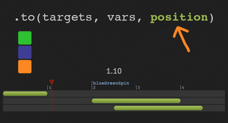 The secret to building gorgeous sequences with precise timing is understanding the position parameter which is used in many methods throughout GSAP. This one super-flexible parameter controls the placement of your tweens, labels, callbacks, pauses, and even nested timelines, so you'll be able to literally place anything anywhere in any sequence. Watch the video For a quick overview of the position parameter, check out this video from the "GSAP 3 Express" course by Snorkl.tv - one of the best ways to learn the basics of GSAP 3. Using position with gsap.to() This article will focus on the gsap.to() method for adding tweens to a Tween, but it works the same in other methods like from(), fromTo(), add(), etc. Notice that the position parameter comes after the vars parameter: .to( target, vars, position ) Since it's so common to chain animations one-after-the-other, the default position is "+=0" which just means "at the end", so timeline.to(...).to(...) chains those animations back-to-back. It's fine to omit the position parameter in this case. But what if you want them to overlap, or start at the same time, or have a gap between them? No problem. Multiple behaviors The position parameter is super flexible, accommodating any of these options: Absolute time (in seconds) measured from the start of the timeline, as a number like 3 // insert exactly 3 seconds from the start of the timeline tl.to(".class", {x: 100}, 3); Label, like "someLabel". If the label doesn't exist, it'll be added to the end of the timeline. // insert at the "someLabel" label tl.to(".class", {x: 100}, "someLabel"); "<" The start of previous animation**. Think of < as a pointer back to the start of the previous animation. // insert at the START of the previous animation tl.to(".class", {x: 100}, "<"); ">" - The end of the previous animation**. Think of > as a pointer to the end of the previous animation. // insert at the END of the previous animation tl.to(".class", {x: 100}, ">"); A complex string where "+=" and "-=" prefixes indicate relative values. When a number follows "<" or ">", it is interpreted as relative so "<2" is the same as "<+=2". Examples: "+=1" - 1 second past the end of the timeline (creates a gap) "-=1" - 1 second before the end of the timeline (overlaps) "myLabel+=2" - 2 seconds past the label "myLabel" "<+=3" - 3 seconds past the start of the previous animation "<3" - same as "<+=3" (see above) ("+=" is implied when following "<" or ">") ">-0.5" - 0.5 seconds before the end of the previous animation. It's like saying "the end of the previous animation plus -0.5" A complex string based on a percentage. When immediately following a "+=" or "-=" prefix, the percentage is based on total duration of the animation being inserted. When immediately following "<" or ">", it's based on the total duration of the previous animation. Note: total duration includes repeats/yoyos. Examples: "-=25%" - overlap with the end of the timeline by 25% of the inserting animation's total duration "+=50%" - beyond the end of the timeline by 50% of the inserting animation's total duration, creating a gap "<25%" - 25% into the previous animation (from its start). Same as ">-75%" which is negative 75% from the end of the previous animation. "<+=25%" - 25% of the inserting animation's total duration past the start of the previous animation. Different than "<25%" whose percentage is based on the previous animation's total duration whereas anything immediately following "+=" or "-=" is based on the inserting animation's total duration. "myLabel+=30%" - 30% of the inserting animation's total duration past the label "myLabel". Basic code usage tl.to(element, 1, {x: 200}) //1 second after end of timeline (gap) .to(element, {duration: 1, y: 200}, "+=1") //0.5 seconds before end of timeline (overlap) .to(element, {duration: 1, rotation: 360}, "-=0.5") //at exactly 6 seconds from the beginning of the timeline .to(element, {duration: 1, scale: 4}, 6); It can also be used to add tweens at labels or relative to labels //add a label named scene1 at an exact time of 2-seconds into the timeline tl.add("scene1", 2) //add tween at scene1 label .to(element, {duration: 4, x: 200}, "scene1") //add tween 3 seconds after scene1 label .to(element, {duration: 1, opacity: 0}, "scene1+=3"); Sometimes technical explanations and code snippets don't do these things justice. Take a look at the interactive examples below. No position: Direct Sequence If no position parameter is provided, all tweens will run in direct succession. .content .demoBody code.prettyprint, .content .demoBody pre.prettyprint { margin:0; } .content .demoBody pre.prettyprint { width:8380px; } .content .demoBody code, .main-content .demoBody code { background-color:transparent; font-size:18px; line-height:22px; } .demoBody { background-color:#1d1d1d; font-family: 'Signika Negative', sans-serif; color:#989898; font-size:16px; width:838px; margin:auto; } .timelineDemo { margin:auto; background-color:#1d1d1d; width:800px; padding:20px 0; } .demoBody h1, .demoBody h2, .demoBody h3 { margin: 10px 0 10px 0; color:#f3f2ef; } .demoBody h1 { font-size:36px; } .demoBody h2 { font-size:18px; font-weight:300; } .demoBody h3 { font-size:24px; } .demoBody p{ line-height:22px; margin-bottom:16px; width:650px; } .timelineDemo .box { width:50px; height:50px; position:relative; border-radius:6px; margin-bottom:4px; } .timelineDemo .green{ background-color:#6fb936; } .timelineDemo .orange { background-color:#f38630; } .timelineDemo .blue { background-color:#338; } .timleineUI-row{ background-color:#2f2f2f; margin:2px 0; padding:4px 0; } .secondMarker { width:155px; border-left: solid 1px #aaa; display:inline-block; position:relative; line-height:16px; font-size:16px; padding-left:4px; color:#777; } .timelineUI-tween{ position:relative; width:160px; height:16px; border-radius:8px; background: #a0bc58; /* Old browsers */ background: -moz-linear-gradient(top, #a0bc58 0%, #66832f 100%); /* FF3.6+ */ background: -webkit-gradient(linear, left top, left bottom, color-stop(0%,#a0bc58), color-stop(100%,#66832f)); /* Chrome,Safari4+ */ background: -webkit-linear-gradient(top, #a0bc58 0%,#66832f 100%); /* Chrome10+,Safari5.1+ */ background: -o-linear-gradient(top, #a0bc58 0%,#66832f 100%); /* Opera 11.10+ */ background: -ms-linear-gradient(top, #a0bc58 0%,#66832f 100%); /* IE10+ */ background: linear-gradient(to bottom, #a0bc58 0%,#66832f 100%); /* W3C */ filter: progid:DXImageTransform.Microsoft.gradient( startColorstr='#a0bc58', endColorstr='#66832f',GradientType=0 ); /* IE6-9 */ } .timelineUI-dragger-track{ position:relative; width:810px; margin-top:20px; } .timelineUI-dragger{ position:absolute; width:10px; height:100px; top:-20px; } .timelineUI-dragger div{ position:relative; width: 0px; height: 0; border-style: solid; border-width: 20px 10px 0 10px; border-color: rgba(255, 0, 0, 0.4) transparent transparent transparent; left:-10px; } .timelineUI-dragger div::after { content:" "; position:absolute; width:1px; height:95px; top:-1px; left:-1px; border-left: solid 2px rgba(255, 0, 0, 0.4); } .timelineUI-dragger div::before { content:" "; position:absolute; width:20px; height:114px; top:-20px; left:-10px; } .timelineUI-time{ position:relative; font-size:30px; text-align:center; } .controls { margin:10px 2px; } .prettyprint { font-size:20px; line-height:24px; } .timelineUI-button { background: #414141; background-image: -webkit-linear-gradient(top, #575757, #414141); background-image: -moz-linear-gradient(top, #575757, #414141); background-image: -ms-linear-gradient(top, #575757, #414141); background-image: -o-linear-gradient(top, #575757, #414141); background-image: linear-gradient(to bottom, #575757, #414141); text-shadow: 0px 1px 0px #414141; -webkit-box-shadow: 0px 1px 0px 414141; -moz-box-shadow: 0px 1px 0px 414141; box-shadow: 0px 1px 0px 414141; color: #ffffff; text-decoration: none; margin: 0 auto; -webkit-border-radius: 4; -moz-border-radius: 4; border-radius: 4px; font-family: "Signika Negative", sans-serif; text-transform: uppercase; font-weight: 600; display: table; cursor: pointer; font-size: 13px; line-height: 18px; outline:none; border:none; display:inline-block; padding: 8px 14px;} .timelineUI-button:hover { background: #57a818; background-image: -webkit-linear-gradient(top, #57a818, #4d9916); background-image: -moz-linear-gradient(top, #57a818, #4d9916); background-image: -ms-linear-gradient(top, #57a818, #4d9916); background-image: -o-linear-gradient(top, #57a818, #4d9916); background-image: linear-gradient(to bottom, #57a818, #4d9916); text-shadow: 0px 1px 0px #32610e; -webkit-box-shadow: 0px 1px 0px fefefe; -moz-box-shadow: 0px 1px 0px fefefe; box-shadow: 0px 1px 0px fefefe; color: #ffffff; text-decoration: none; } .element-box { background: #ffffff; border-radius: 6px; border: 1px solid #cccccc; padding: 17px 26px 17px 26px; font-weight: 400; font-size: 18px; color: #555555; margin-bottom:20px; } .demoBody .prettyprint { min-width:300px; } Percentage-based values As of GSAP 3.7.0, you can use percentage-based values, as explained in this video: Interactive Demo See the Pen Position Parameter Interactive Demo by GreenSock (@GreenSock) on CodePen. Hopefully by now you can see the true power and flexibility of the position parameter. And again, even though these examples focused mostly on timeline.to(), it works exactly the same way in timeline.from(), timeline.fromTo(), timeline.add(), timeline.call(), and timeline.addPause(). *Percentage-based values were added in GSAP 3.7.0 **The "previous animation" refers to the most recently-inserted animation, not necessarily the animation that is closest to the end of the timeline.
- 6 comments
-
- 4
-

-

-
- gsap
- position parameter
- (and 9 more)
-
Hi, im working in this Bezier animation: TweenMax.to(myFish, 5, {bezier:{curviness:2.1, values:[{x:0, y:-100},{x:150, y:-200},{x:0, y:-400},{x:-100, y:-500},{x:0, y:-700},{x:0, y:-900}],autoRotate:["x","y","rotation",90,false]}, ease:Power1.easeInOut}); What i want to do is the next: I'm trying to simulate a fish swimming, everything is ok, but when the user do "touchstart" on the fish, this action will kill the tween but also I want to make this draggable, so I'm not sure if this could be, because I suppose I need the current position (top,left) to start the drag stuff. so.. any ideas? thanks a lot. I'm thinking.. $myContainer.append(target); Draggable.create(target,{ type:"top,left", bounds: $myContainer }); var tween = TweenMax.to(target, 10, {bezier:{curviness:2.1, values:[{x:0, y:-100},{x:150, y:-200},{x:0, y:-400},{x:-100, y:-500},{x:0, y:-700},{x:0, y:-900}],autoRotate:["x","y","rotation",90,false]}, ease:Power1.easeInOut}); target.on("touchstart", function() { tween.kill(); //then start dragging });
-
Hi, I'm very new to greensock, but just getting my head around it. I have created my first simple animation using TimelineLite. Everything is working although I can't seem to make animations overlap properly. I am using a position value but it doesn't seem to work with "-=X" or "+=X" I have to enter "+X" or "-X" for it to do anything. And then when it does work I have to calculate from the beginning of the timeline as it doesn't work using the previous animation. <script> window.onload = function() { var tl = new TimelineLite(); var bgMain = document.getElementById("bgMain"); var worldvision = document.getElementById("worldvision"); var darkarea = document.getElementById("darkarea"); var text1 = document.getElementById("text1"); var text2 = document.getElementById("text2"); var text3 = document.getElementById("text3"); var donate = document.getElementById("donate"); tl.from(worldvision, 1, {css:{bottom:"-70px"}}) .from(bgMain, 1, {css:{width:"350px", height:"275px"}}, "+0.2") .from(darkarea, 1, {css:{opacity:"0"}}) .from(text1, 2, {css:{opacity:"0"}}) .to(text1, 2, {css:{opacity:"0"}}) .from(text2, 2, {css:{opacity:"0"}}, "+5.4") I would like this to start just before the last one finishes but I have to calculate all the way from the beginning of the timeline. .from(text3, 1, {css:{opacity:"0"}}) .from(donate, 1, {css:{opacity:"0"}}) } </script> Any guidance would be great thanks!
-
I'd like to have some table cells animate from their automatically laid out relative position, to certain designated absolute positions to highlight them, and then have them return to their position in the table. In particular I have a Gantt chart with three selectable cells which I would like to tween from its initial... {top:"0%",left:"0%",width:"auto",height:"auto",position:"relative"} {top:"0%",left:"0%",width:"auto",height:"auto",position:"relative"} {top:"0%",left:"0%",width:"auto",height:"auto",position:"relative"} to a temporary... {top:"0%",left:"0%",width:"100%",height:"33%",position:"absolute"} {top:"33%",left:"0%",width:"100%",height:"33%",position:"absolute"} {top:"66%",left:"0%",width:"100%",height:"33%",position:"absolute"} ...and then tween them back to their initial relative values again. Is there a Greensock way of doing this? If I use a regular to(...) tween with the values above, the 'position' value is toggled monolithically to 'absolute', with the top and left set to 0 so the cells jump to the top left corner immediately, then tween their location and width from there, rather than tweening smoothly from their initial (relative) location. There's probably a workaround, involving JQuery calculating the starting positions for the tween from the rendering engine, but perhaps someone has an elegant way of doing this, as I'm sure I'm not the only one who needs the behaviour.
-
Hi there, I read this forum front to back and can't find a solution for my problem. We're using the TweenMax pack on a animation and it works amazingly on Chrome, FF and Safari, as you would expect. Even IE9+ is a doozie and we're not having problems with that. HOWEVER, IE8 insists in not playing ball. So after a lot of debugging and fiddling around, I have two questions for you. 1) I notice that a few of the animations use "filter:progid:DXImageTransform.Microsoft.Matrix" while other will use use margin to move things around. Why's that? I can't find a pattern why TweenMax. The animations that use "filter" work fine. But... 2) The animations using margin don't. If I use "TweenMax.to" it disregards the current position of the element and starts from 0x0. The "from" values below are also disregarded and the animation starts from 0x0. TweenMax.fromTo(_cloud_small, 4.6, {css:{x:600}}, {css:{y:120, x:200}}); We've tried changing 'x' and 'y' to 'left' and 'top' and a whole bunch other things, but nothing seems to work. It is as if on onStart the the object's margin is set to 0 and the animation starts from there. Why, I ask you, WHY? I've spent a few hours on this now, and I can't understand the reason. Any clues will be most appreciated! Hug of the bear and thanks!
-
Hello, I have an element whose opacity is being changed based on scroll position. No problem there. When the element is in the scroll range, I want it to loop an animation only while within the scroll position range. The looping the animation part is what I'm having trouble with. I tried calling a function, using onComplete, etc. Here is the timeline: var tlwhoweareGreen = new TimelineMax({paused:true}); tlwhoweareGreen.append( TweenLite.to($("div#whoweare-green"), 1, {css:{opacity:1, autoAlpha:1}}) ); /*I've been trying to append the timeline or call a function here. Once the opacity has been set to 1, I want it to loop back to zero and back to one, infinitely until the the user has scrolled outside the range*/ Here is the scroll function: $(window).scroll(function() { var getVert = $(this).scrollTop(); console.log(getVert); var getHor = $(this).scrollLeft(); function scrollTween(startPoint, endPoint, tweenName, type) { var progressNumber; if(type == 'vertical') { progressNumber = (1 / (endPoint - startPoint)) * (getVert - startPoint); } else if (type == 'horizontal') { progressNumber = (1 / (endPoint - startPoint)) * (getHor - startPoint); } if (progressNumber >= 0 && progressNumber <= 1) { tweenName.progress(progressNumber); } else if(progressNumber < 0) { tweenName.progress(0); } else if(progressNumber > 1) { tweenName.progress(1); } } scrollTween(400, 800, tlwhoweareGreen, 'vertical'); $("div#whoweare-green").css("display", "block"); }); }); </script>
-
Hey! First of all, this isn't an animation or tween problem but as there is no other Javascript section, I'm posting it here. Also I'm not entirely sure that it is caused by TweenLite but it is happening in my TweenLite line of code. I have an image and I want to generate a reflection effect for it so I duplicated the image, mirrored it and reduced the opacity through TweenLite (makes it so much easier!). In all browsers I have tested it so far it works fine (including IE7) but in Chrome it's behaving weird. The reflecting image is at the bottom of my page and should partially exceed the bottom border of the DIV it is in. What Chrome does is that the image itself does not go further down than the border of the content div but the canvas or area of the image does go down. This results in clipping the image. This could be an issue with the css I'm applying with the TweenLite line or it could be the way TweenLite handles it. If I comment out the line with where the TweenLite css is set, it gets positioned over the border just fine, but obviously without the right css attributes. Here is the Jsfiddle: http://jsfiddle.net/qTE2m/ here are screenshots of what I mean: Chrome: http://puu.sh/1xI15 FireFox: http://puu.sh/1xI24 The black line at the bottom is the border of the div the image is in.
-
Hello. This is my first post. And I believe this is a noob question, in fact. I have a tween that has a bezier effect on it and I want it to receive the "y" position through a variable. Something like this: var myTween: TweenLite = new TweenLite(my_mc, 2, {y: myVar + 43 , ease:Bounce.easeOut, onComplete: myFunction}); Is there a simple way to pass this value? Thx in advance.


