Jump to content
Search Community

Search the Community

Showing results for tags 'CSS'.

  • Search By Tags

    Type tags separated by commas.
  • Search By Author

Content Type


Forums

  • GreenSock Forums
    • GSAP
    • Banner Animation
    • Jobs & Freelance
  • Flash / ActionScript Archive
    • GSAP (Flash)
    • Loading (Flash)
    • TransformManager (Flash)

Product Groups

  • Club GreenSock
  • TransformManager
  • Supercharge

Categories

There are no results to display.


Find results in...

Find results that contain...


Date Created

  • Start

    End


Last Updated

  • Start

    End


Filter by number of...

Found 237 results

  1. Hello, I have a problem not related to GSAP, I don't find any solution, I asked on 3 forums (+stackoverflow) and didn't find any answer. I already used GSAP on my webpage for a small animation and I was wondering if it could help me with this problem or if it would be overkill to use GSAP (performance/ressources). I tried to document my problem on stackoverflow (if someone want to read more details) : https://stackoverflow.com/questions/57784926/why-using-opacity-or-an-absolute-position-ruin-my-transform-rotatey180deg I made a card that can rotate on Y when it's mouse hovered (everything with CSS). the problem is that when I use css to change the opacity (svg flag) or the position of an element (text in my situation) on the back of the card, the rotate animation is buggy and got a delay of +/-1sec to display the back of the card. /!\ the bug occur only once, the first time the rotateY is used; to do it again, you need to reload the page (F5). The bug only apear in Chrome (work perfectly on firefox). If I use GSAP to do the rotation instead of css, should it fix the problem or is the problem from chrome and would still be here with GSAP ? (what would be more logic using GSAP for the rotation on Y or for opacity/text position?) I made a codepen with the problem : https://codepen.io/Demky/pen/pozWZKM -> if you remove the css classes .bottom-right and .changeOpacity there is no more delay. As I said on stackoverflow, if you use the template from w3school and just add an opacity to an element from the back of their card (exemple .flip-card-back), it does the same delay problem so I don't think the error is from my code : https://www.w3schools.com/howto/tryit.asp?filename=tryhow_css_flip_card What would you do in my situation ? I can't believe it's impossible to customise the back of a card that rotate ? I don't really know if I can post my question here but I don't know where to search a solution Let me know if something isn't clear. ---------------------- Edit : looking to test it with gsap to see if it work; found this thread, will try it soon ;
  2. GreenSock

    CSS animations performance: the untold story

    Note: This page was created for GSAP version 2. We have since released GSAP 3 with many improvements. While it is backward compatible with most GSAP 2 features, some parts may need to be updated to work properly. Please see the GSAP 3 release notes for details. There are some interesting (and surprising) performance implications of using CSS animations that aren't widely known. I stumbled across a few of them while running tests for a customer in the advertising industry who is pushing to have GSAP adopted as the standard, so I recorded a screencast explaining what I found. I figured it was worth sharing: Summary Timeline recordings in Chrome Dev Tools don't show the overhead involved with CSS animation of transforms, so people often misinterpret the [lack of] data. Recordings look "clean" with CSS and "dirty" with JS which leads to faulty conclusions about performance. CSS animations of transforms used twice as much CPU compared to JS according to Chrome's task manager. CSS animations caused the main thread to bog down more than using JavaScript animations. User interaction is typically handled on the main thread, making things feel sluggish to the user. It is especially costly if you animate transforms along with almost any other property at the same time. Webkit browsers have synchronization problems. JavaScript was faster than CSS animations on every device that I ran this test on – the only exception was animating transforms in Webkit browsers (and then there's that heavy cost on the main thread and sync problems). In order to independently control the timing/easing of transform components (rotation, scale, skew, position) in CSS, you must create a DOM node for each which negatively impacts performance. With JavaScript, no such workarounds are necessary. (see note below) I love Dev Tools - I'm not knocking it at all. These things are just tough to measure. Do your own tests! Don't put too much faith in Dev Tools or my tests. Use your eyes because ultimately perception is what matters to end users. Smooth movement and responsive UI are both important. Links Raw Codepen test Google's Paul Lewis addresses CSS vs. JS Animations A great article about hardware accelerated CSS by Ariya Hidayat Why GSAP? - a practical developer's guide UPDATE: After recording the video, I did some more tests that showed that one of the biggest contributors to the slowdowns in the pure CSS version was the fact that multiple elements had to be nested in order to accomplish the independent transform component controls. In other words, staggering the start/end times (or easing) of rotation, scale, and position is practically impossible in pure CSS unless you nest things like that, but there's a relatively significant performance tradeoff. When nesting could be avoided, pure CSS animation of only transforms did appear smoother on webkit browsers under heavy pressure and it was basically indistinguishable from optimized JS animations under all other levels of pressure.
  3. Note: This page was created for GSAP version 2. We have since released GSAP 3 with many improvements. While it is backward compatible with most GSAP 2 features, some parts may need to be updated to work properly. Please see the GSAP 3 release notes for details. A post by Carl Schooff, GreenSock's "Geek Ambassador" Hot on the heels of the CSS Myth-Busting article, I'm going to take a deeper look into CSS Animations and how they fit (or don't fit) into a modern animator's workflow. This isn't about simple fades or basic transitions (CSS is great for those); Developers who use animation to tell a story or deliver rich interactivity require a very different workflow than those who are simply doing UI transitions. I'm going to show you exactly where some of the pain points are for a typical project and how they can bring your workflow to a grinding halt. Even relatively simple animations like the one below can become surprisingly cumbersome with CSS. Example of a Simple, "Story-Telling" Animation See the Pen GSAP: Full Version Complete by GreenSock (@GreenSock) on CodePen. Seriously, You guys are beating up on CSS Animations again? Really, I'm not trying to be negative for the sake of being negative. It's just that so many developers are looking for animation tools that accommodate their real-world projects and the industry seems to scream "use CSS!" even though the API doesn't adequately serve the workflow of modern animators who are building immersive experiences or animations that "tell a story". Too many people are being led down a path that results in utter frustration, or at least a lot of wasted time. And no, CSS Animations aren't "evil". In fact, sometimes they're perfectly appropriate (see the CSS Myth-Busting article for details). There are CSS fans who craft animations and proudly shout "Pure CSS! No JS!" as if the grueling effort necessary is a badge of honor. The accomplishment is indeed admirable, and we tip our hats to them. But WOW it's a lot of work and doesn't exactly lend itself to experimentation or easy edits. Quite simply, we aim to change the tide with tools like GSAP. The majority of the GSAP API has been shaped by feedback from real developers in the trenches over the course of many years. The process of animation should be fun and inspiring. Challenge! Still not convinced that GSAP is better suited for professional animators? I'm very interested to see how this animation can be built more effectively. Are you in the CSS-Purist camp? Do you prefer to trigger animations with JavaScript setTimeouts? Maybe you have another library that blows GSAP away. Dig in and build the animation I've been using with your own choice of tools. Below are some resources that should make it easy to get started. When you're done, just drop us a line in the comments or in the forums. Full storyboard showing css values for each key frame: http://codepen.io/GreenSock/pen/DzHBs Starter Pen: http://codepen.io/GreenSock/pen/EsAvF Recommended reading: Myth Busting: CSS Animations vs JavaScript (css-tricks.com guest post) Main GSAP page Jump Start: GSAP JS Cage matches: CSS3 transitions vs GSAP | jQuery vs GSAP 3D Transforms & More CSS3 Goodies Arrive in GSAP JS
  4. GreenSock

    CSS Animations vs GSAP: Cage Match

    Note: This page was created for GSAP version 2. We have since released GSAP 3 with many improvements. While it is backward compatible with most GSAP 2 features, some parts may need to be updated to work properly. Please see the GSAP 3 release notes for details. Update: don't miss our guest post on css-tricks.com, Myth Busting: CSS Animations vs. JavaScript which provides some additional data, visual examples, and a speed test focused on this topic. Ever since CSS3 "transitions" and "animations" were introduced, they have been widely lauded as the future of animation on the web. It often seems like all the "cool kids" are talking about them. Should you jump on the bandwagon? Is JavaScript animation headed for extinction? How does the new GreenSock Animation Platform (GSAP) fare when it steps into the ring and faces off against the hyped-up tag-team of CSS3 transitions & animations? Does GSAP have the chops to hold its own? Let's find out. Ready...FIGHT! Performance One of the most common arguments in favor of CSS3 animations has been that they're hardware accelerated, thus outperform any JavaScript-based equivalent. The theory is that if you define your transitions/animations directly in css, the browser can worry about all the calculations behind the scenes and tap into hardware and native code to execute them. Sounds awesome. Unfortunately it's not quite that clean. Only certain properties are hardware-accelerated (like 3D transforms and opacity - mostly ones that don't affect document flow) and different browsers handle things differently. Plus every comparison we saw on the web pitted CSS3 transitions against jQuery, but GSAP is up to 20 times faster than jQuery. In our real-world tests, we saw drastic differences in performance among the various browsers and when tested head-to-head against GSAP, CSS3 animations were usually slower! Weird. As expected, however, 3D transforms were indeed faster under heavy stress although in most situations you'd never notice a difference. GSAP is extremely optimized. UPDATE (2015-01-05): There are some interesting (and surprising) performance implications of using CSS animations that aren't widely known. Here's a screencast that shows how Dev Tools doesn't report the overhead involved with CSS animations, some synchronization problems, and how they can drag down the main thread performance more than JS. To see a simple comparison for yourself, select the "Zepto" engine in the speed comparison because it uses CSS3 transitions for its animations, and then compare it to GSAP. Beware that the fps (frames per second) counter in the lower right corner isn't always accurate in some browsers (like recent versions of Safari) when using CSS3 transitions because requestAnimationFrame events [incorrectly] get dispatched even when the screen is clearly not being updated. So the animation may actually be running at a very jerky 10fps, yet 50+ requestAnimationFrame cycles are being triggered by the browser! This exposes another flaw in CSS3 transitions - there's no way to know when updates truly occur. There's only a "complete" event fired at the end of the transition/animation. If anyone knows how to get a more accurate fps counter in Safari while using CSS3 transitions, please let us know. Another performance issue to note in the speed comparison is the clumping that occurs with many engines (including Zepto) under heavy stress, where the stars begin pulsing out in rings instead of a nicely dispersed field. Even though GSAP was faster than CSS3 transitions in the majority of our real-world tests, it's still true that 3D transforms and opacity tweens are faster with CSS3 transitions and it's possible that browsers will be able to further tap into hardware acceleration in the future, so we'll call this round a tie. Feel free to build your own tests to see how things compare in your workflow. Performance winner: TIE Controls This is one of the major weak spots for CSS transitions (its "glass jaw" of sorts). Let's say you invest the time in writing a bunch of css for a whiz-bang animation and then you need to control the whole thing - good luck with that. It is virtually impossible. GSAP's object oriented architecture allows you to pause, resume, reverse, restart, or seek to any spot in any tween. Even adjust timeScale on the fly for slow motion or fastforward effects. Place tweens in a timeline with precise scheduling (including overlaps or gaps) and then control the whole thing just like it's a single tween. All of the easing and effects remain perfectly intact as you reverse, adjust timeScale, etc. (with CSS transitions, easing flip-flops upon reverse). You can even kill individual portions of a tween anytime (like if a tween is controlling both "top" and "left" properties, you can kill "left" while "top" continues). Put labels in a timeline to mark important spots and seek() to them anytime. Imagine trying to build the example below using CSS transitions. It would be virtually impossible. With GSAP, it's easy. In fact, all of the animation is done with 2 lines of code. Drag the scrubber, click the buttons below, and see how easy it is to control the sequenced animation. Controls winner: GSAP Tweenable Properties Both competitors can animate transforms (2D and 3D), colors, borderRadius, boxShadow, and pretty much every important property, but there's one key shortcoming of CSS - you cannot animate individual transforms distinctly! For example, try rotating an object and then halfway through that animation, start scaling it with a different ease and finish at a different time. Since all transforms (scaleX, scaleY, rotation, rotationX, rotationY, skewX, skewY, x, y, and z) are all mashed into one "transform" property, it's virtually impossible to handle them distinctly. GSAP not only works around this limitation, but it also allows you to do advanced things like animate along Bezier paths or do momentum-based motion (with ThrowPropsPlugin) or relative tweens or animate the scroll position or do directional rotation or physics-based motion, etc. Plus GSAP can animate any numeric property of any object, not just DOM elements. Do you really want to use one toolset (CSS) for animating DOM elements and then have to switch to a completely different toolset and syntax when you do canvas-based animation? GSAP handles both consistently. CSS transitions and animations just can't compete here. Tweenable properties winner: GSAP Workflow When you're creating fun and interesting animations, workflow is critical. You need to be able to quickly build sequences, stagger start times, overlap tweens, experiment with eases, leverage various callbacks and labels, and create concise code. It would be great to modularize your code by creating functions that each spit back an animation object (tween or timeline) which can be inserted into another timeline at a precise time. You need a flexible, powerful system that lets you experiment without wasting hours. GSAP wipes the floor with CSS transitions in this round. Anyone who has attempted an ambitious project with CSS3 transitions/animations will attest to the fact that they tend to get very cumbersome and verbose. Experimenting with timing and fine-tuning details can get extremely tedious especially when dealing with all the browser prefixes. GSAP CSS3 transitions = supported = unsupported Flexible object-oriented architecture that allows animations to be nested inside other animations as deeply as you want Supported Unsupported Concise code that doesn't require vendor prefixes Supported Unsupported Create sequences (even with overlapping animations) that auto-adjust as you insert/remove/change intermediate pieces of animation (makes experimenting MUCH easier) Supported Unsupported Accommodate virtually any ease including Bounce, Elastic, SlowMo, RoughEase, SteppedEase, etc. Supported Unsupported Animate things into place (backwards) with convenience methods like from() and staggerFrom() Supported Unsupported Callbacks for when an animation starts, updates, completes, repeats, and finishes reversing, plus optionally pass any number of parameters to those callbacks Supported Unsupported Place labels at specific times in a sequence so that you can seek() there (and/or insert animations there) Supported Unsupported Animate any numeric property of any JavaScript object, not just DOM elements (great for canvas-based animation). Supported Unsupported Workflow winner: GSAP Compatibility CSS transitions simply don't work in older browsers, even Internet Explorer 9. GSAP works in all browsers (although some particular features may be disabled, like 3D transforms in IE8). Once again, this round was no contest. GSAP can even do 2D transforms like rotation, scaleX, scaleY, x, y, skewX, and skewY all the way back to IE6 including transformOrigin functionality! Plus it works around scores of other browser issues so that you can focus on the important stuff. Safari's 3D transformOrigin bug? No problem. Firefox's flashing 3D elements bug? No worries. Inconsistency in IE's backgroundPosition values? GSAP has you covered. Vendor prefixes? Nah, GSAP adds 'em for you when necessary. Compatibility winner: GSAP Popularity CSS3 transitions have been talked about (and used) for years all over the web whereas GSAP is relatively new. It can't match CSS3 transitions' popularity. As clients start pushing for more aggressive animations and HTML5 games proliferate and operating systems become very JavaScript-friendly, the balance may very well shift quickly. For now, though, this round goes squarely to CSS transitions. Popularity winner: CSS3 transitions Conflict management What happens if a particular set of properties (like "left" and "top") are animating and then you need to redirect one of those to a different value (like "left" to 100px instead of 300px) using a different ease and duration? With CSS transitions, it's a very complex process. With GSAP, it's simple and automatic. In fact, there are several overwrite modes you can choose from. Conflict management winner: GSAP Support There are numerous places on the web where you can ask the community your CSS transitions-related questions, but GSAP has dedicated support forums where there's rarely a question that remains unanswered for more than 24 hours. GreenSock's forums are manned by paid staff (including the author of the platform), so you're quite likely to get solid answers there. Add to that the fact that GreenSock has a track record of being much more agile in terms of squashing bugs and releasing updates than browsers do for CSS3 transitions, so GSAP gets the upper hand here. Support winner: GSAP Expandability GSAP employs a plugin architecture, making it relatively easy to add features and custom animation properties but CSS transitions have no such equivalent. You're stuck with what the browsers decide to offer. In addition to CSSPlugin, GSAP already has plugins like ScrollToPlugin for scrolling to specific window or div scroll positions, BezierPlugin for animating along Bezier curves, ThrowPropsPlugin for momentum-based motion, and RaphaelPlugin, EaselPlugin, and KineticPlugin for those libraries (Raphael, EaselJS, and KineticJS). Plus there are physics-based plugins like Phyics2DPlugin and PhysicsPropsPlugin as well as a fun ScrambleTextPlugin for Club GreenSock members. More plugins are on their way, and you can create your own too. Expandability winner: GSAP Learning resources Again, the popularity of CSS3 transitions trumps anything GSAP could throw at it right now. There are lots of tutorials, videos, and articles about CSS3 transitions whereas GSAP is new to the game. GreenSock is being aggressive about putting together solid resources (like the Jump Start tour) and the community is crankin' out some great articles and videos too, but CSS3 transitions score the win in this round. Learning resources winner: CSS3 TRANSITIONS Price & license Both CSS3 transitions and GSAP are completely free for almost every type of usage. GSAP allows you to edit the raw source code to fix bugs (if that's something you need to do), but there's no way to edit the source code that drives CSS3 transitions. Then again, there's no special license required to use them either. If you plan to use GSAP in a product/app/site/game for which a fee is collected from multiple customers, you need the commercial license that comes with "Business Green" Club GreenSock memberships (one-off commercial projects don't require the special license). It's actually a more business-friendly license in many ways than a typical open source license that offers no warranties or backing of any kind or imposes code sharing or credit requirements. GreenSock's licensing model provides a small funding mechanism that benefits the entire user base because it empowers continued innovation and support, keeping it free for the vast majority of users. See the licensing page for details. Although there are some clear benefits of GreenSock's model, we'll give this round to CSS3 transitions because using them is technically "free" in more scenarios than GSAP. Price & license winner: CSS3 TRANSITIONS File size This is a tricky round indeed because GSAP requires inclusion of at least 1 JavaScript file whereas CSS3 transitions leverage native code in the browser, but the code you'd have to write to accomplish the same thing in CSS3 animations or transitions is often far more verbose, offsetting the kb savings. For example, let's take a relatively simple sequenced animation (see codepen or jsfiddle? GSAP code: var tl = new TimelineLite(); tl.staggerFrom('.box', 0.5, {opacity:0, scale:0, rotation:-180}, 0.3) .staggerTo('.box', 0.3, {scale:0.8}, 0.3, 0.7); This type of thing is impossible with CSS3 transitions, but it can be done with CSS3 animations as long as we give each element its own class name or ID. Let's take a look at the CSS code (see codepen or jsfiddle? Equivalent CSS3 Animation: .animated { -webkit-animation-fill-mode: both; -moz-animation-fill-mode: both; animation-fill-mode: both; -webkit-animation-duration: 1s; -moz-animation-duration: 1s; animation-duration: 1s; } @-webkit-keyframes introAnimation { 0% { -webkit-transform: scale(0) rotate(-180deg) ; opacity: 0; } 50% { -webkit-transform: scale(1) rotate(0deg) ; opacity: 1; } 70% { -webkit-transform: scale(1) rotate(0deg); } 100% { -webkit-transform: scale(0.8) rotate(0deg); } } @-moz-keyframes introAnimation { 0% { -moz-transform: scale(0) rotate(-180deg); opacity: 0; } 50% { -moz-transform: scale(1) rotate(0deg); opacity: 1; } 70%{ -moz-transform: scale(1) rotate(0deg); } 100% { -moz-transform: scale(0.8) rotate(0deg); } } @keyframes introAnimation { 00% { transform: scale(0) rotate(-180deg); opacity: 0; } 50% { transform: scale(1) rotate(0deg); opacity: 1; } 70%{ transform: scale(1) rotate(0deg); } 100% { transform: scale(0.8) rotate(0deg); } } .introAnimation { -webkit-backface-visibility: visible !important; -webkit-animation-name: introAnimation; -moz-backface-visibility: visible !important; -moz-animation-name: introAnimation; backface-visibility: visible !important; animation-name: introAnimation; } .two { -webkit-animation-delay: 0.3s; -moz-animation-delay: 0.3s; animation-delay: 0.3s; } .three { -webkit-animation-delay: 0.6s; -moz-animation-delay: 0.6s; animation-delay: 0.6s; } .four { -webkit-animation-delay: 0.9s; -moz-animation-delay: 0.9s; animation-delay: 0.9s; } .five { -webkit-animation-delay: 1.2s; -moz-animation-delay: 1.2s; animation-delay: 1.2s; } .six { -webkit-animation-delay: 1.5s; -moz-animation-delay: 1.5s; animation-delay: 1.5s; } .seven { -webkit-animation-delay: 1.8s; -moz-animation-delay: 1.8s; animation-delay: 1.8s; } .eight { -webkit-animation-delay: 2.1s; -moz-animation-delay: 2.1s; animation-delay: 2.1s; } .nine { -webkit-animation-delay: 2.4s; -moz-animation-delay: 2.4s; animation-delay: 2.4s; } As you can see, the CSS3 code is more than 10 times longer! And what if you want to have the entire sequence repeat 3 times? Good luck with that in CSS - you can set an animation-iteration-count but it only applies to each individual element, so it doesn't give us the effect we're after. And what if you want to experiment with the easing or offsets/delays or rotational values? It is quite cumbersome to say the least, even if you use sass or something like that. With GSAP, it's simple. If you only need very simple animations/transitions, CSS3 would deliver smaller file sizes, but once you start getting more aggressive and expressive with your animations, the scales shift quickly and GSAP becomes more economical. The other thing to keep in mind is that GSAP's JS file(s) are typically cached by the browser, so the savings page-to-page is much larger since the code you write on each page is far more concise. In other words, think of how much js/css the browser must actually request from the server over the course of your users' multi-page visit to your site. File size winner: TIE Flexibility Let's face it: basic tweening is pretty straightforward for any system, but it's really the details and advanced features that make a robust platform shine. GSAP crushes CSS3 transitions and animations when it comes to delivering a refined, professional-grade tool set that's truly flexible. Here are just a few of the conveniences baked into GSAP: Tween any numeric property of any object. Optionally round values to the nearest integer to make sure they're always landing on whole pixels/values. Animate along Bezier curves, even rotating along with the path or plotting a smoothly curved Bezier through a set of points you provide (including 3D!). GSAP's Bezier system is super flexible in that it's not just for x/y/z coordinates - it can handle ANY set of properties. Plus it will automatically adjust the movement so that it's correctly proportioned the entire way, avoiding a common problem that plagues Bezier animation systems. You can define Bezier data as Cubic or Quadratic or raw anchor points. Animate any color property of any JavaScript object (not just DOM elements). Define colors in any of the common formats like #F00 or #FF0000 or rgb(255,0,0) or rgba(255,0,0,1) or hsl(30, 50%, 80%) or hsla(30, 50%, 80%, 0.5) or "red". Set a custom fps (frames per second) for the entire engine (the default is 60fps). All tweens are perfectly synchronized (unlike many other tweening engines). Use the modern requestAnimationFrame API to drive refreshes or a standard setTimeout (the default is requestAnimationFrame with a fallback to setTimeout) Tons of easing options including proprietary SlowMo, RoughEase, and SteppedEase along with all the industry standards Animate css style sheet rules themselves with CSSRulePlugin Animate the rotation of an object in a specific direction (clockwise, counter-clockwise, or whichever is shortest) by appending "_cw", "_ccw", and "_short" to the value. You can tween getter/setter methods, not just properties. For example, myObject.getProp() and myObject.setProp() can be tweened like TweenLite.to(myObject, 1, {setProp:10}); and it will automatically recognize that it's a method and call getProp() to get the current value when the tween starts. Same for jQuery-style getters/setters that use a shared method like myObject.prop(). You can even tween another tween or timeline! For example, TweenLite.to(otherTween, 1, {timeScale:0.5}) would animate otherTween.timeScale to 0.5 over the course of 1 second. You can even scrub the virtual playhead of one tween/timeine with another tween by animating its "time". Flexibility winner: GSAP Conclusion Despite the hype surrounding CSS3 transitions and animations, they just aren't well-suited for professional-grade animation tasks. They did manage to win a few rounds in this match but ultimately GSAP man-handled them, sending them running from the ring like scared sissies. Of course we're slightly biased, but check out the facts for yourself. Kick the tires. Audition GSAP on your next project. See how it feels once you get past the initial learning curve. If you only need simple fades or very basic animation in modern browsers, CSS3 transitions are probably just fine. However, what happens when your client wants to do something more expressive? What if browser compatibility becomes an issue? Why not build on a solid foundation to begin with so that you don't find yourself having to rewrite all your animation code? If you want professional-grade scripted animation, look no further. To get started fast, check out our Jump Start tour. Recommended reading: Main GSAP JS page Why GSAP? A practical guide for developers Jump Start: GSAP JS jQuery vs GSAP: cage match 3D Transforms & More CSS3 Goodies Arrive in GSAP JS Speed comparison Explanation of CSS3 transitions, transforms and animations P.S. A rant about where animation logic belongs: We can't put this post to bed without mentioning a beef we've got with the whole concept of putting all your animation logic in css. Ever since the <blink> tag, there has been this tendency for browser vendors to offer developers these nifty "conveniences" that end up encouraging them to mix markup and/or style rules with behavioral logic. Is that really a good idea? One of the wonderful things about the modern web is that we've got this lovely separation between markup, presentation/styling, and behavioral logic (at least that's the goal). Should we be blurring the line like this? Isn't JavaScript the logic layer that should be handling state changes, application logic, reaction to user interaction (which often includes animation), etc.? Some may claim "But putting animation in css is great because that way if the user has JavaScript disabled, the animations still work!" Do you really think users of the modern web can turn off JavaScript and expect to browse the web with great results? Is that who you're targeting for a rich experience? And if they turned off JavaScript, might they have done so specifically to avoid annoying animations? Is it really helping to shift animation logic into css where they can't turn it off? In the web of yesteryear, animations were quite simplistic; fade this, slide that. Done. Anything more aggressive was relegated to a plugin like Flash which afforded incredible richness and complexity in terms of animation. But today, clients want that sort of expressiveness directly in the browser. It needs to work on mobile devices. It's no longer about simple fade-ins or sliding an image across the screen. CSS3 transitions fit the old mentality well, but not the new one. CSS3 animations technically provide more flexibility but they fall miserably short and they still force behavioral logic into the style layer. And to use them effectively, we still need JavaScript to at least swap classes and trigger things. From a development and debugging standpoint, when I apply a class to an element how would I know if that will trigger an animation or transition or neither? Should I have to keep bouncing back and forth between css and JS to manage behavioral logic related to animations? Maybe we're just ill-informed and there are some fantastic reasons for putting behavioral logic like animation into the css layer, but one thing seems pretty clear: the current way that developers have to build all but the simplest css animation leaves a LOT to be desired. The API is terribly limiting and clunky. Let's move the web forward. Let's make animation fun and flexible. Let's keep behavioral logic and style rules distinct. Let's leverage the incredible flexibility of JavaScript. If we've misrepresented anything here or if you want to weigh in with your opinion about where behavioral logic like animation belongs, feel free to post your comment below. If you're someone who has attempted an aggressive animation task with CSS3 transitions/animations as well as GSAP, we'd love to hear how you felt they compared.
  5. Hello There , Swedish London based Rich Media Banner Developer & Designer, with over a decade of experience of building banners for a wide range of clients. Canvas or no canvas? No problem. Greensock or Pixie? Can do. Story-boarding needed? Yes. Video? You bet! Interactive Javascript or image slider? Consider it done! Can work over Zeplin or WeTransfer, whatever you prefer. A codepen sample of my work: https://codepen.io/ThomasJames/pen/RXQrzp Some of the companies I worked with: WWF, Wunderman Ogilvy Gamesys, TBWA\Copenhagen, MRM Meteorite, McCann, The Two Marias, NKD Learning, DOOH, York Press, TAG Worldwide Ad banner platforms I work with: Google Studio, Google Campaign Manager, Flashtalking, Celtra, Sizmek, Adform, Admeto, +Yours (Send me the specs!) Contact me at [email protected] for more samples of recent work and a discussion of what you need done!
  6. Sceik

    Analog clock using GSAP

    Hello folks, For a school project I am creating an analog clock and animating it using GSAP. For now, I've got it moving in the way I want, but part of the functionality of a clock is that it actually shows the current time. So my hence my question, how do I get the arms to show the current hours, minutes and seconds?
  7. Sceik

    JQuery clock to GSAP

    So for a school product I really want to recreate something like this, but the example here is using jQuery. One of the conditions of the challenge was to use the GSAP libraries, so jQuery is not allowed. Is there an easy way to make this kind of clock using GSAP? Is there fast way to replace jQuery with GSAP withing my js files? I'm a beginner so all the tips are welcome!
  8. Hello, I am having a problem in creating a hover dropdown using GSAP animations to stagger in links after the container fades and drops in. After the user hovers off, it does another timeline in reverse. However, if a user were to go back and forth too quickly there are partial or full loops of the animations over and over depending on the swipes across the trigger. I am wondering if there is a way GSAP knows and animations are playing and will not allow another set to run if another is playing. Something along the lines of if tl starts and the user hovers off then it finish before starting timeLine's animation...? Thanks in Advance!
  9. FAKS

    GSAP vs CSS

    Hi everyone, I wanted to reply this post -> http://greensock.com/css-performance But I don't know why I can't leave a message, even if I'm logged in... So I'll share my opinion here I'm working on a game webapp (HTML5/CSS/JS), running on desktop browsers, smartphone, tablet and also into a native IOS app (webview) built with Cordova. In this webapp, like in every games, there is of course transitions between pages, popup and dialog apparition, drag and drop functions, etc... there is also transitions/animations on elements such as div, svg, png from the DOM during the game. During my development process, I was looking for the best way to animate those elements to get the best visual effect during transitions, tween, bouncing effect, apparition effect, etc. I was focusing on this idea "the user should NOT see the difference between my webapp and a real native app". I wanted every transitions/animations look smooth and great. I know GSAP since 2010 so this was my first idea. GSAP is really the most convenient JS library that I know to animate. I have nothing to say on that point. But, during my test on different devices, I noticed that large transitions such as fade on the entire screen, dialog and popup bouncing, opacity apparition was laggy on smartphone and tablet (on desktop browser it was great). So I did some research and test. After reading lot of post about CSS vs JS I tried by myself to recode all those laggy transitions only with CSS rules. The result was surprising because those new transitions was great, no lag, very fluid, better than with GSAP. Then I found this article -> http://greensock.com/css-performance I tried the CodePen linked -> http://codepen.io/GreenSock/full/2a53bbbcd47df627f25ed1b74beb407d/ On my laptop I can't see any difference (I'm not talking about pure performance and FPS benchmark, I'm only talking about visual feeling, looking for something fluid, without lag). But did you try this CodePen on tablet and smartphone? The difference is huge. CSS transitions look really better, fluid without any lag during transition. I did test on iPad Pro, iPad Air, iPad 3, iPhone 5, iPhone 6... Each times I set the Quantity at 2000 and I can see a huge difference. CSS looks much better. Of course coding complex animation with pure CSS rules is awful, so if I could get the same result with GSAP I'll use it for sure. And you guys? Did you encountered the same issue with smartphone and tablet? Any opinion or comment are welcome! Thanks!
  10. seanmoo

    about random color of backgroundcolor

    i want to set random backgroundcolor of the animate elements, but still not works, in the following code,i tried to test several properties "left"、"top" and "skewY" "backgroundColor",why "left" "top" is regular working, if set "backgroundColor" value to colors arrary ,it can regular working , but set to an anonymous funtion will not work. the "skewY" is same issue, it confused me , the anonymous funtion return a colors arrary too, why not work. var colors = ["#164","#350","#350","#088","#254","#401","#306","#209","#005","#987","#614","#767","#406","#909","#201","#405","#806","#558"]; var tween = new TimelineLite(); var obj = $(".dot-test"); tween.add(TweenMax.staggerFrom(obj, 2, { cycle: { skewY: ["42deg", "242deg", "12deg", "92deg", "256deg", "310deg", "48deg", "122deg", "162deg", "142deg", "77deg"], // backgroundColor : colors, backgroundColor:function(){ var m = new Array(); for (var i = 0; i < 80; i++) { m.push("#"+ Math.floor((Math.random() * 10))+ Math.floor((Math.random() * 10))+Math.floor((Math.random() * 10))); // to construct a color arrary. } console.info(m); return m; }, left: function () { var m = []; for (var i = 0; i < 80; i++) { m.push(Math.random() * 10000 * (Math.random() > 0.5 ? -1 : 1)); } return m; }, top: function () { var m = []; for (var i = 0; i < 80; i++) { m.push(Math.random() * 5000 * (Math.random() > 0.5 ? -1 : 1)); } return m; }, autoAlpha: [0], }, yoyo: true, ease: Power4.easeOut },0.1)); thanks for come in to see my iusse.
  11. Gubbels

    Different text displays on hover

    Hi First what I want to do. I have a slider with 4 pages and depending on the page I'm on, when hovering over a pre-specified element I want some text to display. This text is otherwise (when not hovering over the element) hidden. I've been thinking about ideas how to do it and thought about something and I'm wondernig whether it's possible. I give my "dots" (as seen below) <div style="text-align:center"> <span class="dot"></span> <span class="dot"></span> <span class="dot"></span> <span class="dot"></span> </div> a css active state and then display the appropriate text depending on which "dot" is active? If that wouldn't be possible, how else could I achieve this? So far I only was able to display the text, which is otherwise hidden, when hovering over the pre-specified element. All help is appreciated! Thanks in advance!
  12. WarenGonzaga

    Is it possible to make a game using GSAP?

    HI everyone! I am being active here! I made a simple game using GSAP I know it is possible but it is really hard to code a game using GSAP alone.. can you guys which part of gsap I am going to use if I want to make an awesome game using GSAP! Pen Link: http://codepen.io/Waren_Gonzaga/pen/dMpjMy Thanks heroes!
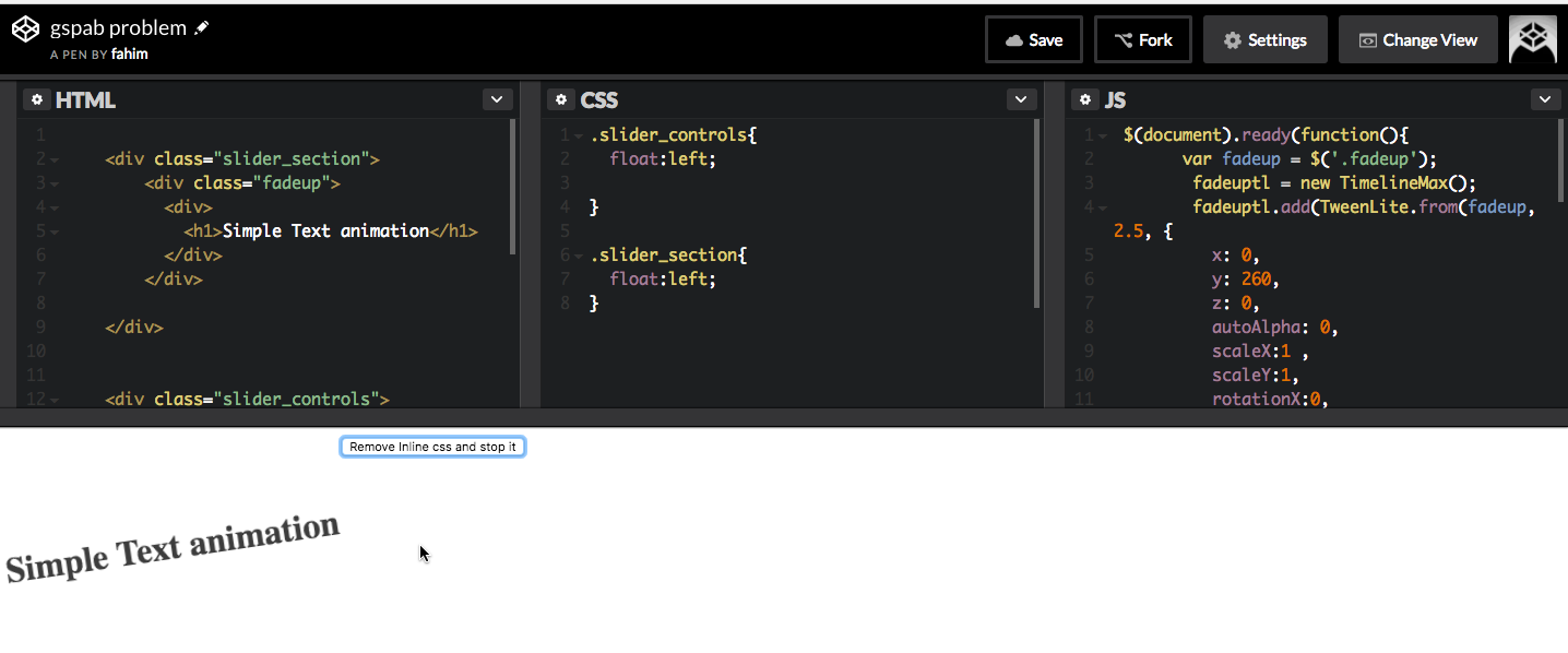
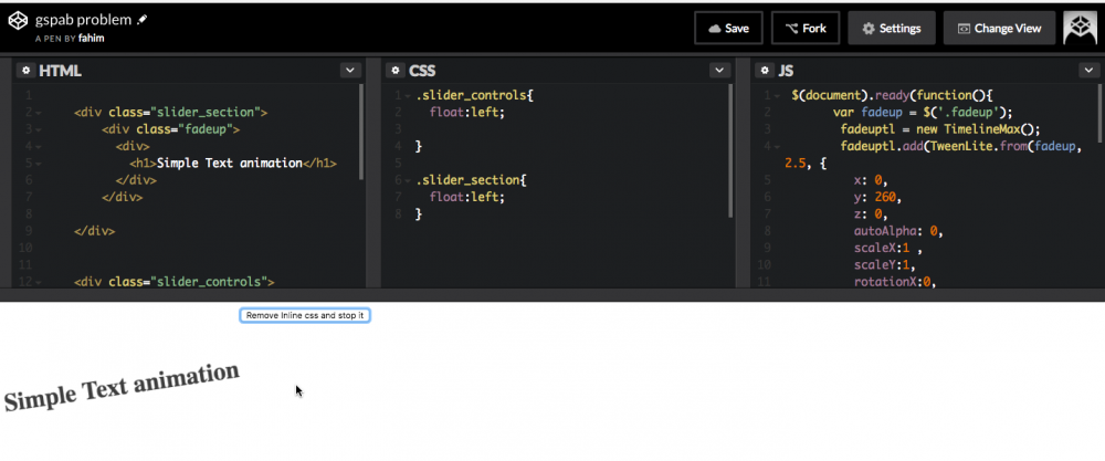
  13. Hi! I'm a little stuck on a little issue ? I am trying to make a simple responsive variable in a tween. At different screen sizes, the box needs to move up by varying amounts ( does not work with yPercent ) It was suggested somewhere on this forum that className would work for this, but the css values seem to 'cache' to whatever rules applied at the screen size on page load. i.e. On the codepen the red box should move to the top of the grey bar, and < 1000px turn black, > 1000px turn green. It does this if you run the pen at either size, but if you resize live the initial css value is always used. Is there an easy way around this? Or a simpler method? I also tried using modifier plugin, as suggested elsewhere, but had similar results ( I couldn't find the modifiers plugin js link to make another codepen, commented out in my demo ) I'm guessing some sort of destroy / rebuild the timeline on resize would do the trick, but would be nice if I didn't have to do that? ( maybe not relevant but I am attaching it to a scrollmagic scene, which triggers the shrink / expand nav logo on scroll ) Cheers Greensock you're awesome!
  14. Hi! Let's say I want to animate an SVG circle element. I can move it around by tweening its center (cx, cy), or its (x, y) coordinates. Is there a difference between these choices, e.g., in performance? I've read that tweening x and y is just sugar for doing a css translation, which is supposed to be GPU accelerated. (Indeed, a "translate" attribute gets added to the circle node.) On the other hand, tweening cx and cy makes it easy to work in absolute coordinates, whereas the coordinate system for x and y is relative to the element being animated (right?)... Matt
  15. Hi, I'm trying to animate the stdDeviation attribute of a svg filter, it's actually working when I inspect the element, it's updating the attribute, but the rendering is either very bad and slow (firefox) or not rendering at all (chrome). Are the browsers struggling to render properly an animated svg filter? the SVG filter (if stdDeviation="0 20" it works fine but if I animate the values it render very pourly) : <svg xmlns="http://www.w3.org/2000/svg" version="1.1" viewPort="0 0 500 300"> <filter id="blur" x="-50%" y="-50%" width="200%" height="200%"> <feGaussianBlur id="test" in="SourceGraphic" stdDeviation="0 0" /> </filter> </svg> the CSS : p { width: 50%; margin: 0 auto 50px auto; font-size: 35px; font-weight: bold; color: white; filter: url("#blur"); } and JS : let currentPixel = window.pageYOffset; const looper = function(){ const newPixel = window.pageYOffset; const diff = newPixel - currentPixel; const speed = diff * .1; const blur = speed < 0 ? speed * -1 : speed; //console.log(speed); //TweenMax.to($('.item-content'), .5, {skewY: speed + 'deg'}); TweenMax.to("#test", 0, {attr:{stdDeviation:"0 " + blur}}); //TweenMax.to("#test", 0, {attr:{stdDeviation:"0 " + blur * 2}}); currentPixel = newPixel; requestAnimationFrame(looper); } looper() Once again, GSAP seems to do the job properly, but the rendering on the screen is terrible. I might miss something very basic. If anyone has an idea,... Thank you
  16. Stagnax

    Invoking function on scrolling

    Hi, I was looking for animation on scrolling and i came across this So I played with it a little. I used scrollmagic to pin the layout during the duratoin of the box animation. So now i want to create similar animation timelines, with few changes. How do i put an individual timeline into a function and call it on scroll. Ive tried this syntax, but it doesnt seem to work : jQuery('.Screen').each(function () { var currentScreen = this; new ScrollMagic.Scene({ triggerElement: currentScreen, duration: 2000, offset: iScreenSize_H }) .on('start', function () { console.log(this.triggerElement().id); }).addTo(controller); }); Thank you .
  17. GreenHorny

    How Can I Achieve This Slide Effect?

    Hi, Anybody can help me achieve the slider effect this firm is using? antoni.de I am new to using greensock. Thank you in advance! GH
  18. In a project I'm doing, I need to match easing feel of elements animated using CSS cubic-Bezier timing function (example:cubic-bezier(0.1, 0.9, 0.2, 1) using tweenmax. Is this supported in GSAP ? I'm trying to avoid writing my own cubic-Bezier plugin if possible Thanks! Orry
  19. nmarketti

    Animating CSS Circles

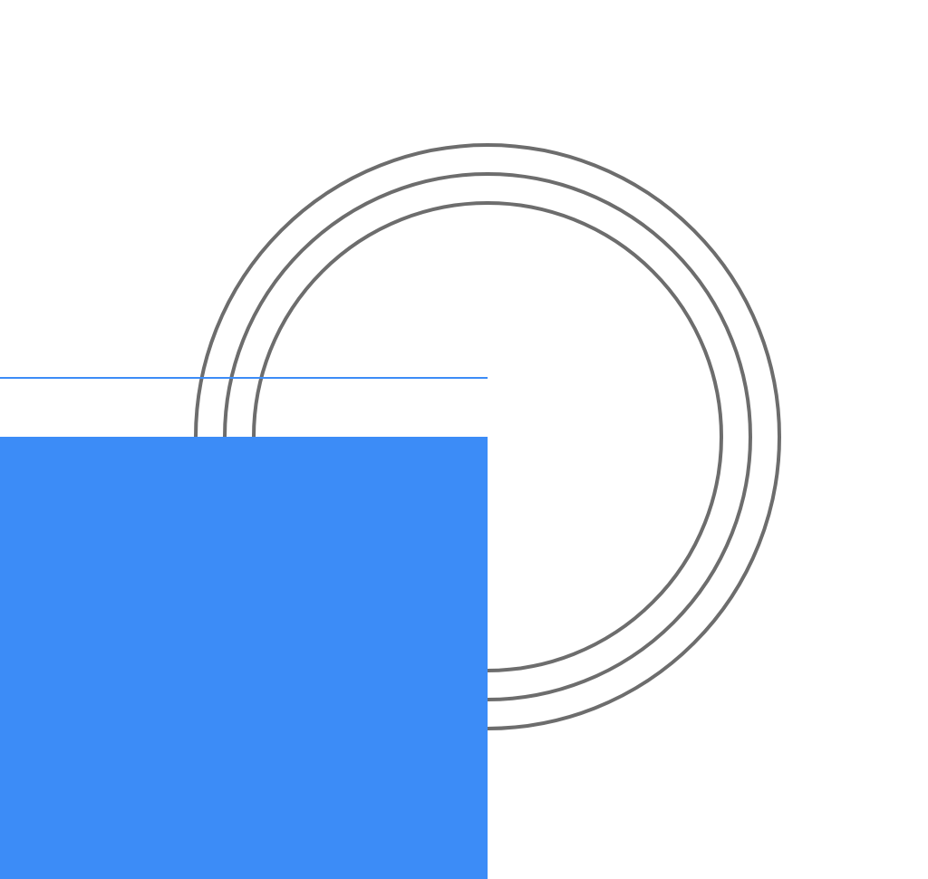
    I'm laying out ideas on how to approach an animation that will happen in multiple places across an entire site. While I know I could use DrawSVG...the way I developed these circles for each section was specifically for ease of control of the various sizes across sections, viewports, etc...so I opted for a circle created with straight CSS rather than SVG. Can you do a similar draw effect with the circles on CSS properties, without having to use SVG and DrawSVG?
  20. imkopkap

    How to make Website like this?

    I try to copy this website to study and I found that my fonts are not smoothly. I would like to gain your suggestion how to make website like this. Thank you, Kopkap. http://www.carlsberg.com/170/
  21. Mantvydas

    Radient Gradient Glow

    Hi guys, Sorry if this is not right question in this forum, but I hope you can help me. I need to achieve such nice gradient glow as in picture. I made this in photoshop and I tried to do same with CSS but I cant make it. With CSS you still can see edges of circle, I want it to fade 100%, like in picture. Also in picture center of the circle is more bright mine is all same. It is possible to make exactly same glow as in this picture? Or this is max what I can achieve with CSS? So maybe I can achieve this with GSAP? Thanks, Mantvydas
  22. Stagnax

    Revealing a background

    I am trying to reveal the black background only after the two red and blue canvases have completed the animation. But as you can see there is "leak" and the black ground is visible during the rotation. Also I'm learning to control overflow and have found this link https://stackoverflow.com/questions/8837050/allow-specific-tag-to-override-overflowhidden , but theres something I'm doing wrong . Please Help.
  23. Stagnax

    Perspective

    Hi, This is broad question. How can I create something like the pen i mentioned through GSAP. (A detailed explanation would be really helpful as I'm a noob) Thank you in advance.
  24. Stagnax

    Smooth Repeat Vertical motion

    Hi, How do I animate this ball up and down smoothly. I'm using fromTo but i don't know where to put "repeat:-1"
  25. Stagnax

    Draw svg

    Hello, I'm trying to use DrawSVG for the external border . As you can see I have 4 blocks that appear one by one . What I'd like to do is : As soon as the first block appears a border should start and complete its path as the last block appears I hope I'm clear what I want
×
×
  • Create New...