Search the Community
Showing results for tags 'transformorigin'.
Found 47 results
-
 Trying to basically "walk" a square across the screen the way you'd tip a heavy box across a room to move it. For it to work, I need to update the transform origin (i.e. rotation point) of the box for each step but since the origin is relative to the original box position, it doesn't quite work. Any thoughts on getting this to work? Currently I'm just using a div but I'm open to SVG solution.
 -
Hi, Firstly many thanks for taking a look at my query. I am getting inconsistent behavior on rotation of my clip path. Chrome and Safari are behaving correctly, but Firefox seems to be acting very strange. I would appriciate if someone could explain why. Many thanks ?
-
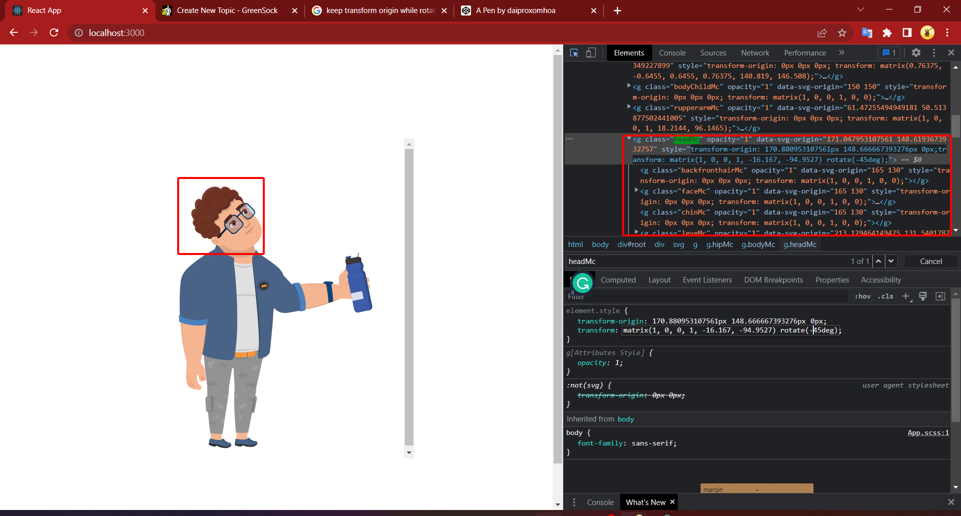
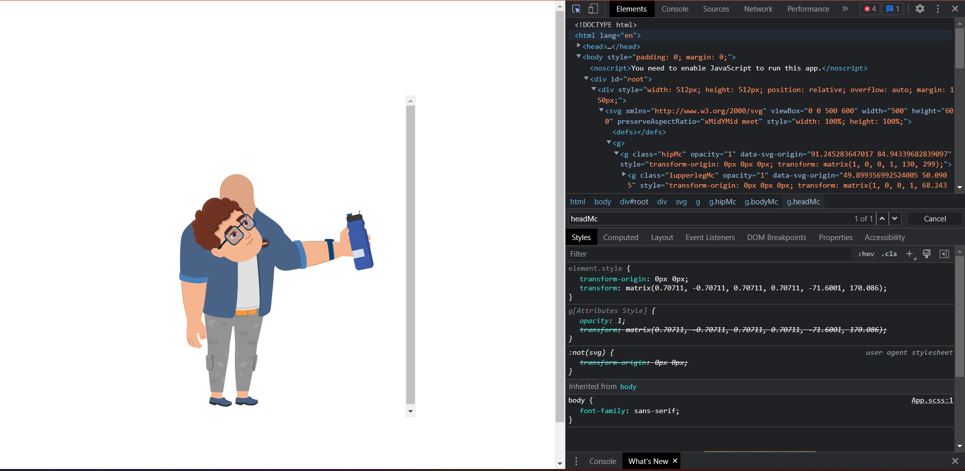
This is what i have when i rotate headMc by transform css. This is a result which I have when I use Gsap : gsap.set('.headMc', { transformOrigin: '170.880953107561px 148.666667393276px', rotation: -45 }); What I have to do to get the result when I use css like the first image; Link svg :

-
Hey folks! I'm having a problem with SVG transform properties using transform-box: fill-box Is possible to avoid the matrix calculation in the rect ? I created a Codepen example with three rects, the red use only css, the blue use a normal tween and the yellow one is crazy ? Thanks! ?
-
Hello Green Socks! I'm having a very confusing issue with an animation I'm doing, where the transform-origin seems to (sometimes) quickly flip to a value I have not defined anywhere. I recreated a super simplified version showing the issue. The codepen version for some reason does not have the issue(??) ** But it happens on my local machine and also on the server here >> https://vektor.co.uk/dev/gsap-debug/970x250--debug/ So the transform-origin should always be 50% 50%, but it quickly flips to '275px 0' before swapping back, this causes the image to jump around. I even added a 'set' to the start of the code, and also added it into the tween itself. it is also in the timeline 'defaults{}'. Can anyone shed some light on what is going on and how I can make sure the transform origin never changes? Is this a bug or does it make sense somehow? Cheers! p.s. loving V3! ??? ** EDIT: I have seen the issue happen on codepen if I open it in a window and refresh it enough times >> EDIT2: seems to be some sort of caching issue? Happens with devtools open or in new incognito window. But I don't think it's an issue of GSAP.js not loading quickly enough, as the animation starts with the image transformed, which is done via gsap code? (uses a 'from' tween which always shows up immediately). (It is going to be a google banner so assuming that most people will see it like this, on a 'first load' basis, if that makes sense)
-
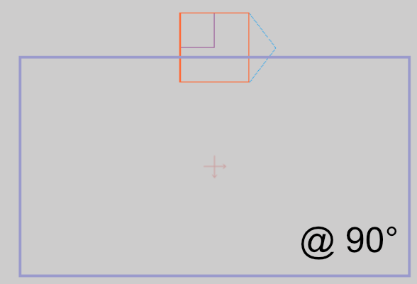
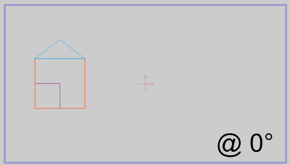
Hi. I am starting to go mad trying to resolve this, so I thought I would post a question here instead. I am try to implement a rotation such that everything on the page view box (the outermost group -- depicted by the purple outline) rotates about its pre-defined origin point (shown by the cross - located at 50% 50% of view port in this case, but could be anywhere). At present the resultant rotation is relative to the compound contents of the Group (i.e. all the House elements) -- spinning around itself , whereas I need it to be relative to the parent view box -- effectively spinning around a fixed point on the page. So... the outer Group element ('street' in my codepen example) needs to behave like a parent-filler rather than a child-wrapper, with the origin offsets relative to the parents offset and dimensions. Note: The content items can be arbitrary i.e. multiple houses, cars etc. (set by a user), and the content may also exceed the bounds of the purple view box. None of these factors should affect the pre-defined rotation origin of the 'street'. (start) (desired @ 90 deg)
-
 Hey GSAP enthusiasts, I have a problem with the following scenario: I have two image elements: .el { position: absolute; width: 100px; height: 100px; } .el1 { transform: matrix(1, 0, 0, 1, 100, 100); } .el2 { transform-origin: 0 0; transform: matrix(0, 1, -1, 0, 400, 100); } The second element "el2" has an initial rotation applied and also the transformOrigin set. Now I use gsap to animate both elements like this: gsap.to('.el', { delay: 2, repeat: -1, yoyo: true, transformOrigin: '50% 50%', scale: 2 }); When running in the browser I see the second element "el2" making a jump to the right, before the animation starts. I know that it's not the best practice to set transforms/origin in CSS instead of initialising these properties via gsap.set(...). But in my scenario the code (Markup and CSS) is being generated, so I don't have control over it. Is there anything I am missing or is this an unsupported edge case? (Not 100% sure if this comment might be related: ) Thanks in advance and keep up the amazing work. (BTW: loving the new ScrollTrigger :)
 -
Ok, so here are 2 almost identical tweens. Both initially set transformOrigin of bars to bottom-center. The first one uses gsap.from() and it works weird, looks like it's some bug (or perhaps I miss something?) The second one is almost the same, but it uses gsap.to() and transformOrigin seems to work fine. What could be the reason for such behaviour?
-
Hello GreenSockers, You guys are so awesome and thank you for providing this platform. Today, I saw this beautiful accordion animation https://uimovement.com/design/beaches-app/ and I want to create the same effect using GS. Is it possible to create this effect using in GS? Thanks in advance.
-
Hi, So this is a simple rotation animation that works well on all browsers but Safari. Can't figure out why this is happening. Any ideas? (Chrome for desired results, Safari for wrong ones) Thanks!
-
 I'm at a loss. I cannot replicate this issue in a CodePen so sorry in advance. Here's what I have: var aiAnimations = (function () { function init() { TweenMax.set('.ai-hero__flare', { opacity: 1, transformOrigin:'50% 50%'}) TweenMax.from('.ai-hero__flare', .7, { scale: 0, ease: Power3.easeOut }) } return { init: init, }; })(jQuery); $(document).ready(function () { aiAnimations.init(); }); The output is: element { transform-origin: 0px center 0px; opacity: 1; transform: matrix(1, 0, 0, 1, 0, 0); } I cannot figure out what is going wrong with transformOrigin. I'm loading GSAP v: 2.0.2 via NPM and am compiling via Gulp. If I remove the line with transformOrigin nothing shows up for transform-origin inline, so it's not being overwritten elsewhere. Any ideas? I can set the transform-origin in my CSS, but I'd rather control it via GSAP. Thanks, Ryan
 -
I am unable to get the transformOrigin property to be centered within the object. It is being set to 0px 0px regardless of whether I have a 'transformOrigin' property defined or not. The codepen illustrates this issue: https://codepen.io/ron-itelman/pen/xzqMWN?editors=1010

-
Hey guys, so i am wondering how i can animate my svg? It is only the second time i am doing this only this time it wont work. If i place in the css for instance : opacity:0; this will work. When i use .from opacity or autoAlpha:0 nothing happens. I also used transform origin in the inline style, that also works. What is wrong? Also no console errors in the browser. Would like to animate them so they look like a bar graph Thanks allot in advance
-
 Hi, I'm getting more and more familiair with GSAP and JS, but I'm only diving in to it since last week. Now I was playing around with the TweenMax.ticker and mousemove event based on: But I got stuck on trying two things: 1)move SVG paths in the same way as the circle element; I did get the rect element to work by changing the cx and cy into x an y, but I don't know how to interpret this with a path position, since the ticker event does not seem to work if I give the SVG group tag an id. 2)I attached a codepen sketch based on the pen from Blake Bowen; as you can see I simply added a timeline to rotate one of the elements. Now I want this to keep on rotating around the origin value of the element, but this doesn't happen. The origin point stays on the begin value of the element (which is the top left corner) and does not move accordingly to the mouse position. Initially I want to be able to do: 1)move SVG paths based on mouse position 2)know how to apply more than the change of position accordingly Can anyone help me? Please let me know if my question is unclear. Thank you in advance!
 -
Greetings GSAP community, I'm having some trouble getting an SVG origin to center. Please see the Codepen, there is not much else to explain. Thanks in advance for any help. ~Jareth
-
Hi, I need to scale a polygon so that its "width" goes to zero. In the codepen its the pink element. It seems like the scale animation makes it rotates. I've included a blue rect who works perfectly. Is it normal behavior or did i miss something ?
-
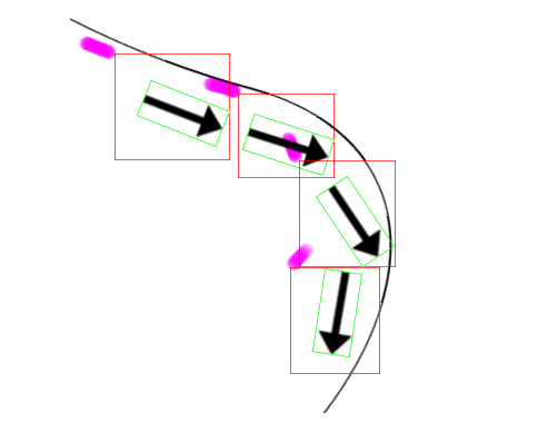
Hello great almighty GSAP forum, here I am with another question I'm having. Goal create some sort of traveling trail emitter that follows the object and being manipulated by scroll event. Also everything is responsive, relative to the SVG size.Progress/ attempts Got most parts working, however there're a few visual things I just can't figure out. I've tried manipulating x,yPercent, transformOrigin, svgOrigin on the <image> tag inside the <svg> Help needed I'd like to know how to make the image's transform origin to the tip or tail of the arrow how to properly adjust the emit position so it sync with the arrow tail.. Actual travelling route doesn't have to follow the predefined path strictly, it's more important getting the emitter right. I don't know how autoRotate works under the hood, by the look of the relationship between particle and the arrow position, seems like a "invisible bounding box" is created, and the arrow rotate inside the box, and the box takes on the bezier curve data. Question outside of this topic Why isn't <image> tag visible on Safari, let alone IE?? The emitted particle shows on Safari but seems the percentage position is way off? Seems like line 48-51 behave differently on Safari. Added on 19th of April To answer my own question for peoples reference. <image> tag needs an inline width and height attribute in browsers other than Chrome, somehow other browser can't take the CSS and apply it to <image> tag within svg; Thanks a lot!

-
Hi all, I use TweenMax to try a animation bouncing down a image. The problem is when I using transformOrigin attribute ( transformOrigin:"bottom" ), the image do not scale rightly. I want the image scale from top to bottom. Can you tell me the solution for this problem? Sorry for my English. //here is svg circle. It's work normally var duration = 3; var tl = new TimelineLite({delay:0.2}); CustomBounce.create("myBounce", {strength:0.01, squash:2}); tl.to("#ball", 2, {y:200, ease:"myBounce"}) .to("#ball", 2, {scaleY:0.7, scaleX:1.1, ease:"myBounce-squash", transformOrigin:"bottom"}, 0) // Problem here, when I replace circle by an image. the transformOrigin bottom no working var tl2 = new TimelineLite({delay:0.2}); CustomBounce.create("myBounce2", {strength:0.01, squash:2}); tl2.to("#burger", 2, {y:200, ease:"myBounce2"}) .to("#burger", 2, {scaleY:0.7, scaleX:1.1, ease:"myBounce2-squash", transformOrigin:"bottom"}, 0)
-
 CodePen should demonstrate the issue I am facing. Clicking on RED should ideally rotate the "+" sign into an "x" sign by applying "rotation":45. However, this rotation must be done alongside changes in inherited height, which, as you can see, totally disturbs the rotation matrix. I am expecting the scale of the icon to change with relative box-position unchanged, i.e. the center of the icon as per transformOrigin property should stay the same relative to the parent box. Any help would be appreciated!
 -
Hi guys, I am trying to use the Attribute Plugin to ensure that my SVG also animates in Firefox, but can't figure out the correct syntax for this: .fromTo("#star",1, {attr:{transform:"scale(0.2)"}},{attr:{transform:"scale(1)",transform:"rotate(360)"}}) The issue: This above code ignores the fromTo scale tween completely and just rotates the SVG and this gives me a syntax error: .fromTo("#star",1, {attr:{transform:"scale(0.2)"}},{attr:{transform:"scale(1)","rotate(360)"}}) All I want to do is scale up and rotate the star at the same time from transformOrigin:"50% 50%". I tried that as well as transform-origin:"center center" inside the Attr plugin with no luck. Thanks!
-
Sunday night, I could be doing so many things other than breaking Jack's toys couldn't I? Well, I am that boring sometimes. Sorry Jack. So, the combo that caused the weirdness is CustomBounce + percentage base movement + transformOrigin in a shape element of an SVG. As you will see in the pen (at least in Chrome), the element gets moved to the 0,0 position according to the transformOrigin you define. Not something desirable if you're trying to squash an element.
-
Can anyone give me a clue as to why IE9 is rotating my SVG files differently than all other browsers? TransformOrigin doesnt seem to work the same (I have tried, %, pixels, and top), and it is going in different directions. The CodePen link should show the 3 lettter "A"s pointing to the left. But in IE9, they get squished and point down after a TweenMax.set call. Any thoughts? Thanks very much. Also posted here in case CodePen doesnt allow IE9 viewing: http://brendyn.com/test2/
-
 Hi, Is it possible to make an element that has a transform origin set to 'top left' rotate (using Draggable rotate) around the element's center, as if the transform origin was originally set to 50% 50%? I was thinking perhaps to temporarily changes the transform origin yet keeps the element in the same position in the onDragStart event and in the onDragEnd event to restore the 'top left' origin, is that possible? Thanks, Elior
 -
In the first lines of JS i´m doing: TweenMax.set(".big-flipper", { transformOrigin:"75px 0px -37.5px", }); Gsap is not applying the z value, when i inspect the element with google Dev tools the z value always becomes "0" no matter what value i use: transformOrigin:"75px 0px 0px", .... cheers
-
In the linked codepen (http://codepen.io/anon/pen/JXeoYy?editors=1010), I would expect the image to move across the screen smoothly over 5 seconds, instead it jumps as though the transformOrigin values are not being tweened. Why is this, and how can I fix it? (Also, it doesn't seem to work at all in Firefox...)