

Welcome! In this article we’re going to cover GSAP's core fundamentals and animate some HTML elements. If that’s not your end goal, don’t worry. Whatever you plan to animate, whichever framework you use - the techniques and principles covered here will serve you well.
If you just want to jump in, here are some handy links.
- Full documentation
- GSAP cheatsheet
- CodePen starter template
- Installation guide.
Still with us? Wonderful, let's get started!
What is "GSAP"?
The GreenSock Animation Platform (GSAP) is an industry-celebrated suite of tools used on over 11 million sites, including more than 50% of award‑winning ones! You can use GSAP to animate pretty much anything JavaScript can touch, in any framework. Whether you want to animate UI, SVG, Three.js or React components - GSAP has you covered.
The core library contains everything you need to create blazing fast, cross-browser friendly animations. This is what we'll be stepping through in this article.
In addition to the core, there are a variety of plugins. You don’t need to learn them in order to get started, but they can help with specific animation challenges like scroll based animation, draggable interactions, morphing, etc.
See an overview of the available plugins.
Creating an animation.
Let's start by animating an HTML element with a class of "box".
gsap.to(".box", { x: 200 })
A single animation like this is called a 'tween'. This tween is saying "hey GSAP, animate the element with a class of '.box' to an x of 200px (like transform: translateX(200px))".
Let's take a closer look at the syntax.
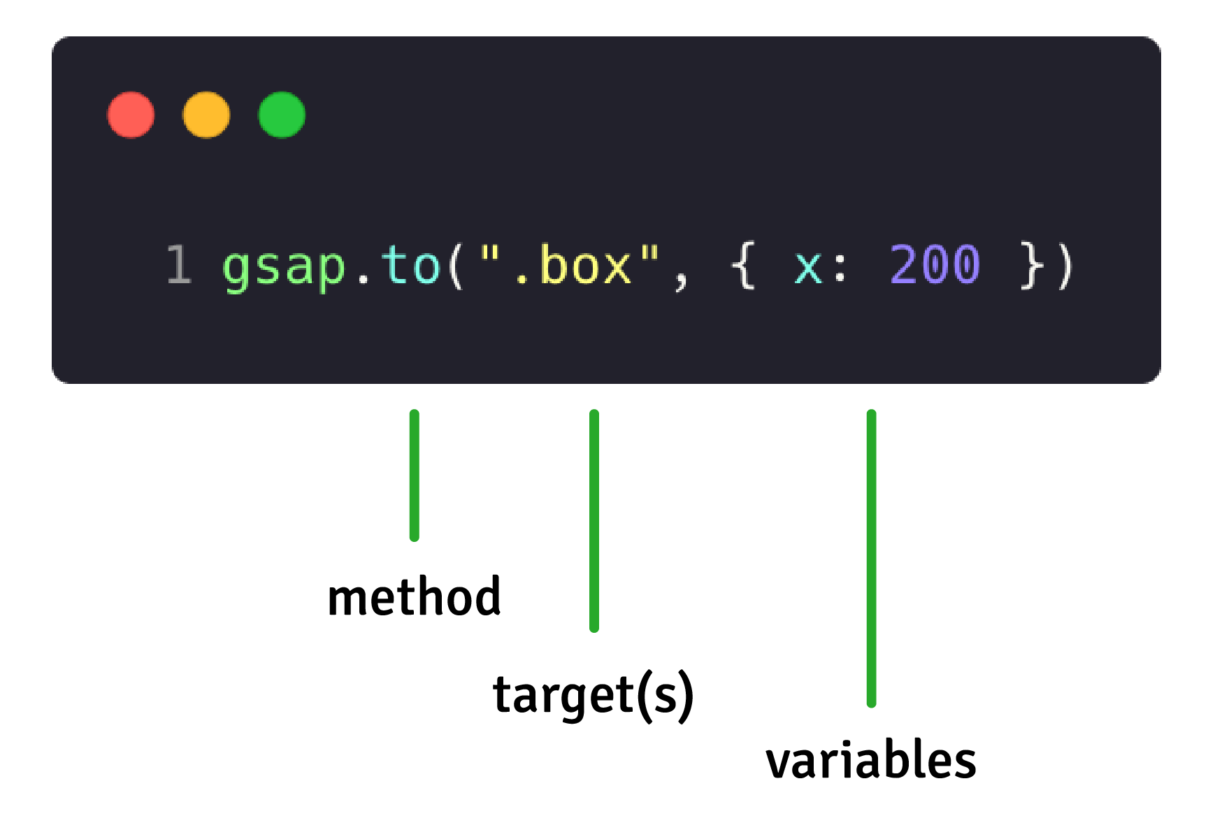
We've got a method, a target and a vars object which contains information about the animation
The method(s)
There are four types of tweens:
gsap.to() - This is the most common type of tween. A .to() tween will start at the element's current state and animate "to" the values defined in the tween.
gsap.from() - Like a backwards .to() where it animates "from" the values defined in the tween and ends at the element's current state.
gsap.fromTo() - You define both the starting and ending values.
gsap.set() - Immediately sets properties (no animation). It's essentially a zero-duration .to() tween which can be reverted.
Let's look at them in action!
The target (or targets)
Next up we have to tell GSAP what we want to animate. Under the hood GSAP uses document.querySelectorAll(), so for HTML or SVG targets we can use selector text like ".class" and "#id". Or you can pass in a variable or even an Array.
// use a class or ID
gsap.to(".box", { x: 200 });

// a complex CSS selector
gsap.to("section > .box", { x: 200 });

// a variable
let box = document.querySelector(".box");
gsap.to(box, { x: 200 })

// or even an Array of elements
let square = document.querySelector(".square");
let circle = document.querySelector(".circle");

gsap.to([square, circle], { x: 200 })
The variables
The vars object contains all the information about the animation. This can be arbitrary properties you want to animate, or special properties that influence the behavior of the animation - like duration, onComplete or repeat.
gsap.to(target, {
  // this is the vars object
  // it contains properties to animate
  x: 200,
  rotation: 360,
  // and special properties
  duration: 2
})
So what properties can I animate?
GSAP can animate almost anything; there is no pre-determined list. This includes CSS properties, custom object properties, even CSS variables and complex strings! The most commonly animated properties are transforms and opacity.
Transforms are a web animator's best friend. They can be used to move your elements around, scale them up and spin them around. Transforms and opacity are also very performant because they don't affect layout, so it's less work for the browser.
The first tween we looked at was using x: 200 to move the element along the horizontal axis
When possible, use transforms for animation rather than layout properties like "top", "left" or "margin". You'll get smoother animations!
Transform shorthand
You may be familiar with transforms from CSS:
transform: rotate(360deg) translateX(10px) translateY(50%);
GSAP provides a shorthand for transforms. The previous line of CSS would be written like so.
{ rotation: 360, x: 10, yPercent: 50 }
Here's a handy chart with some of the most commonly used transform values.
| GSAP | CSS | Explanation |
|---|---|---|
| x: 100 | transform: translateX(100px) |
Move horizontally (px or SVG units) |
| y: 100 | transform: translateY(100px) | Move vertically (px or SVG units) |
| xPercent: -50 | transform: translateX(-50%) | Move horizontally (percentage of element's width) |
| yPercent: -50 | transform: translateY(-50%) | Move vertically (percentage of element's height) |
| rotation: 360 | transform: rotate(360deg) | Rotate (degrees) |
| scale: 2 | transform: scale(2, 2) | Increase or decrease size |
| transformOrigin: "0% 100%" | transform-origin: 0% 100%; | The center of translation, this will rotate around the bottom left. |
View all the shorthand transforms...
| rotationX: 360 | transform: rotateX(360deg) |
| rotationY: 360 | transform: rotateY(360deg) |
| skewX: 45 | transform: skewX(45deg) |
| skewY: 45 | transform: skewY(45deg) |
| scaleX: 2 | transform: scaleX(2) |
| scaleY: 2 | transform: scaleY(2) |
The best way to learn is by experimenting. This demo below is a live code playground, go ahead and tweak the values to make the box move!
By default GSAP will use px and degrees for transforms but you can use other units like, vw, radians or even do your own JS calculations or relative values!
x: 200, // use default of px
x: "+=200" // relative values
x: '40vw', // or pass in a string with a different unit for GSAP to parse
x: () => window.innerWidth / 2, // you can even use functional values to do a calculation!

rotation: 360 // use default of degrees
rotation: "1.25rad" // use radians
What else can I animate?
Pretty much anything - If you’re not sure, give it a try!
CSS properties
Transforms, colors, padding, border radius, GSAP can animate it all! Just remember to camelCase the properties - e.g. background-color becomes backgroundColor.
Although GSAP can animate almost every CSS property, we recommend sticking to transforms and opacity when possible. Properties like filter and boxShadow are CPU-intensive for browsers to render. Animate with care and make sure to test on low-end devices.
SVG attributes
Just like HTML elements, SVG elements can be animated with transform shorthands. Additionally you can animate SVG attributes like width, height, fill, stroke, cx, opacity and even the SVG viewBox itself using an attr object.
Any numeric value, color, or complex string containing numbers
GSAP doesn't need DOM elements in order to animate properties. You can target literally any property of any object, even arbitrary ones you create like this:
let obj = { myNum: 10, myColor: "red" };
gsap.to(obj, {
  myNum: 200,
  myColor: "blue",
  onUpdate: () => console.log(obj.myNum, obj.myColor)
});
In the demo below we have a box drawn with HTML canvas. We're animating x and y values stored in a position object and then we update the canvas on each tick of the animation. GSAP is often used this way to animate in Three.js, HTML canvas and Pixi.js:
Special Properties
To adjust how a tween behaves we can pass in some special properties. In fact, we've looked at one already - duration.
You can check them all out in our documentation, but here are some of most common ones.
| Property | Description |
|---|---|
| duration | Duration of animation (seconds) Default: 0.5 |
| delay | Amount of delay before the animation should begin (seconds) |
| repeat | How many times the animation should repeat. |
| yoyo | If true, every other repeat the tween will run in the opposite direction. (like a yoyo) Default: false |
| stagger | Time (in seconds) between the start of each target's animation (if multiple targets are provided) |
| ease | Controls the rate of change during the animation, like the motion's "personality" or feel. Default: "power1.out" |
| onComplete | A function that runs when the animation completes |
Let's look at some of these in more detail...
Repeats and alternating repeats
repeat does exactly what you might think - it allows you to play an animation more than once. repeat is often paired with yoyo in order to reverse the direction each cycle. Change the code to yoyo:false in the demo below to see the difference.
Do you want your animation to repeat infinitely? No problem! Use repeat: -1
Delays
You can delay the start of an animation by a certain number of seconds. You can also use repeatDelay to add a delay to the start of any repeat iterations.
So far so good. But... these animations aren't very exciting yet. Easing to the rescue!
Easing
Easing is possibly the most important part of motion design. A well-chosen ease will add personality and breathe life into your animation.
Take a look at the difference between no ease and a bounce ease in the demo below! The green box with no ease spins around at a consistent speed, whereas the purple box with the 'bounce' ease revs up, races along and then bounces to a stop.
gsap.to(".green", { rotation: 360, duration: 2, ease: "none" });

gsap.to(".purple", { rotation: 360, duration: 2, ease: "bounce.out" });
Under the hood, the "ease" is a mathematical calculation that controls the rate of change during a tween. But don't worry, we do all the math for you! You just sit back and select the ease that best fits your animation.
For most eases you'll be able to specify a type. There are three types of ease: in, out and inOut. These control the momentum over the course of the ease.
ease: "power1.in"
// start slow and end faster, like a heavy object falling

ease: "power1.out"
// start fast and end slower, like a rolling ball slowly coming to a stop

ease: "power1.inOut"
// start slow and end slow, like a car accelerating and decelerating
Ease out animations like "power1.out" are the best for UI transitions; they're fast to start which helps the UI feel responsive, and then they ease out towards the end giving a natural feeling of friction.
Staggers
This is one of our favourite tricks! If a tween has multiple targets, you can easily add some delightful stagger between the start of each animation:
You can even stagger items that are laid out in a grid just by telling GSAP how many columns and rows your grid has!
Staggers are totally configurable and SUPER powerful - more information here.
Sequencing animations
Just like we've just seen with staggers, It's common to animate more than one thing. But what if we need more control over the order and timing of those animations. Delays give us rudimentary control:
But this method of sequencing animations is a little fragile. What happens if we lengthen the duration of the first tween? The second and third tweens have no awareness of this change, so now there's an overlap - we'd have to increase all of the delays to keep them synchronized. Frustrating? Yep. That's why we created timelines!
Timelines
Timelines are the key to creating easily adjustable, resilient sequences of animations. When you add tweens to a timeline, by default they'll play one-after-another in the order they were added.
// create a timeline
let tl = gsap.timeline()

// add the tweens to the timeline - Note we're using tl.to not gsap.to
tl.to(".green", { x: 600, duration: 2 });
tl.to(".purple", { x: 600, duration: 1 });
tl.to(".orange", { x: 600, duration: 1 });
Timelines are one of the most important GSAP concepts to wrap your head around. In the next article we cover how to position tweens on a timeline to precisely choreograph your motion and then control the entire sequence as a whole.
Your animation superpowers are about to get a serious boost...
Read the next article >>
-
 8
8
-
 6
6
-
 2
2


.jpg.c1693021788ceda64cca1ccf202d1f9c.jpg)

.png.66d4b2c3108352e904e85f2388f8f016.png)


Recommended Comments
Create an account or sign in to comment
You need to be a member in order to leave a comment
Create an account
Sign up for a new account in our community. It's easy!
Register a new accountSign in
Already have an account? Sign in here.
Sign In Now