hightwo
hightwo's Achievements


-
Thank you Jack for the improvements! Didn't know, that I can gsap.set an entire array saves some work! Basically it's the same approach, right? Updated the code in my project and now it seems to work on Desktop-Safari as well ? However not always 100% correct on my iPhone (6s, Safari, Firefox or Chrome). The first time scrolling down the first time (keeping finger touched) the image is not displayed completely and I can see the second one below. Jumps to normal state after a sec or so. Same on Android. After some slow up and down scrolls it seems to work. Could this be an issue with the bottom nav bars in mobile browsers, which disappear on scroll? Or maybe some willchange: transform or anticipate pin?
-
Just saw, that it doesn't work on mobile neither... so I'll try to find another approach.
-
Hi Greensockers! Do you know, why this works in Firefox and Chrome but not in Safari? Most probably my code will seem too complicated (as always)... but I try to explain my goal (as always : - In a longer page, I would like to one "revealbox" or more. Each of them containing an arbitrary number of images. - They should be revealed one after the other, while they are pinned. - The crux is, that all images may have different heights (please try the pen with different viewport ratios) All the demos that I found just put a given number of 100vh-divs on top of each other with position: absolute. This is clear. First I tried to solve it in a similar way with a timeline, but got confused with calculating the durations and positions in the timeline for each image (given the fact that they may have different heights). So I ended up with this solution, which seem to work in Firefox and Chrome, but not in Safari. If you know some other demo that would address my idea or suggest a better approach at all, you're welcome! Thanks!
-
Works like a charm! ? Thanks for the CSS and the explanation. Gives me a little bit more understanding of how ScrollTrigger works.
-
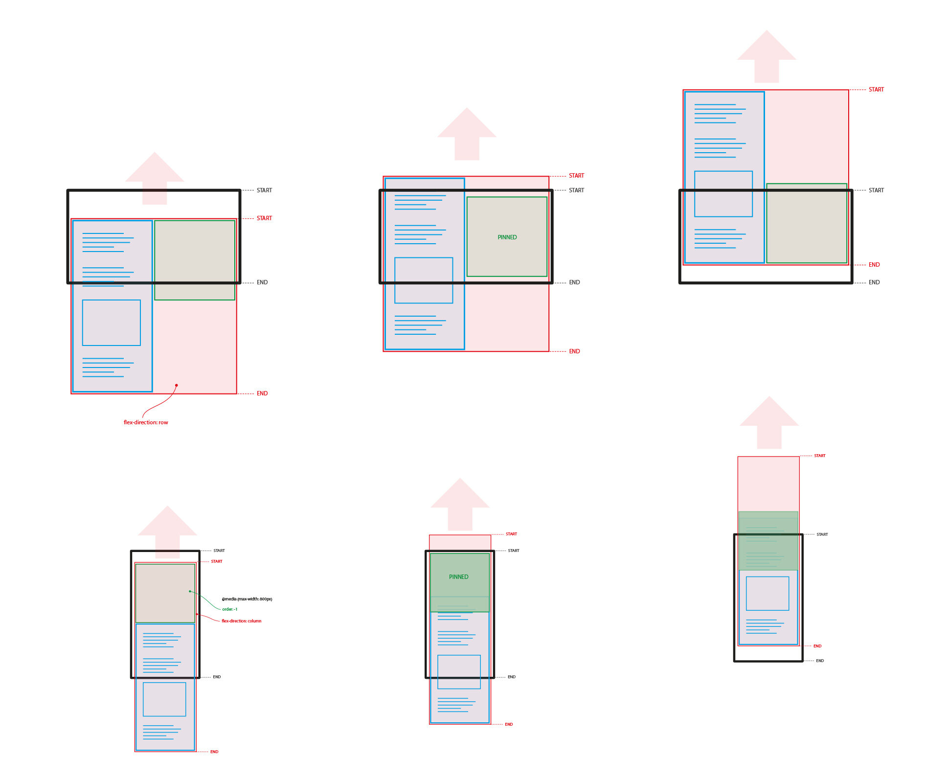
Hi Cassie, thanks for your reply! Does my drawing here explain better? With the media query I just change flex-direction and place the green box on top. The red div is always the trigger, and the green div is always pinned. Start: "top top" and end: " bottom bottom" also remains the same. So in my opinion the Scrolltrigger should work the same way on both...
-
Thanks for the quick reply, Jack! No, it the fixedElement should be pinned on any width. So I don't think matchMedia helps. Simply the flex-layout should be switched on smaller widths. I updated the pen. There's now a second element .wrapperNoScrollTrigger below (which is not targeted by the scrollTrigger). Here the two flexboxes switch position as expected and the one I aim to pin sits on its correct position. However I can't figure out, why the ScrollTrigger does not work correctly... it doesn't look that complex to me. (Well honestly I assume that it does work correctly but that there's an issue with the layout) https://codepen.io/hightwo/pen/YzxjjzO Thanks!
-
Hey GreenSocks! I have a wrapper with two elements in a row with flexbox. On widescreen one should be pinned while the other scrolls. This works. On smaller screens flex-direction: column is set on the wrapper and order: -1 for the fixedElement, because this should always be the upper one. Without any JS this layout works as expected. But together with the scrollTrigger something goes wrong with the heights on smaller screens. Do I have to take care about something with flex, order and scrolltrigger? Or are there simply some heights missing. Thanks!
-
Improvement with aspect-ratio: 1. calculate the aspect-ratio for each slide (slide.width / slide.height) 2. find the maximum (instead of the minHeight) 3. set the slideshow-containers aspect-ratio to the maximum Now the everything is settled at the beginning and window.onresize is not required anymore. So, once again thanks for your inputs. Some thoughts later they proved to be helpful! ?
- 7 replies
-
- 1
-

-
- scrolltrigger
- fade
- (and 2 more)
-
I played around with all variations of divs with background-image, background-fit etc. Nothing really served my desired behavior. So I'll stick with object-fit. Did some minor improvements in the JS, but the fadeTL.scrollTrigger.refresh did help a lot. Had to add one more div (.imgcontainer), because if the trigger is the same element that I'm changing the height on (.fadebox), this doesn't work. https://codepen.io/hightwo/pen/ZEJaddW Yes, I know... still looks overengineered Thanks!
-
Yes, I fully agree, that it would be favorable to stick with CSS for the layout. That's why the issue left me confused in the end (maybe I am really thinking too complicated ). Aspect-ratio is a good point. Will keep it in mind. Sure super-pano images make no sense 100% width on a phone screen. But the three images I used in my sketch in the initial post could be a case. All three are landscape but not exactly the same ratio. Now I could use a 16/9 aspect-ratio... but on three more or less square images I would cut off much of the images. I thought object-fit, object-position does more or less the same like background-size. Seems I need to catch up some basics here. And calling refresh after the resizing is a good hint! Thank you both very much for your quick replies and the ideas! ? I think for the moment they will be good inputs for me to carry on. I will update my result here.
- 7 replies
-
- 1
-
-
- scrolltrigger
- fade
- (and 2 more)
-
Thanks for you quick reply, Jack! The reason is, that it would like to use it for any set of images (except portrait ones). This means I do not know the size of the image in advance. The landscape ratio could be slightly different. Maybe a set of panorama images, maybe a set of nearly square images. And I would like to "cut" off as little as possible from the images. > Regarding backgroud-image: Then it's not real "part" of the sites content, right? More kind of decoration. > Your question makes me think of an alternative: Reading the heights of the images when selecting them in the editor that I would like to provide for this as back-end later on. Finding the smallest height and set it to the div during the creation of the site. > However: To me it seems that should be a rather simple layout task and at least without scrolltrigger the approach basically works (although I am not sure if it is recommended). The scrolltrigger then somehow seems to interferes with setting the height. Thanks!
-
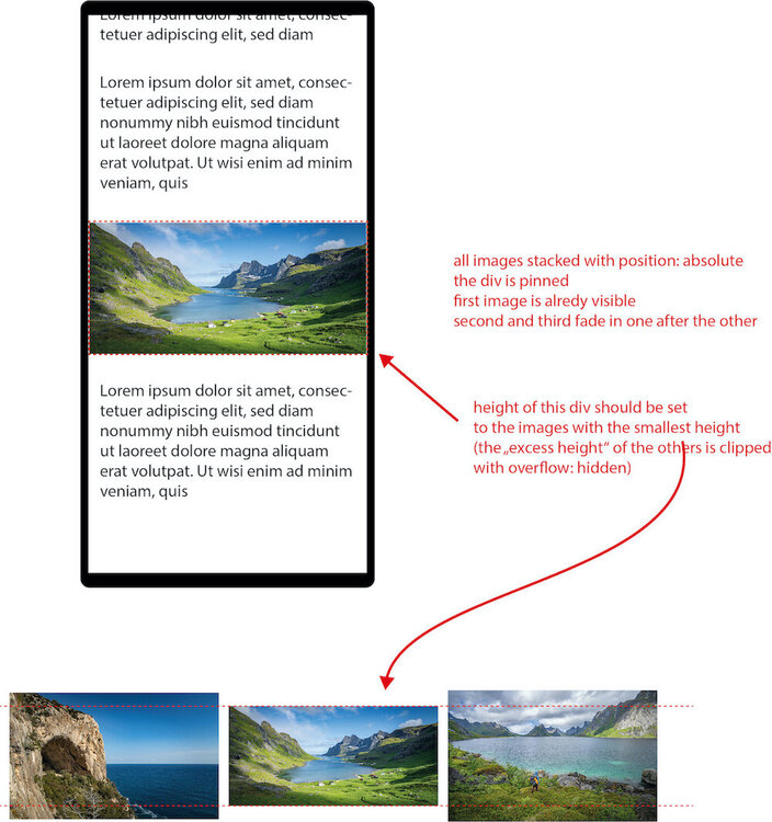
Hi there! I would like to have a pinned section with images on my page. Using scrolltrigger they should fade in one after the other. If I have a mobile viewport and three images, all landscape but with slightly different ratios I want the container to be the height of the smallest image. The other two being too big, can be clipped with overflow: hidden. On landscape viewports max-height should be 100vh. I am struggling when and where to find out about the height of the smallest image and set it to the container. My thoughts so far: - I have to wait until the images are loaded (> window.onlad) otherwise clientHeight is 0 - If I use the container as trigger, I cannot change the height anymore - so I tried to include putting also the Scrolltrigger into the window.onload However this does not resize correctly when resizing from super landscape back to portrait viewport ... and above all I expect that this is not the best option at all Glad about your inputs! Thanks!
-
Many thanks @GreenSock for optimizing the initial idea. I updated your advice to my project and it works as expected ?. I also tried @akapowls suggestion of tweening the container itself using scrollWidth. Works well too ?. So for this issue I really thank you guys providing not just one solution, but two I will continue with tweening the container as this seems a little simpler and does the job. Anyway checking both solutions definitely improved my understanding of GSAP and how to combine it with different values and functions. You may consider it as solved and I'll be happy to bother you with more GSAP questions in the future as my project continues. Thanks!
-
Thanks @akapowl for the alternative approach. If it works in the end I don't care what to tween Many thanks for your advice on "forEach-ing" the whole thing. Just tested the pen in Chrome, Firefox and Safari. Seems to work as expected ? (apart from overflow-x: hidden on the body... somehow Safari behaves different here ?) What I am wondering: Does this work now without the resfreshInit eventListener that we had in the first example? ScrollTrigger.addEventListener('refreshInit', getTotalWidth); I will try it it my project and test it in the next days.
-
Hi @akapowl, thanks for the follow-up. Meanwhile I played around a with the code in VS Code and different browsers... mainly figuring out how to use this code for more than one horizontal slider per page... any hint appreciated I didn't find a good starting point yet. And I discovered some other issues: Interesting. For me it doesn't ? I just figured out, that overflow-x: hiddenin the body works as expected in Firefox and Chrome, but not in Safari. Thanks for the hint. Eases are clear so far. By the way: cool thing that possibilities for the eases are almost limitless in GSAP. What I found out when running this piece in VS Code (outside codepen): Resizes in horizontal direction are handled as expected, but not, when I resize the browser in it's height (vertically). Reducing the height leaves some white space right of the images (of course, they are getting smaller) If I then resize it horizontally, it is calculated correctly again.