

Norfeldt
Content Type
Profiles
Forums
Store
Blog
Product
Showcase
FAQ
Downloads
Posts posted by Norfeldt
-
-
5 hours ago, Rodrigo said:
Welcome to the GreenSock forums and Happy New Year!!!
Thanl you very much and I wish you a happy new year as well ?
5 hours ago, Rodrigo said:I actually never dealt with something that specific such as checking for a single value in such way. When dealing with TDD I try to keep GSAP instances out of it because is not actually that trivial to do it. Keep in mind that React is basically used to create UI's, hence any TDD using it should consider that there is an effect to any update in the app state that can be checked. In this particular case you're checking an attribute of an SVG element so you can use the
toHaveAttributeexpectation given by jest-dom, all you have to do is query the target element and check the attribute value.I tried the
.toHaveAttributeon thefill-opacityin order to check if it was visible and also read thexvalue (to check if it was moving to the right side - not checking how much it moved). But it did not work..5 hours ago, Rodrigo said:Also in your code you have this for the initial set up:
{
  value = false,
  onClick,
  scale = 1,
  radius = 16,
  length = 120,
  borderWidth = 1,
  borderColor = '#333',
  knobColor = '#c0c0c0',
  onBackgroundColor = '#228b22',
  hasBoldText = false,
  onTextColor = '#ffffff',
  offBackgroundColor = '#b22222',
  offTextColor = '#ffffff',
  duration = 0.5,
  style = null,
}
And this for rendering the text element:
<text
  ref={onTextRef}
  id="on-text"
  x={-(length * 0.5)}
  y={radius * 1.42}
  fill={onTextColor}
  fontSize="20"
  fontWeight={hasBoldText ? 'bold' : 'normal'}
  stroke={borderColor}
  strokeWidth={borderWidth / 2}
>
  OPEN
</text>
So the initial position is
-(length * 0.5)and that is -60. Nowhere in your code I see anything that changes the initial position ofonTextRefto a positive value.The change is done in
useEffect()... const onPosition = { x: 0 } const offPosition = { x: length - radius * 2 } useEffect( () => { TweenLite.fromTo( knobRef.current, duration, value ? onPosition : offPosition, value ? offPosition : onPosition ) TweenLite.fromTo( backgroundRef.current, duration, { fill: value ? offBackgroundColor : onBackgroundColor }, { fill: value ? onBackgroundColor : offBackgroundColor } ) ...
if you put a
console.loginto that, then you see that it prints before the assertions.5 hours ago, Rodrigo said:Please try to create a Codesandbox sample since you can include testing there as well, in order to get a live editable code that we can look at.
I actually tried to make a codesandbox for it (since it allows to run testing online) - but I having some issues
Failed to execute 'getComputedStyle' on 'Window': parameter 1 is not of type 'Element'.
(even though I'm not calling
.getComputedStylein the example)The attempt can be found here https://codesandbox.io/s/greensock-react-open-closed-toggle-pycbn
5 hours ago, Rodrigo said:Finally I'm not very fond of TDD everything in React since it forces to add a bunch of extra code and boilerplate in the JSX and sometimes the logic of components that is not really necessary beyond testing that some part of the component is rendered or not due to some data received from a server request or a specific user interaction. Honestly I'd like to think that the fact that you can encapsulate your components (even re-usable ones) should be enough for securing that extending a component doesn't create issues. As a personal opinion I'm not really a big fan of TDD since a code that is well written doesn't need a safety net to work, but is a trend now a days so we're forced to follow it whether we like it or not.
In a unit test TDD like this I would like to make some test like
-
It contains the right text (
"OPEN"/"CLOSED") -
One of the text is hidden when the other are visible (
fill-opacity) - The text moves position to the correct direction (not checking how much) - LTR or RTL.
Was thinking that
jest.useFakeTimers()could be a help to avoid waiting for the animation to finish - but never got that far.5 hours ago, Rodrigo said:Happy Tweening!!!
Thank you very much and thank you for taking the time to reply to my question.
-
It contains the right text (
-
I'm playing around with GreenSock for the first time. It's really awesome!
I succeed making an open/closed toggle (which I wanted for some time now - but without css). It works really fine
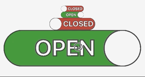
The code for it is currently:
import React, { useRef, useEffect } from 'react'
import { TweenLite } from 'gsap'

export default function Toggle({
  value = false,
  onClick,
  scale = 1,
  radius = 16,
  length = 120,
  borderWidth = 1,
  borderColor = '#333',
  knobColor = '#c0c0c0',
  onBackgroundColor = '#228b22',
  hasBoldText = false,
  onTextColor = '#ffffff',
  offBackgroundColor = '#b22222',
  offTextColor = '#ffffff',
  duration = 0.5,
  style = null,
}) {
  const knobRef = useRef(null)
  const backgroundRef = useRef(null)
  const onTextRef = useRef(null)
  const offTextRef = useRef(null)

  const onPosition = { x: 0 }
  const offPosition = { x: length - radius * 2 }

  useEffect(
    () => {
      TweenLite.fromTo(
        knobRef.current,
        duration,
        value ? onPosition : offPosition,
        value ? offPosition : onPosition
      )

      TweenLite.fromTo(
        backgroundRef.current,
        duration,
        { fill: value ? offBackgroundColor : onBackgroundColor },
        { fill: value ? onBackgroundColor : offBackgroundColor }
      )

      TweenLite.fromTo(
        onTextRef.current,
        duration / 3,
        {
          fillOpacity: value ? 0 : 1,
          strokeWidth: value ? borderWidth / 2 : 1,
        },
        {
          fillOpacity: !value ? 0 : 1,
          strokeWidth: !value ? 0 : borderWidth / 2,
        }
      )

      TweenLite.fromTo(
        offTextRef.current,
        duration / 3,
        {
          fillOpacity: !value ? 0 : 1,
          strokeWidth: !value ? borderWidth / 2 : 1,
        },
        {
          fillOpacity: value ? 0 : 1,
          strokeWidth: value ? 0 : borderWidth / 2,
        }
      )
    },
    // eslint-disable-next-line
    [value]
  )

  return (
    <span
      style={{ width: length * scale, height: radius * 2 * scale, ...style }}
    >
      <svg
        viewBox={`0 0 ${length + 2 * borderWidth} ${radius * 2}`}
        width={length * scale}
        height={radius * 2 * scale}
      >
        <mask id="mask">
          <rect
            width={length + 2 * borderWidth}
            height={radius * 2 + 2 * borderWidth}
            x={borderWidth - borderWidth}
            y={-borderWidth}
            rx={radius}
            fill="white"
          />
        </mask>
        <g ref={backgroundRef} onClick={onClick} mask="url(#mask)">
          <rect
            width={length}
            height={radius * 2}
            x={borderWidth}
            rx={radius}
            stroke={borderColor}
            strokeWidth={borderWidth}
          />
          <g ref={knobRef}>
            <text
              ref={onTextRef}
              id="on-text"
              x={-(length * 0.5)}
              y={radius * 1.42}
              fill={onTextColor}
              fontSize="20"
              fontWeight={hasBoldText ? 'bold' : 'normal'}
              stroke={borderColor}
              strokeWidth={borderWidth / 2}
            >
              OPEN
            </text>
            <circle
              cx={radius + borderWidth}
              cy={radius}
              r={radius}
              fill={knobColor}
              stroke={borderColor}
              strokeWidth={borderWidth}
            />
            <text
              ref={offTextRef}
              id="off-text"
              x={radius * 2 + length * 0.04}
              y={radius * 1.42}
              fill={offTextColor}
              fontSize="20"
              fontWeight={hasBoldText ? 'bold' : 'normal'}
              stroke={borderColor}
              strokeWidth={borderWidth / 2}
            >
              CLOSED
            </text>
            )
          </g>
        </g>
      </svg>
    </span>
  )
}
Now my problem is that I wish to make these things via some test driven development (TDD) or at least make sure that new features won't break anything I made in the past. So I made a smoke test:
import React, { useState } from 'react'
import { render } from '@testing-library/react'
import '@testing-library/jest-dom/extend-expect'

import Toggle from './'

describe('when the value is true', () => {
  it('renders the OPEN text', () => {
    const ToggleWithState = () => {
      const [value, setValue] = useState(true)
      return <Toggle value={value} onClick={() => setValue(!value)} />
    }
    const { queryByText } = render(<ToggleWithState />)

    const openElement = queryByText('OPEN')
    expect(openElement).toBeTruthy()
    expect(openElement).toBeVisible()
    console.log(openElement.getAttributeNames())
    console.log(openElement.getAttribute('x'))
    console.log(openElement.getAttribute('y'))
    console.log(openElement.getAttribute('fill'))
  })
})
The output looks like this
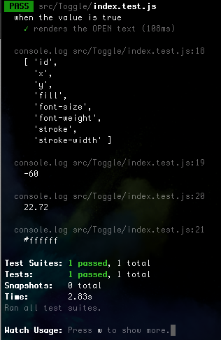
since the toggle is loaded in a true state then the OPEN text should not be outside the viewport. So the 'x' should not be -60 (but some positive number).
The console.log results are the same if I render it in a false state.
Is there anyone who has good experience with these sort of unit tests?
- I would really appreciate a helping hand. Thanks for taking the time to read this far!
(Initially I wanted to test the opacity of the text before and after a click event, but dividing the task into small steps at a time)
Run test react jest test after animations?
in GSAP
Posted
I don't think that `rerender` is the right tool for this..
I think I got more closer to the answer this way:
The code can also be found on https://github.com/Norfeldt/gsap-svg
The `jest.useFakeTimers` however throws some errors (because I'm messing with the internal timers)
Re-running the tests indicate that I'm not truely there yet -
`{ xStart: 45.126, xEnd: 54.39 }`
<hit `a`>
`{ xStart: 45.126, xEnd: 54.607 }`