Norfeldt
Norfeldt's Achievements
0
Reputation
-
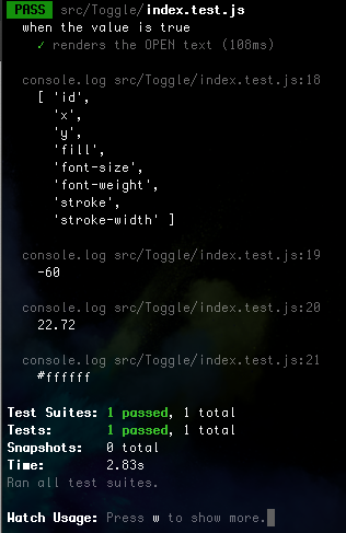
I don't think that `rerender` is the right tool for this.. I think I got more closer to the answer this way: import React, { useState } from 'react' import { render, waitForDomChange, fireEvent } from '@testing-library/react' import '@testing-library/jest-dom/extend-expect' import Toggle from './' describe('when the value is true', () => { const ToggleWithState = ({ propsValue }) => { const [value, setValue] = useState(propsValue) return <Toggle value={value} onClick={() => setValue(!value)} /> } it('renders the "OPEN" text', () => { const { queryByText } = render(<ToggleWithState propsValue={true} />) expect(queryByText('OPEN')).toBeTruthy() // TODO: Should check that it is 'visible' and within the viewbox... }) it('moves the text and knob from right to the left when clicked', async () => { // Arrange jest.useFakeTimers() // This will throw some GSAP warnings `GSAP target null not found. https://greensock.com` const getXYRegex = /[\d\.]+/g // Act const { container } = render(<ToggleWithState propsValue={true} />) jest.runAllTimers() const group = container.querySelector('#knob-and-text-group') await waitForDomChange({ container, }) let style = group.getAttribute('style') const [xStart, _yStart] = style.match(getXYRegex).map(Number) fireEvent.click(container) jest.runAllTimers() await waitForDomChange({ container, }) style = group.getAttribute('style') const [xEnd, _yEnd] = style.match(getXYRegex).map(Number) // Assert console.log({ xStart, xEnd, }) expect(xStart).toBeLessThan(xEnd) }) }) The code can also be found on https://github.com/Norfeldt/gsap-svg The `jest.useFakeTimers` however throws some errors (because I'm messing with the internal timers) Re-running the tests indicate that I'm not truely there yet - `{ xStart: 45.126, xEnd: 54.39 }` <hit `a`> `{ xStart: 45.126, xEnd: 54.607 }`
-
Thanl you very much and I wish you a happy new year as well ? I tried the.toHaveAttribute on the fill-opacity in order to check if it was visible and also read the x value (to check if it was moving to the right side - not checking how much it moved). But it did not work.. The change is done in useEffect() ... const onPosition = { x: 0 } const offPosition = { x: length - radius * 2 } useEffect( () => { TweenLite.fromTo( knobRef.current, duration, value ? onPosition : offPosition, value ? offPosition : onPosition ) TweenLite.fromTo( backgroundRef.current, duration, { fill: value ? offBackgroundColor : onBackgroundColor }, { fill: value ? onBackgroundColor : offBackgroundColor } ) ... if you put a console.log into that, then you see that it prints before the assertions. I actually tried to make a codesandbox for it (since it allows to run testing online) - but I having some issues Failed to execute 'getComputedStyle' on 'Window': parameter 1 is not of type 'Element'. (even though I'm not calling .getComputedStyle in the example) The attempt can be found here https://codesandbox.io/s/greensock-react-open-closed-toggle-pycbn In a unit test TDD like this I would like to make some test like It contains the right text ("OPEN" /"CLOSED") One of the text is hidden when the other are visible (fill-opacity) The text moves position to the correct direction (not checking how much) - LTR or RTL. Was thinking that jest.useFakeTimers() could be a help to avoid waiting for the animation to finish - but never got that far. Thank you very much and thank you for taking the time to reply to my question.
-
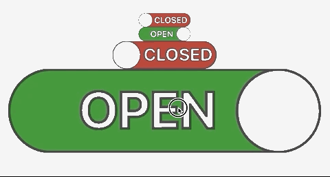
I'm playing around with GreenSock for the first time. It's really awesome! I succeed making an open/closed toggle (which I wanted for some time now - but without css). It works really fine The code for it is currently: import React, { useRef, useEffect } from 'react' import { TweenLite } from 'gsap' export default function Toggle({ value = false, onClick, scale = 1, radius = 16, length = 120, borderWidth = 1, borderColor = '#333', knobColor = '#c0c0c0', onBackgroundColor = '#228b22', hasBoldText = false, onTextColor = '#ffffff', offBackgroundColor = '#b22222', offTextColor = '#ffffff', duration = 0.5, style = null, }) { const knobRef = useRef(null) const backgroundRef = useRef(null) const onTextRef = useRef(null) const offTextRef = useRef(null) const onPosition = { x: 0 } const offPosition = { x: length - radius * 2 } useEffect( () => { TweenLite.fromTo( knobRef.current, duration, value ? onPosition : offPosition, value ? offPosition : onPosition ) TweenLite.fromTo( backgroundRef.current, duration, { fill: value ? offBackgroundColor : onBackgroundColor }, { fill: value ? onBackgroundColor : offBackgroundColor } ) TweenLite.fromTo( onTextRef.current, duration / 3, { fillOpacity: value ? 0 : 1, strokeWidth: value ? borderWidth / 2 : 1, }, { fillOpacity: !value ? 0 : 1, strokeWidth: !value ? 0 : borderWidth / 2, } ) TweenLite.fromTo( offTextRef.current, duration / 3, { fillOpacity: !value ? 0 : 1, strokeWidth: !value ? borderWidth / 2 : 1, }, { fillOpacity: value ? 0 : 1, strokeWidth: value ? 0 : borderWidth / 2, } ) }, // eslint-disable-next-line [value] ) return ( <span style={{ width: length * scale, height: radius * 2 * scale, ...style }} > <svg viewBox={`0 0 ${length + 2 * borderWidth} ${radius * 2}`} width={length * scale} height={radius * 2 * scale} > <mask id="mask"> <rect width={length + 2 * borderWidth} height={radius * 2 + 2 * borderWidth} x={borderWidth - borderWidth} y={-borderWidth} rx={radius} fill="white" /> </mask> <g ref={backgroundRef} onClick={onClick} mask="url(#mask)"> <rect width={length} height={radius * 2} x={borderWidth} rx={radius} stroke={borderColor} strokeWidth={borderWidth} /> <g ref={knobRef}> <text ref={onTextRef} id="on-text" x={-(length * 0.5)} y={radius * 1.42} fill={onTextColor} fontSize="20" fontWeight={hasBoldText ? 'bold' : 'normal'} stroke={borderColor} strokeWidth={borderWidth / 2} > OPEN </text> <circle cx={radius + borderWidth} cy={radius} r={radius} fill={knobColor} stroke={borderColor} strokeWidth={borderWidth} /> <text ref={offTextRef} id="off-text" x={radius * 2 + length * 0.04} y={radius * 1.42} fill={offTextColor} fontSize="20" fontWeight={hasBoldText ? 'bold' : 'normal'} stroke={borderColor} strokeWidth={borderWidth / 2} > CLOSED </text> ) </g> </g> </svg> </span> ) } Now my problem is that I wish to make these things via some test driven development (TDD) or at least make sure that new features won't break anything I made in the past. So I made a smoke test: import React, { useState } from 'react' import { render } from '@testing-library/react' import '@testing-library/jest-dom/extend-expect' import Toggle from './' describe('when the value is true', () => { it('renders the OPEN text', () => { const ToggleWithState = () => { const [value, setValue] = useState(true) return <Toggle value={value} onClick={() => setValue(!value)} /> } const { queryByText } = render(<ToggleWithState />) const openElement = queryByText('OPEN') expect(openElement).toBeTruthy() expect(openElement).toBeVisible() console.log(openElement.getAttributeNames()) console.log(openElement.getAttribute('x')) console.log(openElement.getAttribute('y')) console.log(openElement.getAttribute('fill')) }) }) The output looks like this since the toggle is loaded in a true state then the OPEN text should not be outside the viewport. So the 'x' should not be -60 (but some positive number). The console.log results are the same if I render it in a false state. Is there anyone who has good experience with these sort of unit tests? - I would really appreciate a helping hand. Thanks for taking the time to read this far! (Initially I wanted to test the opacity of the text before and after a click event, but dividing the task into small steps at a time)