the_gmo
Content Type
Profiles
Forums
Store
Blog
Product
Showcase
FAQ
Downloads
Everything posted by the_gmo
-
Hi Rodrigo, thanks for your reply. You're right, it was (at least partly) the Slick Slider. Its height calculation does not catch up with GSAP in some cases. Unfortunately the slider you suggested does not match a couple of my requirements. However I managed to get it patched, by using the good old aspect ratio hack on the parent of the slider. This way, the resizing issue is solved and the last section is no longer being cut off.
-
I'm trying to implement a complex animation, that should be animated on scroll before the page starts scrolling. The timeline should look like this, when users start scrolling: 1) Increase the size of the background image, and at the same time, move each line of the headline to either side. 2) Once the first part of the animation is complete, increase the size of the hidden SVG to 50% 3) Keep increasing the size, and move it to the bottom/right of the section I managed to get the animation exactly how I wanted, however I noticed now that this setup breaks the page after resize. After some resize events (the further and quicker the resize is, the more it likely it happens), it won't recalculate the height of the page (at least not correct), and the Slick-Slider does not resize until toggled. I'm quite sure it is caused by pinning the container. If I don't pin the container, I cannot recreate this behaviour. But how else can I prevent the page from scrolling until the animation is complete? Bonus question: It's not the first time my beloved slick slider causes problems when on the same site as my GSAP-animations. Can anyone recommend a slider plugin that plays well with GSAP, or would it be possible/more sensible to build sliders, using GSAP?
-
UPDATE: I seem to have found the villain. I have a slick slider on the same page. Once I remove this script I no longer get the problem. I will add one to the Codepen tomorrow and see if I'll get the same the problem there.
-
Thanks for the replies. I didn't really had a chance to take a lot through the day. I just forgot those on the Codepen example, the live site has those wrappers. Whenever it doesn't work, the markers are somewhere in the empty space below the element. After a resize a snaps to the right position. The marker is in the correct position and the element works as intended. I logged the variables, they are the same in both browsers. I tried with rounded numbers, still same. I tried Greensock via cdn, still the same.

-
I have an element that contains a large image, which pins in the center of the screen (trigger: center center), scrolls the entire image and carries on (see attached Codepen*). On Chrome (and Edge) it is working exactly as intended every time. On Safari and Firefox, it doesn't in most cases. It doesn't pin, and leaves a large space underneath the element. After activating the markers I noticed that it seems the trigger is not set to the parent (the pinned element) in those browsers, but to center of the containing image. Thus way too far below. However, if I resize the browser, even by a pixel, it snaps to the right position and works. Any ideas in which area I could search for the problem if it only works after I resize the browser? I have tried to deactivate ScrollSmoother, I have tried without matchMedia (even though I really need it for this element), the problem remains. * the Codepen works fine, even in Safari or Firefox. This is just to show what I'm doing and it replicates the code of the site as close as it gets.
-
That's it thanks! Thought I tried this, but must've been in a previous setup. Works perfectly now.
-
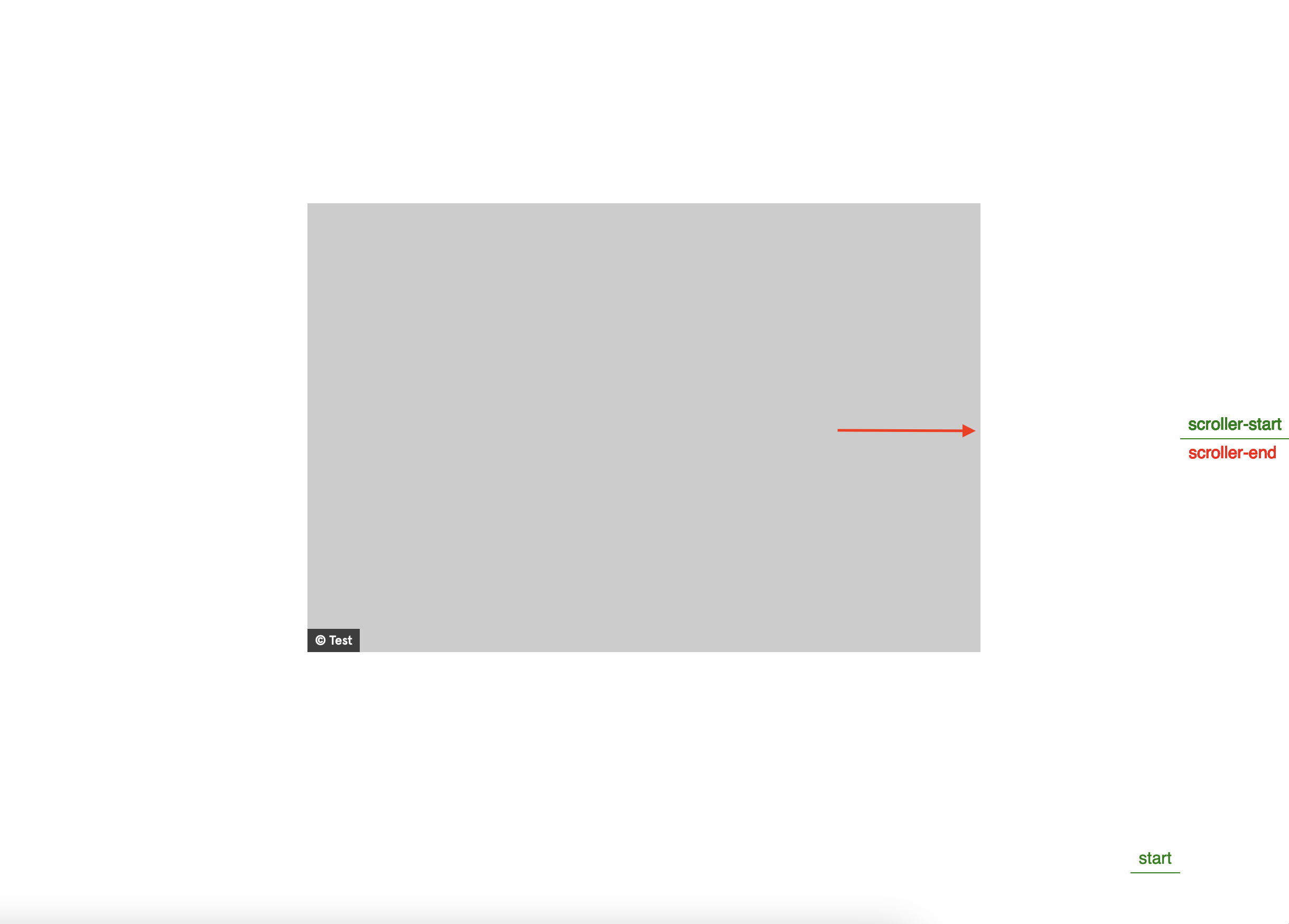
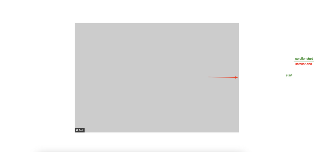
I'm trying to achieve an effect where a container stops in the center of the screen until all its content has scrolled through. As long as there is only one such element on a page it works great. However, I will need several of those elements on the same page and can't figure out how to do it. Any pointers what I need to change to enable this effect for multiple elements would be greatly appreciated. var autoscroll = gsap.utils.toArray(".autoscrollContainer"); autoscroll.forEach(panel => { var ratio = panel.querySelector(".ratio"); var ratioHeight = ratio.offsetHeight; var image = panel.querySelector(".scroll-image"); var imageHeight = image.offsetHeight; var difference = imageHeight - ratioHeight; var distance = (difference / imageHeight) * -100; var tl = gsap.timeline({ scrollTrigger: { trigger: autoscroll, start: "center center", end: "+=3500", scrub: true, snap: 0, pin: true, //markers: true } }); tl.to(image, { yPercent: distance, }); });
-
Thanks Zach! That work like a charm! Thought to much in the CSS realm where rules overide each other (rendering them at least partly false) - but sure, here it was left with two "true" queries. Thanks for the quick help.
-
I'm trying to setup a sidescroll, which works fine for one screen-size. However, on smaller screens the number of elements that are shown next to each other is changing, and so should the setup. Once the screen gets too small, I want to no longer offer this sidescroll feature and rather have the user navigate using arrows. I just can't get multiple media-queries if they don't cover the entire pixel range. For example: With this setup I get the two different ScrollTrigger settings I need. However it goes down to the small screen: "(min-width: 1351px)": ... "(max-width: 1350px)": ... With this setup, both ScrollTrigger settings no longer work as expected. However below 631px there's no more Scrolltrigger magic (which is what I want): "(min-width: 1351px)": ... "(min-width: 631px)": ... What am I missing here? What sort of definition does ScrollTrigger expect for the range I don't want it to do anything? Also, would it make a difference if I use rem in the media-queries instead of px? ScrollTrigger.matchMedia({ //"(min-width: 84.4375rem)": function() { "(min-width: 1351px)": function() { gsap.to(sections, { xPercent: -100 * (sections.length - 3), ease: "none", scrollTrigger: { trigger: "#product-container", pin: true, scrub: 2, snap: 1 / (sections.length - 3), end: () => "+=" + document.querySelector("#product-container").offsetWidth } }); }, //"(min-width: 39.4375rem)": function() { "(min-width: 631px)": function() { gsap.to(sections, { xPercent: -100 * (sections.length - 4), ease: "none", scrollTrigger: { trigger: "#product-container", pin: true, scrub: 1, snap: 1 / (sections.length - 4), end: () => "+=" + document.querySelector("#product-container").offsetWidth } }); }, })