

Susan
Content Type
Profiles
Forums
Store
Blog
Product
Showcase
FAQ
Downloads
Posts posted by Susan
-
-
I was trying to experiment GS playback functions with this tutorial - https://ihatetomatoes.net/module-1/g101-controlling-timeline-playback-0747/.
However, this pause function doesn't pause.
tl.pause();
And this play function doesn't play.
$('#bPlay').on('click',function(){
  tl.play();
})
Please let me know the errors that I have rendered, thank you!
See the Pen PEqxZg by susansiow (@susansiow) on CodePen
-
Hi @Sahil I have created another pen with the repeat value, thank you! Happy weekend!
See the Pen xpGyer by susansiow (@susansiow) on CodePen
-
 1
1
-
-
@Sahil I have replaced the targets with unique vars, please take a look and advise if you have any comments. Thanks!
See the Pen dJogYN by susansiow (@susansiow) on CodePen
-
1
-
-
-
@Sahil Thank you for the reference, I have a better understanding of how to run the animations.
Would you mind to have a look of my 2nd test pen? Kindly advise, if you have any comments, thank you!
See the Pen eyYaYJ by susansiow (@susansiow) on CodePen
-
I am having problem to understand how to bind multiple animations into one variable which is in nest timelines.
What I would like to achieve is a looping variables like this codepen:
See the Pen symha?editors=0110 by GreenSock (@GreenSock) on CodePen
But with multiple animations for one/first variable (box1Timeline) like this, mentioned by @OSUblake
Kindly assist, thank you!
See the Pen XVWdoZ by susansiow (@susansiow) on CodePen
-
@OSUblake The previous code looks great on modern browser, thank you for providing the new codes which are compatible with different versions of browser.
-
32 minutes ago, Sahil said:
I tried editing your pen, but it just seems too complex along with issues in css, html. I will post few links to video tutorial, that should cover most of the basics about how you can repeat animations etc and how to create complex animations with functions. I hope you will go through these tutorials, otherwise it just opens door for more questions. Also, try to post your questions with as simple example as possible with reduced codepen demo specific to the question. It makes it a lot easier to answer and will also help you understand quickly.
https://www.youtube.com/watch?v=sXJKg8SUSLI
https://www.youtube.com/watch?v=tMP1PCErrmE
https://www.youtube.com/watch?v=QO1mLs96krY
https://www.youtube.com/watch?v=ZbTI85lmu9Q
This is very helpful, thanks @Sahil
-
46 minutes ago, Sahil said:
Didn't really understand your question about infinite repeating animation.
Thanks for the kind help! 'Infinite repeating animation' means I would like to create a repeating multiple objects - #left-1 to #planet to #left-1. Which means when #left-1 has completed 2 times of animation, then #planet will take place (eg also 2 times of animation) and followed by #left-1 and so on (followed by #planet).
How can I achieve such repeating animation sequence with GreenSock JS?
Thank you!
-
On 11/28/2017 at 12:11 AM, OSUblake said:
Just a note about skew. The way CSS handles skew causes the object to scale. GSAP can skew like that if you pass in skewType as "simple" or set the CSSPlugin.defaultSkewType = "simple". See the section on 2D transforms in the CSSPlugin for more info.
Comparison of skew types.
See the Pen 77a1dbdb7573a15850e14fbb69ea3bd1 by osublake (@osublake) on CodePen
After some further experiments, here are some queries:
1. I have changed the repeating number from infinite to 2 times but it is still animating unceasingly. Am I missing something here?
var tl = new TimelineMax({ repeat: 2})
2. How can I create a layer to layer infinite repeating animation (from left-1.png to planet.jpg to left-1.png) with the following code? I have tried to check from the CSSPlugin documentation but not found.
function animate(target, skewType) {
  var tl = new TimelineMax({ repeat: 2})
    .to(target, 3, { skewType, skewX:  90, repeat: 1, yoyo: true }, "+=0.2")
    .to(target, 3, { skewType, skewX: -45, repeat: 1, yoyo: true })
    .to(target, 3, { skewType, skewY:  90, repeat: 1, yoyo: true }, "+=0.2")
    .to(target, 3, { skewType, skewY: -45, repeat: 1, yoyo: true })
}
Furthermore, I have added this line to execute a delayed animation for planet.jpg but it breaks the whole JS coding.
TweenMax.fromTo("#left-1", 30, {opacity: 0}, {opacity: 1} );
See the Pen NwVoMX by susansiow (@susansiow) on CodePen
Kindly advise, thank you very much!
-
On 11/28/2017 at 12:11 AM, OSUblake said:
Just a note about skew. The way CSS handles skew causes the object to scale. GSAP can skew like that if you pass in skewType as "simple" or set the CSSPlugin.defaultSkewType = "simple". See the section on 2D transforms in the CSSPlugin for more info.
Comparison of skew types.
See the Pen 77a1dbdb7573a15850e14fbb69ea3bd1 by osublake (@osublake) on CodePen
@OSUblake This is something I have been searching for high and low, zillion thanks for this!!!
-
On 11/28/2017 at 12:16 AM, OSUblake said:
You could just call the function directly since you're not using a delay.
function animateBg(){
  TweenMax.to("#left-1", 20, {
    opacity: 1,
    skewY: '+=360deg',
    rotation: '+=10',
    ease: Power0.easeNone,
    onComplete: animateBg
  });
}
Thank you so much for the enlightenment.
-
Thanks @Sahil for the kind explanation, I really appreciate it, thank you!
-
1
-
-
Hi GreenSock,
I have removed the CSS transition code
transition: all 0.5s ease 0s;
and edited the TweenMax code
TweenMax.fromTo("#left-1", 20, {opacity: 0.3, skewY: '30deg', rotation: 80, ease: Power0.easeIn} , {opacity: 1, skewY: '360deg', rotation: -10, ease: Power0.easeNone, repeat:-1} );
Is this correct?
And how can I apply a smoother background transition? I have tried the GreenSock's easing alternatives but the background still doesn't repeat/transit smoothly.
See the Pen YEjRGp by susansiow (@susansiow) on CodePen
Please help further, thank you!
-
Thank you @GreenSock !
No wonder the background animation appears shaky occasionally.
May I know how I can incorporate the following code with GSAP, so it will not cause conflicts?
transition: all 0.5s ease 0s;
-
Hi GreenSock,
First of all, I would like to thank you for your amazing JS library! It allows me to create a pretty web animation in a short time, thank you!
Here's the progress - https://z1.golddigitaldesign.com/ and enclosed is a screenshot which is showing the skewed background image is overflowed.
CSS codes:
#left-1-wrap {
    position: relative;
    overflow: hidden;
}
#left-1 {
    position: relative;
    top: 0;
    right: 0;
    bottom: 0;
    left: 0;

    -ms-transform: skewY(-80deg);
    -webkit-transform: skewY(-80deg);
    transform: skewY(-80deg);

    transition: all 0.5s ease 0s;
}
TweenMax codes:
TweenMax.to("#left-1", 20, {skewY: '360deg', rotation: -180, ease: Power0.easeOut, repeat:-1} );
Is there anything that I can do to prevent the overflowing over the Y axis? Or is a normal case and no further adjustments is needed?
Thank you!
-
Thank you @Sahil for the kind information, happy weekend!
-
Hi GreenSock,
Thank you so much for pointing out my negligence, I have missed out he opacity value!
Another question, TweenMax allows id to have no # beside the name? As you can see below, I did not include the # but the id is rendered together with the code.
TweenMax.to(light, 2.5, { opacity: 0.5, ease: Power0.easeOut, y: -50, repeat: -1 });
Kindly advise, thank you.
-
Hi GreenSock,
Yes, I have commented-out the "top" code, because I would like to try the Linear.easeNone animation but the #light isn't displaying and animating.
Please assist, thank you.
-
What did I miss out here, why the easing function isn't working? Thank you.
See the Pen ZaJXQy by susansiow (@susansiow) on CodePen
-
That sounds super awesome! Thank you @Sahil
-
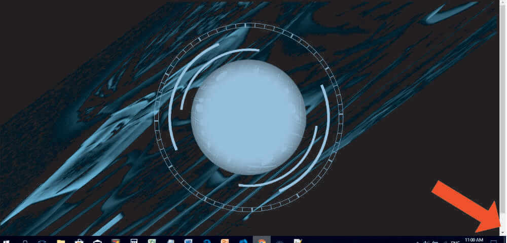
Hi GSAP,
Is it possible to integrate GSAP with an AI chatbot to achieve a text-replying animation effect? Eg while the chatbot replies in text, a radar animation will follow along.
Thanks,
Susan
See the Pen vLOZap by ahsanrathore (@ahsanrathore) on CodePen
-
@Jonathan I see, so shy, I'm a newbie on this. Thank you so much for your kind pointer!
-
2
-
-
I am trying to experiment GSAP on Codepen but it doesn't work. What did I left out?
Thanks!
See the Pen ZaJXQy by susansiow (@susansiow) on CodePen
GS Playback Functions
in GSAP
Posted
Thank you @Sahil and @Carl .