Hi everyone,
I'm trying to build an animation where I have two blocks of text, and when I scroll, it will show the first block. Using Split Type, I've created an animation where the text gets filled. Once the first block is filled, it should hide, and the second block should appear with the same text fill animation.
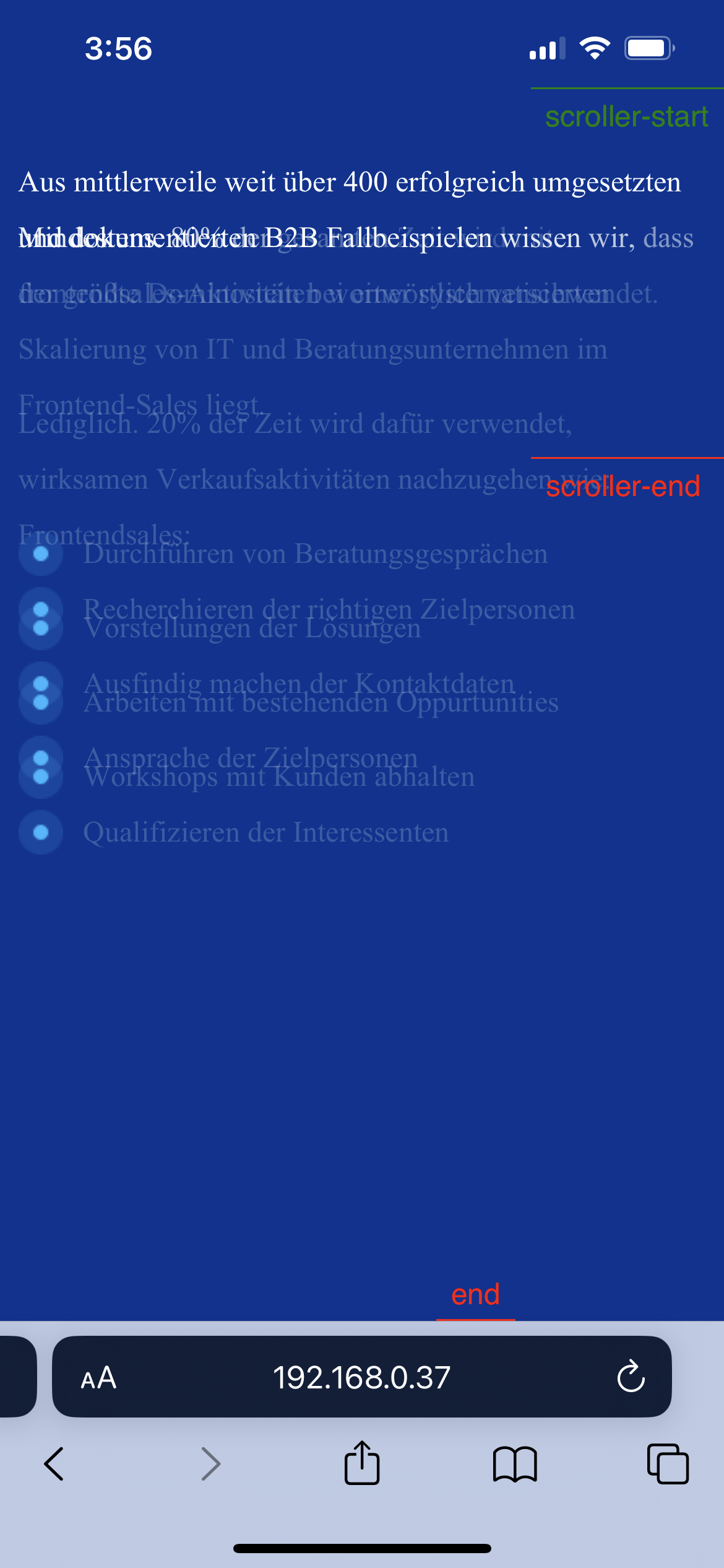
However, I'm encountering an issue where the animation breaks, mostly on mobile and sometimes on desktop. When I scroll, stop, and then scroll again—especially when I'm in the second block—the animation resets, and the text overlays with each other.
I have turned on the markers, and when this happens, I can see the start and end changes.
I would really appreciate any feedback and help.
Video: https://youtube.com/shorts/XL3N8pri2rg?feature=share
Here is the code:
<!DOCTYPE html>
<html lang="en">
<head>
<meta charset="UTF-8" />
<meta name="viewport" content="width=device-width, initial-scale=1.0" />
<script src="https://cdnjs.cloudflare.com/ajax/libs/gsap/3.9.1/gsap.min.js"></script>
<script src="https://cdnjs.cloudflare.com/ajax/libs/gsap/3.9.1/ScrollTrigger.min.js"></script>
<title>Document</title>
<style>
body {
background: #003393;
}
.text-container-slider {
/* height: 300vh; */
width: 100%;
max-width: 100vw;
font-family: Poppins;
will-change: transform;
position: relative;
height: 300vh;
/* mix-blend-mode: multiply; */
}
.text-section-slider {
left: 0;
width: 100%;
height: 100vh;
display: flex;
flex-direction: column;
justify-content: center;
align-items: center;
opacity: 1;
position: sticky;
top: 0;
pointer-events: none; /* Allow scrolling through sections */
color: #fff;
will-change: transform;
}
.text-section-container {
max-width: 1200px;
display: flex;
width: 100%;
}
.text-card {
line-break: normal;
width: 80%;
margin: 0 auto;
}
.text-section-container > .text-card > p {
font-family: Poppins;
font-size: 20px;
font-weight: 400;
color: #fff;
line-height: 30px;
letter-spacing: 0px;
text-align: left;
}
.list-grid ul li {
margin: 40px 0;
background: url("https://i.ibb.co/LzK07Vz/line-type.png") no-repeat left
center;
padding: 10px 10px 10px 35px;
list-style: none;
margin: 0;
vertical-align: middle;
font-size: 20px;
}
.list-grid {
display: flex;
}
.list-grid ul {
flex-basis: 50%;
padding-left: 0;
padding-top: 0;
}
.text-section-container .ultitle {
margin-bottom: 16px;
margin-top: 40px;
}
@media (max-width: 768px) {
.list-grid {
flex-direction: column;
}
.list-grid ul {
margin: 0;
}
.text-section-container .ultitle {
margin-bottom: 5px;
margin-top: 40px;
}
.text-section-container > .text-card > p,
.list-grid ul li {
font-size: 1rem;
}
.text-card {
width: 99%;
}
}
</style>
</head>
<body>
<div class="text-totalContainer">
<div class="text-container-slider">
<div class="text-section-slider" id="text-section1">
<div class="text-section-container">
<div class="text-card">
<p class="text-sec-1">
Aus mittlerweile weit über 400 erfolgreich umgesetzten und
dokumentierten B2B Fallbeispielen wissen wir, dass der größte
Dominostein bei einer systematisierten Skalierung von IT und
Beratungsunternehmen im Frontend-Sales liegt.
</p>
<p class="text-sec-1 ultitle">Frontendsales:</p>
<div class="list-grid">
<ul>
<li class="text-sec-1">
Recherchieren der richtigen Zielpersonen
</li>
<li class="text-sec-1">Ausfindig machen der Kontaktdaten</li>
</ul>
<ul>
<li class="text-sec-1">Ansprache der Zielpersonen</li>
<li class="text-sec-1">Qualifizieren der Interessenten</li>
</ul>
</div>
</div>
</div>
</div>
<div class="text-section-slider" id="text-section2">
<div class="text-section-container">
<div class="text-card">
<p class="text-sec-2">
Mindestens. 80% der gesamten Zeit wird mit
frontendsales-Aktivitäten wortwörtlich verschwendet.
</p>
<p class="text-sec-2 ultitle">
Lediglich. 20% der Zeit wird dafür verwendet, wirksamen
Verkaufsaktivitäten nachzugehen wie:
</p>
<div class="list-grid">
<ul>
<li class="text-sec-2">
Durchführen von Beratungsgesprächen
</li>
<li class="text-sec-2">Vorstellungen der Lösungen</li>
</ul>
<ul>
<li class="text-sec-2">
Arbeiten mit bestehenden Oppurtunities
</li>
<li class="text-sec-2">Workshops mit Kunden abhalten</li>
</ul>
</div>
</div>
</div>
</div>
</div>
</div>
<script src="https://unpkg.com/split-type"></script>
<script>
document.addEventListener("DOMContentLoaded", function () {
const sectionstext = document.querySelectorAll(".text-section-slider");
const textsec1 = SplitType.create(".text-sec-1");
const textsec2 = SplitType.create(".text-sec-2");
function initScrolltext() {
sectionstext.forEach((sectiontext, indextext) => {
const cardstext = sectiontext.querySelector(".text-card");
gsap.config({ performance: true });
const tltext = gsap.timeline({
scrollTrigger: {
trigger: sectiontext,
scrub: true,
markers: true,
start: "top 0%",
end: "bottom+=70px 30%",
toggleActions: "play reset play reset",
},
});
if (indextext > 0) {
tltext
.fromTo(
cardstext,
{
opacity: 0,
stagger: 3,
},
{
opacity: 1,
ease: "power2.out", // Adjust easing for a smoother transition
}
)
.fromTo(
sectiontext,
{
opacity: 0,
},
{
opacity: 1,
ease: "power2.out", // Adjust easing for a smoother transition
}
)
.from(textsec2.words, {
opacity: 0.2,
stagger: 0.1,
})
.fromTo(
sectiontext,
{
opacity: 1,
},
{
opacity: 1,
ease: "power2.out", // Adjust easing for a smoother transition
}
);
} else {
tltext
.from(textsec1.words, {
opacity: 0.2,
stagger: 0.1,
})
.fromTo(
cardstext,
{
opacity: 1,
},
{
opacity: 1,
ease: "power2.out", // Adjust easing for a smoother transition
}
)
.fromTo(
sectiontext,
{
opacity: 1,
},
{
opacity: 0,
ease: "power2.out", // Adjust easing for a smoother transition
}
);
}
});
}
initScrolltext();
});
</script>
</body>
</html>