ELmanuelito
Content Type
Profiles
Forums
Store
Blog
Product
Showcase
FAQ
Downloads
Everything posted by ELmanuelito
-
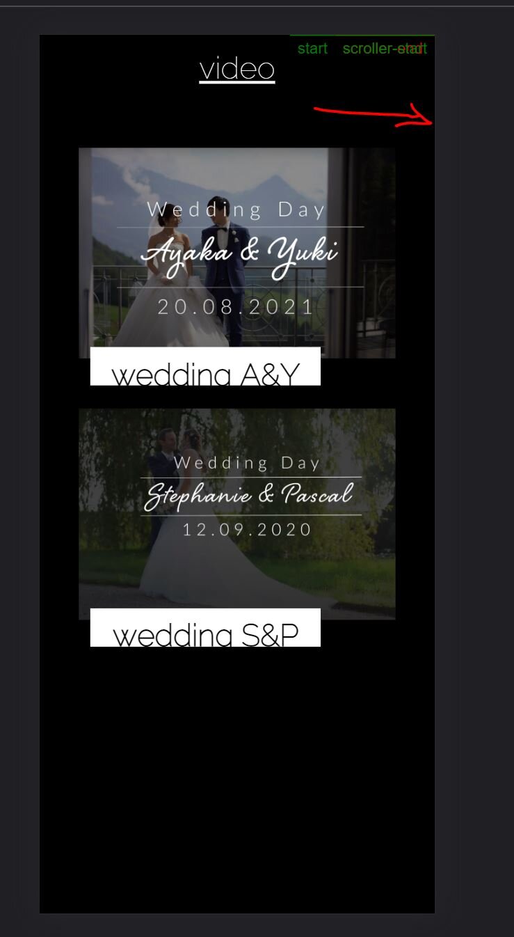
Hey again Wow you are fast. I'm really sorry. This wasn't about me being lazy to show you my problem. I really thought it would be more understandable this way. But I do see the reason for these codepen demos now. I couldn't reproduce the problem in Codepen, that's why I thought it would be better on my workspace. First of all the scrollAnimation Problem. This seems now resolved. I don't know why it wouldn't work before, I've added center left as you proposed and it didn't work. Now it does. Thank you for your tip, I probably set start and end wrong, as you suggested. I've set the scrub on 4 on purpose, that I see it moving. If I set it to true, it still is not moving. This can now also be seen on the codepen. https://codepen.io/mclauch/pen/JjMQdmL Anyway, I think I could reproduce the problem now (yey). I added my media queries that I need to make it look ok on both devices. And if we go to mobile now we can see this (screenshot from project) and this (screenshot from codepen) which seems to be the same problem. As this only comes to play in mobile, I suppose my mobile overflow: hidden properties are the problem again. You have probably already given me the solution, and I'm just too dumb to understand it. If you need to close this topic or something just go ahead and I will just try everything and ask my teacher about this. Thank you again for your help!
-
Hey akapowl thank you again for your fast reply, sorry I couldn't update you earlier, this project is getting a bit over my head. First of all, your explanations make sense about the markers. So I think they probably work as intended, I might just be doing something wrong with the viewport. Sorry that I didn't include the line of the animation. It's maybe way more easy if I just share the whole project with you on our Student Serverspace. The animation is on the second Section called #navi. Also I've removed a lot of the images as I'm posting this online now. This shoulnd't change the showcase. https://manuelr.mywdd.info/testfile.html Although containerAnimation works fine on the codepen demo, it won't work in my project. I removed the toggle but the animation only plays if I remove containerAnimation. But this is actually not that huge of a problem. As long as it works somehow. My main problem right now is really mobile. The animation wont work there, and I see with the markers turned on that start and end never touch as they do not move at all in mobile. If you had one last tipp on how to solve that I'd be incredibly grateful. You have already helped me so much, I know I shouldn't ask for more. Best regards, Manuel
-
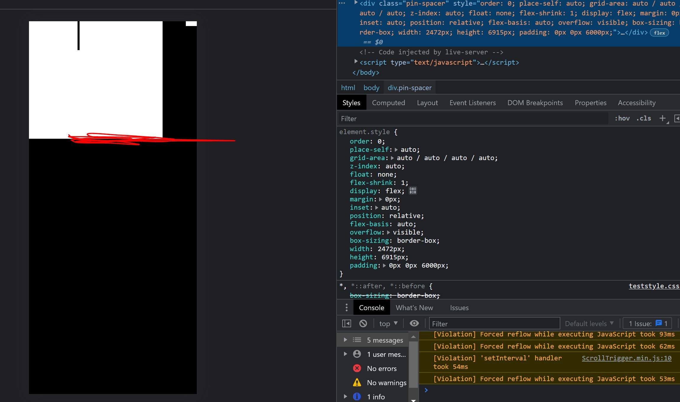
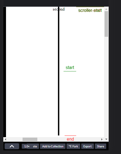
Hey akapowl first of all, thank you so much for your time! I can't tell you how grateful I am that actually somebody responds and that so fast. Thank you thank you! I've tried to implement your suggestions and it did indeed change up somethings. I do have the feeling this is almost the solution. So if I understood you correctly and changed things accordingly, this should now work both ways? I actually got the scrolling to the point where it works on desktop and does not mess up mobile. But I have the feeling that something is still wrong with these scroller start & end markers. (or the orientation of my page). Because they are still over each other (screenshot) and animations don't work on mobile because the start and end never meet there, only on desktop if I don't use containerAnimation. That doesn't work on desktop either. I've set the regular css code (mobile first page) like this: body { overscroll-behavior: none; height: 100%; width: 100%; overflow-y: scroll; overflow-x: hidden; } .container { overscroll-behavior: none; width: auto; height: 100vh; display: flex; flex-wrap: nowrap; overflow-y: hidden; overflow-x: scroll; } And the media queries like this: body { overflow-y: hidden; overflow-x: hidden; } .container { overflow-y: hidden; overflow-x: hidden; } And like this it feels good on desktop and doesn't mess up mobile. But if I add my animation it only works on desktop because start and end markers are all on top of each other. Oh and my animation works on desktop only if I remove the containerAnimation: scrollTween, maybe you also know what I did wrong there? gsap.registerPlugin(ScrollTrigger); let container = document.querySelector(".container"); let sections = gsap.utils.toArray(".panel"); let scrollTween = gsap.to(sections, { xPercent: -100 * (sections.length - 1), ease: "none", scrollTrigger: { trigger: ".container", pin: true, markers: true, scrub: 1, snap: 1 / (sections.length - 1), end: () => "+=" + (container.scrollWidth - container.clientWidth), } }); gsap.to(".d-line-black",{ scrollTrigger: { //should pin the animation to the timeline containerAnimation: scrollTween, trigger: "#navi", markers: true, toggleActions: "restart pause reverse pause", start: "center left", scrub: true, }, y: 700, duration: 3 }) Again thank you so much for your patience with my idiot code, I would love to pay you a dozen coffes at least for your help afterwards. Best, Manuel

-
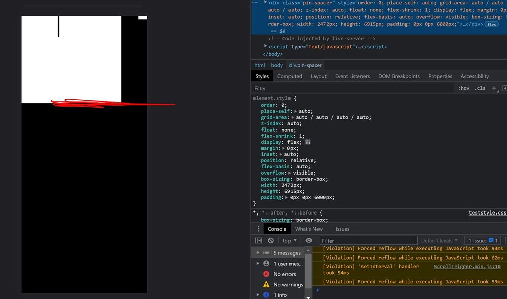
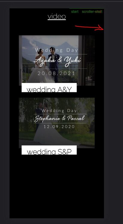
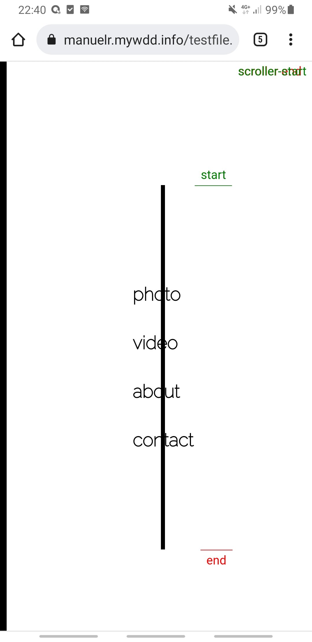
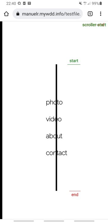
Hey guys I'm pretty new here and I have a important project due soon. I used fake horizontal scroll on my site and then stumbled across greensock. First of all, thank you for this great plugin. I think it's power is incredible, but I'm not sure what I'm doing wrong. Let's describe my problem: First I got rid of the fake Scroll and tried to implement this solution to my page. https://codepen.io/GreenSock/pen/YzygYvM The problem is, although it works fine on desktop, I think the scroller-start & end is somehow not tied on the horizontal scroll position. I''ve tried to showcase my structure on this codepen example (at the bottom of the post). Although I'm not sure if this is the same as in my project, because I have a lot more code that might be the cause of the problem. But this is the shell of the outer container, and my site behaves the same (on desktop at least) The second problem is as mentioned mobile. I cant tap further than the fourth section (400% width) on mobile, then it gets blocked by gsap for some reason. I'll attach a screenshot. And the other problem on mobile is I can scroll down very far (second screenshot) because the pin spacer and end markers are down there for some reason. Do you maybe have an idea what I'm doing wrong? I would be incredibly thankful if one of you pros could have a look into it. Best, Manuel