Leaderboard


Popular Content
Showing content with the highest reputation on 01/29/2018 in all areas
-
Hi @dgmldr, Please have a look to your CSS .slds-notification { position: relative; width: 20rem; border: 1px solid #ecebea; border-radius: .25rem; box-shadow: 0 2px 3px 0 rgba(0,0,0,.2); transition-duration: .4s; transition-timing-function: ease-in-out; transition-property: margin,max-height,opacity,top; If you try ... .slds-notification { position: relative; width: 20rem; border: 1px solid #ecebea; border-radius: .25rem; box-shadow: 0 2px 3px 0 rgba(0,0,0,.2); /* transition-duration: .4s; */ /* transition-timing-function: ease-in-out; */ /* transition-property: margin,max-height,opacity,top; */ } you will have a clear responsibility for the job - done by GreenSock. Kind regards Mikel5 points
-
Oh my lord, you guys are way too kind. This forum is honestly the best I've ever been on! Can't wait to be good enough to give back This example rocks man. I've just read your guides. Very informative, although I'm still struggling with why variable width strokes won't work. Could you shed some light on that? I'd love to be able to make the tight turns on the S & A even if it means spending hours in illustrator aha. If you still have it I'd love to see the project file so I can see how you've layered everything including the strokes, then I can compare it to your example and figure out what the different strokes look like and how I can recreate this for myself. Once again, thank you SO much, Smallio3 points
-
If you want the SVG animation to look like the CSS animation, I think morphing may be a bit of overkill. Why not just animate the border radius attribute of the SVG? Just my two cents worth. Happy tweening.2 points
-
Glad you got it sorted. Just to make sure you got all the details, you can use CustomEase to create an ease from those bezier values. Since you are already a member of these forums, you have access to CustomEase. Learn more about it here: https://greensock.com/customease On that page there is a video that shows exactly what is happening in the demo above with the custom cubic-bezier values. Watch at 9:472 points
-
That's not really a hack. That would be the way to actually mimic the movement you are after because you will need two points to move away from the starting corner in order for the motion to be the same. Another alternative is to have a circle with four point and push the 'curve handles' so far away that they make it look like it is a square. I would recommend @Sahil's suggestion as it will give you more control - for example, it would make it easier to have a rectangle instead of a box.2 points
-
Hi @Syniky, Welcome to the forums. That is because 3D transforms are not really supported on browsers. At least not yet. In order to have your doors rotate in the Y axis, you will have to separate them into DOM objects. That way you will get the rotation as you expect.2 points
-
Hi @Sahil, Great idea ... And this is my fork: How does a camel come through the eye of a needle ? ... or something like that. Mikel2 points
-
How about this? The rectangle has very slight curve, so path morphs according to those extra anchor points. I am curious about correct approach as well but this might be the solution.2 points
-
Hi @suresh_vs, Used InkScape to rotate the circle. And optimized the SVG with SVGOMG - great tool to keep svg code clean. For the 2. square I have no idea. But look at this topic. Trial and error ... and maybe the solution. Happy testing ... Mikel2 points
-
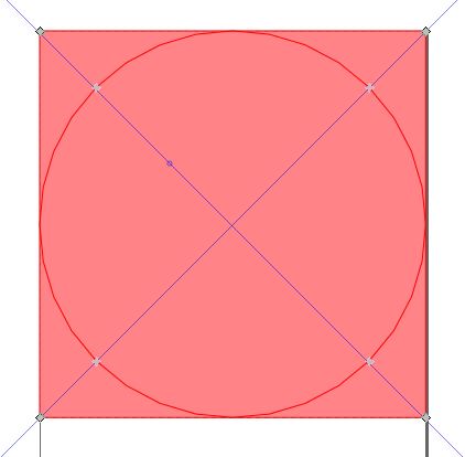
Hi @suresh_vs, Welcome to the GreenSock Forum. If you turn the circle by 45 degrees, it looks better. Did it in SVG. Points of the square and the circle are aligned. Happy morphing ... Mikel
 2 points
 -
Nevermind i was confused and find happiness in custom easing (https://greensock.com/docs/Easing). Topic close2 points
-
Currently you can only have a single width on a SVG stroke. Variable widths may be coming in the SVG 2.0 (or later) spec, but for now you're stuck with a single width. You can create an open path in AI with a variable width stroke using the width tool, but as soon as you export it to SVG you'll get a closed path. Here's an example of an open path with a 10px stroke and a variable width stroke (which is actually a closed path) being revealed with a mask. You can certainly attempt to add points and pull Bezier handles around for hours, but even the most perfect open path curve will eventually overlap itself if you make the stroke too wide. Here's an open curve with three stroke-width versions (2, 24, and 48). You can see the first one is a nice curve, but as that stroke gets wider, it gets really ugly. As I mentioned, you can add points and adjust handles but accurately matching an existing font with an open path can be tricky. Choose your font wisely. Of course, you can always just use a mask for the reveal too. Hopefully that helps. Happy tweening.2 points
-
Hi @smallio If it were my project, I’d probably use masks as @mikel suggested. That route will most likely give you the least number of headaches. That being said, you can recreate fonts with consistent stroke widths. Here’s a quick example of the word ‘social’ from your demo. You can see that the ‘s’ and the ‘a’ aren’t exact matches, but they’re close. The problem with the ‘s’ is the tight turns. When you have a closed path, you can easily make the curves, but now we have an open path with a stroke running down the middle. The turns look less smooth as the stroke gets wider. The ‘a’ has a variable width stroke on the curved portion which won’t work so I just made it consistent all the way around. When you have projects like this, you can usually make it work by recreating the font, but you may have to make some artistic choices that will make the font appear slightly different than the original. If you’re using AI, the pencil and/or curvature tools are great for this type of work. I wrote some posts on CodePen about recreating fonts and the handwriting effect. You may find some useful info in them. https://codepen.io/PointC/post/animated-handwriting-effect-part-1 https://codepen.io/PointC/post/animated-handwriting-effect-part-2 Here’s the final demo from those posts. Hopefully that helps. Happy tweening.2 points
-
Ah, that's just a scope issue. In other words, in your first example, play() is being called directly on "child", but in your second example there is no scope declared. That's just how JavaScript works - it's unrelated to GSAP. To correct your second call, you can define the scope like: parent.call(child.play, [0], child); Does that clear things up?1 point
-
Hi @PointC, It just needs experts - sorry, a SuperHero - for simple solutions. As already the famous Sepp Herberger said: "The round thing has to go into the rectangular thing ..." It's that easy with football, too.1 point
-
Haha.. it's all good ?1 point
-
I would say mikel is right. Your problem is that fonts are outlines of the outer shape and therefore that's where the stroke is placed. Redrawing those fonts as single line strokes even if it's possible would require substantial vector drawing skills. Even this would only work it the fonts are absolutely consistent in their thickness and could be represented as a single stroke. We can see in the "a' right from the start in 'social' that it is not. It might be possible to create a mask from the outer shapes of the fonts and then create paths that roughy follow the center line of the those shapes with strokes that are large enough to fill them and animate the paths inside the mask. This would not require the precision of perfectly redrawing the fonts themselves, as long as long as you're reasonably close it should work. You'd probably have to set these up in illustrator unless you're a genius at plotting path points. This is sort of what is done in the anime post except that they created an outline object of the stroke letters that lines up with the stroke objects so they don't need a mask for inner stroke and outer stoke animations to line up.1 point
-
Use animate dom_overlay_container div for TextPlugin, ScrambleTextPlugin, SplitText... example of code in actions var txt1 = document.createElement("p"); var node1 = document.createTextNode("This is the old text"); txt1.appendChild(node1); txt1.setAttribute("id", "p1"); var element = document.getElementById("dom_overlay_container"); element.appendChild(txt1); TweenLite.to("#p1", 2, {text:"This is the new text"});1 point
-
Hi @smallio, Exactly right, drawSVG only works with strokes. But "writing a special font with strokes" is almost impossible. @PointC has some examples in the forum that cover this topic. I quickly found this. The trick: "use drawSVG to animate the mask and reveal the logo" or a letter. That is still complicated for all letters ... Happy masking Mikel1 point
-
Think of the tweenFromTo() stuff like instructions to move a needle on a record (music). It wouldn't make sense to write the code the way you did because you've got an overlap of 5 seconds where two hands are fighting for control of the needle's position, telling it to go to completely different places. So on a single tick, one tween says "render that timeline at 0.25 seconds" and immediately after that (literally on the same tick), the other one says "render that timeline at 5.25 seconds". Whichever one runs last would win, but it's just a bad idea to structure things like that (in my opinion). See what I mean?1 point
-
You, my friend, will need to step into the wonderful and mesmerising world of MATHS. Have a look at this channel by Keith Peters, it will teach you tons about calculating physics-like movement. https://www.youtube.com/user/codingmath1 point
-
Hi and welcome to the GreenSock forums, Looks like you posted in our archived Flash forums (moving this post to HTML5). No biggie. Thanks for the demo. Very nice. You have some options here. Every animation has a progress() method that you can actually tween. The progress (value between 0 - 1) represents how much of the animation that is complete where 0 = none, 0.5 = half, 1 = fully complete. To tween the progress of a timeline named tl you can do TweenLite.to(tl, 1, {progress:0.5})// animate to a progress of 0.5 Read more about the technique of "tweening a tween" (or timeline) read: https://medium.com/net-magazine/7-hidden-gems-of-the-greensock-animation-platform-4fb71389f6ca --- You can also call tweenTo() on a TimelineMax timeline like tl.tweenTo(5) // tweens to 5 seconds. https://greensock.com/docs/TimelineMax/tweenTo I modified your demo to show both techniques. Press the "reset" button after each animation1 point
-
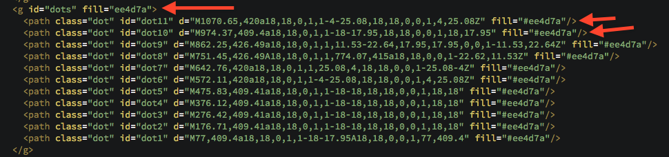
Hi and welcome to the GreenSock forums, Thanks for the demo. Very cool animation. Just a few little mistakes as to why the last fill:white wasn't working. Change .to("#letters", 0.5, {fill:"#FFF"}); //TO .to(".dot", 0.5, {attr:{fill:"white"}}); #letters is the group holding all the paths you are morphing to. You don't actually see the #letters group on screen, you see the #dots. You can't change the fill of the #dots group because each .dot has its own fill set inline So you need to target every element with a class of dot (".dot") Lastly, fill is as attribute not a CSS property so you actually have to pass that value into the AttrPlugin (included in TweenMax) .to(".dot", 0.5, {attr:{fill:"white"}}); Keep up the great work.
 1 point
 -
Hello @multivac Is this what you were after? .. i used a staggerFromTo() without using an onUpdate I think the issue was that the browser did not know what the starting filter value was, since by default CSS filter is none. That is why you saw a an abrupt step with no transition from blur to no blur. It was acting like an on / off switch with no interpolation of values. I also added a slight rotation 0.01 and used autoAlpha instead of opacity to make it animate smoother. As well as adding some needed CSS properties to help with cross browser rendering bugs. So now you should see it animate from blur to no blur: JS: var h1 = document.querySelector( "h1" ); var split = new SplitText( h1, { type: "chars" } ); var timeline = new TimelineMax(); // change visibility for initial load TweenMax.set("h1", { visibility:"visible" }); // use satggerFromTo() timeline.staggerFromTo( split.chars, 0.7, { autoAlpha: 0, webKitFilter: "blur(5px)", filter: "blur(5px)", x: 80, rotation: 0.01 },{ autoAlpha: 1, webKitFilter: "blur(0px)", filter: "blur(0px)", x: 0, rotation: 0.01 }, 0.1 ); CSS: h1 { visibility:hidden; } h1 > div { -webkit-backface-visibility:hidden; backface-visibility:hidden; visibility:hidden; } Happy Tweening!1 point
-
Variables aren't scoped in a for loop. https://stackoverflow.com/questions/790558/variable-scope-in-javascript-for-loop That's what the new let and const statements can be used for. So you can either use those (just be sure to use a transpiler like Babel to support older browsers). for(let i = 0; i < 6; i++ ){ ... function getOffsetValues(){ console.log(i); } } Or do everything inside a function. That's what your jQuery each loop is doing. for(var i = 0; i < 6; i++ ){ setChars(i); } function setChars(i) { ... function getOffsetValues() { console.log(i); } }1 point
-
Well, it certainly sounds like graphics rendering is the issue, and that's not really related to GSAP. SVG is notoriously hard on the CPU (well, perhaps the GPU eventually) because every pixel must be re-fabricated on the fly. With raster graphics, they can be shoved over to the GPU and then just manipulated with matrices for the most part (much cheaper), but of course the tradeoff is that things aren't razor sharp with raster graphics. GSAP already powers down whenever possible, like when you switch tabs or when there aren't any animations happening for a while. My guess is that you're just pushing a lot of pixels around on the screen and that's expensive. I wish I had a silver bullet to offer you. The fewer pixels that change on each tick, the cheaper it's gonna be on your battery. Happy tweening!1 point
-
Hello @multivac and welcome to the GreenSock forum! To get a full cross browser blur effect you should animate using an SVG filter instead of a CSS filter. This is due to the limit of browser support for CSS filters. But it is getting better for CSS Filters support in each passing year. So i have 2 examples.. animates SVG Filter Blur animates CSS Filter Blur The below example uses the GSAP AttrPlugin to animate the stdDeviation attribute of the SVG <feGaussianBlur> element. And here is an example of animating CSS Filter blur() Happy Tweening!1 point
-
Hi @simonb, Welcome to the forums! There's going to be no end to talented individuals and agency teams here. You're in for a ride I'm a freelancer myself, based in the UK. Here's some work from last year - you might notice a theme with these as this one client kept me busy for most of the year https://flowers.penhaligons.com/ http://www.penhaligonstimes.co.uk/ http://mysterymansion.penhaligons.com/ - (notice: has music)1 point
-
Hi @Awmat, 1. Look at this part of the docs: autoAlpha Identical to opacity except that when the value hits 0 the visibility property will be set to "hidden" in order to improve browser rendering performance and prevent clicks/interactivity on the target. When the value is anything other than 0, visibility will be set to "inherit". It is not set to "visible" in order to honor inheritance (imagine the parent element is hidden - setting the child to visible explicitly would cause it to appear when that's probably not what was intended). And for convenience, if the element's visibility is initially set to "hidden" and opacity is 1, it will assume opacity should also start at 0. This makes it simple to start things out on your page as invisible (set your css visibility:hidden) and then fade them in whenever you want. //fade out and set visibility:hidden TweenLite.to(element, 2, {autoAlpha:0}); //in 2 seconds, fade back in with visibility:visible TweenLite.to(element, 2, {autoAlpha:1, delay:2}); 2. Please take a look at these explanations: https://greensock.com/position-parameter And: try the GSdevtools (more here) - its a great help. Just a few modifications here: Happy tweening ... Mikel1 point
-
Hi @jamesg It's always helpful if you can put what you have in a simple demo. It doesn't have to be pretty, or even working. Just something we can experiment with. For this, I would probably morph the lips as a mask or clip path for a group element (<g>). In that group, I would put a darkblue rectangle to give it a background color, and for the mouth, well it probably doesn't need to be morphed. The mouth shape could probably be left as is, but move it down on the y-axis so it's not visible in the starting state. You could also scale it down a bit if needed. And to animate it, just morph the mask or clip path while moving the mouth up. But that's just one way to do it. There is no correct way. And animating masks and clip paths have their own little quirks, so you should test to see what works best. If you haven't already, check out the SVG Gotchas thread. It has some good tips on working with masks and clip paths.1 point
-
You're placing a bunch of unnecessary restrictions on your animation. And I see transforms in your html that do the same thing as xPercent/yPercent. Transform origin does not affect x and y. If you want to move something from the center instead of the top left corner, then offset your points half the width and height of the object your animating.1 point
-
There are a ton of browser inconsistencies and "gotchas" when animating SVG with CSS. For example, transform-origin issues: https://css-tricks.com/svg-animation-on-css-transforms/. There are many, many more that GSAP solves under the hood. Another example, IE and Firefox both have bugs that affect progressively drawing SVG lines, measuring path length, and Safari can leave rendering artifacts in certain cases. I'm curious: why did your client disallow JS for the animations? I'm biased of course, but I think it's a pretty bad tradeoff to dump JS for buggy (and headache-prone, verbose) CSS. Are they concerned about security or something?1 point
-
GSAP has some built-in mechanisms to adjust for lag on-the-fly. Take a look at the videos and info on lagSmoothing() here: https://greensock.com/gsap-1-12-0 If you still have questions or problems, let us know. Unfortunately, there is really only so much you can do to make things look nice while you are hammering the processor.1 point
-
Hi @dgu, If you update all necessary variables and functions after each new point, it should work - @OSUblakecould say something concrete. Here only roughly matched Best regards Mikel1 point
-
Nah, GSAP typically just needs to be loaded once on the web page. In most cases, people inline their SVG (embed it in the HTML) which ensures that it can easily tap into GSAP without any security issues, and there are fewer server requests (faster). Are you trying to embed JS inside each SVG file and loading it into <img> nodes or something? I believe it's possible to load JS into an SVG with a link too (similar to a <script> tag in HTML). It'd help if you had a demo or something we could peek at. But no, it's very unlikely that you'd need to embed TweenMax in a bunch of SVG files. I can't imagine a scenario that'd require that.1 point
-
@Lovestoned Yes technically you can use ThrowProps with Draggable. But the way it is setup now the drag only allows it to animate a certain distance. You would need to add the GSAP ThrowPropsPlugin (which is a Club GreenSock Membership plugin). Then you will need to add the GSAP ThrowPropsPlugin JS script and then add throwProps: true to the Draggable.create() parameters. But again you would need to change the functions of next and previous to go past their predefined distance of just moving to the next or prev slide. GreenSock allows you to use the GSAP ThrowPropsPlugin JS on codepen so you can play and test with it. But keep in mind that the GSAP ThrowPropsPlugin will only work on codepen and not outside of it.1 point
-
Hi @jSwtch, Please take a look at this code: Also try a separate 'pulse' function for the startup animation. And - as an alternative: bind a hover function for the start animation to a container or maybe to window (?). Happy looping ... Mikel1 point
-
Hello @Lovestoned and welcome to the GreenSock Forum! Just to add to the Mighty @Carl and @Sahil great advice and examples! I made some quick optimizations so when you animate it animates each slide using matrix3d() instead of matrix() for a smoother animation, by adding a slight rotation of 0.01. Since i was seeing some jank (lost frames) on windows 10 latest Firefox when animating left or right. As well as adding the CSS transform-style: preserve-3d on the .slide CSS rule elements for cross browser compatibility and preventing some browser bugs. Happy Tweening!1 point
-
Glad you got it working. Yeah, SVG sounds like a good fit for this. Not really sure what you need for the colors, but if you want a random color on each mouseover you could randomly pull from an Array like:1 point
-
Hi and welcome to the GreenSock forums, A CDN is a content delivery network: https://www.cloudflare.com/learning/cdn/what-is-a-cdn/ CDN's provide quick access to commonly used JavaScript files for people all over the world. All of the public GSAP files are hosted on cloudfare's cdn: https://cdnjs.com/libraries/gsap Although you can load any file individually, most people just load TweenMax which includes the most commonly used components. The CDN link for TweenMax is <script src="https://cdnjs.cloudflare.com/ajax/libs/gsap/1.20.3/TweenMax.min.js"></script> You just put that in your html file before any scripts you write that need any GSAP tools in order to run like //load TweenMax for cloudfare CDN <script src="https://cdnjs.cloudflare.com/ajax/libs/gsap/1.20.3/TweenMax.min.js"></script> //write your own code that uses GSAP <script> TweenLite.to("#myDiv", 1, {x:100}); </script> One of the best ways for beginners to learn is to look at some basic demos. We have a bunch on CodePen https://codepen.io/collection/ifybJ/ Click on any of those demos and you will see all the html, css and javascript used to make it run. In the bottom of every Pen is the option to export a zip. You will then get a set of local files you can run. Feel free to download and investigate as many as you like. A typical html file will look like: <!DOCTYPE html> <html lang="en" > <head> <meta charset="UTF-8"> <title>Basic Tween</title> <link rel="stylesheet" href="css/style.css"> </head> <body> <div id="demo"> <div id="logo"></div> </div> <script src='https://cdnjs.cloudflare.com/ajax/libs/gsap/1.20.2/TweenMax.min.js'></script> <!-- your custom javascript file --> <script src="js/index.js"></script> </body> </html> As a side note, I would strongly recommend learning the basics of GSAP before getting too deep into ScrollMagic. Let us know if you have any more questions.1 point
-
Thanks a lot for doing that mikel! So helpful. @bparticle I'm in the same boat as Mikel, not really sure what the desired results are. It might help if you could provide a set of keyframes (static) for what the beginning, middle and end state should look like. I'm kind of assuming you want something that looks like an A to morph into a rectangle or square. The hollow part of the A is always going to give you trouble. I did a quick experiment by drawing something that isn't an A and putting a triangle over it For the the thing that looks like a sqaure (#end) I drew a square using the Pen tool starting in the top center and when I was done I added 4 additional points along the bottom so that the bottom points in the A thing had matching nearby points to move to. I also added an additional point in the top center of the A thing so that it would split the A in half and that point would go to the top-center of where I started drawing my box thing. The end result is this. The moral of the story. You may need to finesse things a bit. The morphing algorithm does what it finds to be most efficient. It can't always be what you want, especially with complex shapes with non-matching numbers of points. Note: I left the little triangle white so you can see it as an individual element. In real life it would match your background color.
 1 point
 -
Hi @bparticle, I looked at the individual parts of the SVG. https://codepen.io/mikeK/pen/5640f95d0efe846102b806e64b98a5dc/ It is difficult for me to imagine what intermediate levels or which final "picture" should arise. One way to control morphing is if both paths contain the same number of anchor points. Best regards Mikel1 point
-
Thanks for the demo. I reduced down so I could just see what #step1 looked like(added stroke and fill). The findShapeIndex tool requires a closed path: https://greensock.com/docs/Plugins/MorphSVGPlugin it appears #step1 is not closed and you have a path / stroke kind of floating around on its own in the demo below #step1 has a green fill. For the best results use a closed path. Also it looked like you edited previous posts and changed the demo while I was trying to help. Please just reply to the thread with updated (new) demos. Your updated demos look very different then the one I initially forked. If you have further questions please reply and clarify. thanks.1 point
-
LoveStoned, I think you can just change the order things appear in the html <div id="container"> <div class="slide">1</div> <div class="slide">6</div> <div class="slide">5</div> <div class="slide">4</div> <div class="slide">3</div> <div class="slide">2</div> </div> <div class="controls"> <div id="next">Prev</div> <div id="prev">Next</div> </div> <span id="info"></div> You can then update your ID's on your buttons ("next" and "prev") and tweak the js as needed so it makes sense.1 point
-
Hi and welcome to the GreenSock forums. The demo below should give you an idea of how something like that is set up http://fiddle.jshell.net/Zuriel/qGcd9/?utm_source=website&utm_medium=embed&utm_campaign=qGcd91 point
-
Lookin' good. You have a great eye for animation.1 point
-
Awesome guys! This is a huge help in my learning ! Here is the semi-finished zipper effect: http://codepen.io/celli/pen/zyfmE1 point
-
Jamie, nice job on the even / odd array split. slick. Celli, I think this should set you up: http://codepen.io/GreenSock/pen/urwev1 point
-
Sure, that should be entirely possible although I must admit I've never personally tried it. I believe several other people have done this successfully - the key is to simply declare a "window" object just so that it doesn't throw an error when TweenLite references "window" (it only does so a few times). Like var window = this; //or perhaps {} Obviously CSSPlugin wouldn't work very well outside of a browser, but I doubt you'd even try using that. The animation platform itself was built so that it is extremely flexible and can animate any numeric property of any JavaScript object (even generics and even function-based getters/setters), so I bet you'd find it to be a very nice fit for what you're doing, especially because the timeline classes can be a very powerful way to modularize your animation workflow. Also note that we're looking into the possibility of reworking things in a Browserify manner to make it even easier to do exactly what you're talking about (no promises yet - we're researching it now but our goal is to make it more module-friendly).1 point


.thumb.jpg.45ad1f0654d8c8cd759c47599fe1796d.jpg)