

Mantvydas
Content Type
Profiles
Forums
Store
Blog
Product
Showcase
FAQ
Downloads
Posts posted by Mantvydas
-
-
Hey @PointC,
Thanks for response.
You intrigue me with Your answer because most of the times animation is sluggish the first time. I am not using timeline, I am using separate tweets. How I can use this progress without timeline?
Thanks
-
Hello guys,
I was wondering when animating an element, better performance would be animating absolute positioned element or doesn't matter?
Now I am working on one animation where I use basic animation on x:
TweenMax.to(['#element1', '#element2'], .7, {x:350});
These 2 elements has basic positioned, its not absolute or anything. But sometimes animation is really sluggish..
-
Not the answer I was looking for but thanks for trying to help
")
-
Dear GreenSockers,
I have been making button animation for mobile navigation. Looks everything nice, but sometimes when you don't wait until animation end and you press button again, animation breaks and in the end I have this (see image).
What I am doing wrong here?
See the Pen yEgBGr by MantvydasBinderis (@MantvydasBinderis) on CodePen
-
Sure Visual-Q, here you go.
See the Pen KoYPEP?editors=0110 by MantvydasBinderis (@MantvydasBinderis) on CodePen
Actualy nothing helped to me so I finally found my own small hack.
To parent div I added:
border:1px solid black;
And for children (door) I added 1px extra to the height and 2px extra to the width and also I set left to -1px.
And voilà! Its worked for me, no more those ugly outlines
-
 2
2
-
-
25 minutes ago, PointC said:
Please try adding this to your .door CSS:
outline: 1px solid transparent;
Happy tweening.
It really smoothed things up on Mozilla. Thanks Craig!
-
2
-
-
Yesterday when I removed 'transition: all 1s ease;' and animate it with GSAP, these outline 'ghost pixles' gone, but there is one last problem with that door animation. When I open the door on Mozilla, top and bottom lines get pixelated, not smooth at all while on all other browsers these top and bottom lines of the door are much more smoother.
-
13 hours ago, Visual-Q said:
It boggles my mind that they put a man on the moon in less than a decade when the total computing power of North America was probably less than a single iPhone and after twenty some years the biggest tech companies in the world still can't manage to get css to render consistently.
Was thinking the same.
Thank you for spending your time just to help me out. I really appreciate it
You said "I've seen it before on other '3d' objects in chrome where items need to line up perfectly".
What you mean by saying items need to line up perfectly? Line up with what?
Sorry for asking these kind of questions, I am still kind of beginner in coding.
-
Hmm, when I removed 'transition: all 1s ease;', ofc there is no more animation, but lines are gone!
-
Thank you Jack
-
1
-
-
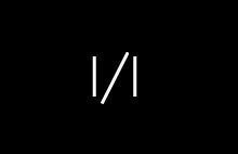
Here You can see these lines.
Sorry Jack, I just tried to add GSAP on main code, didnt add to codepen.
And with border still the same. Can it be that only on my pc these lines appearing?
How I can make same action using GSAP? Or for such animation there is no need to use GSAP?
-
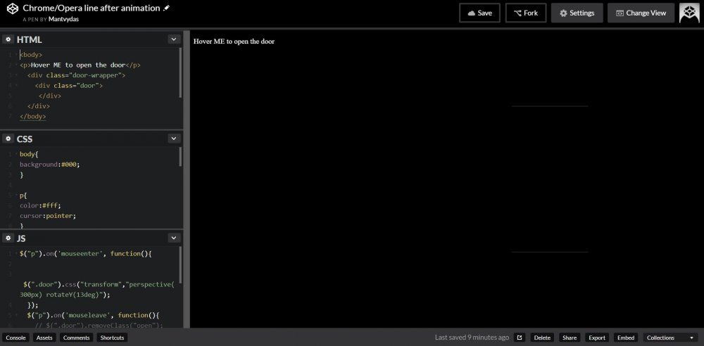
On Chrome and Opera after animating (opening) div (door) lines around that div appears. Tried adding translateZ(0), but then even worse - lines appears after page loads, you don't even need to animate.. On Mozilla and Edge seems fine.
Can GSAP fix this issue?
I tried adding something like this on hover event:
TweenMax.to(".door", 2,{rotationY:13, transformPerspective:300, transformStyle:"preserve-3d",repeat:1, yoyo:true}});
but doesnt work at all..
Thanks,
Mantvydas
See the Pen KoYPEP by MantvydasBinderis (@MantvydasBinderis) on CodePen
-
11 hours ago, Sahil said:
@Mantvydas Following example uses TweenLite's tick event that gets called on each frame, similar to requestAnimationFrame if you are familiar with that. Right now this example works with single parent only but you can make it work with multiple parent elements with little work. I have left a lot of comments explaining everything. There are some libraries out there that do parallax effects for you, parallax.js supports gyroscope as well so you can check that if you want.
As for not being familiar with GreenSock and coding, I will suggest you to spend some time on forum every day, an hour or so. Start by looking at simple questions and try to solve them. It's great way to learn coding and get familiar with GSAP. Starting with something small is easy get learn and get answers as well.
See the Pen PRKQVp?editors=0010 by Sahil89 (@Sahil89) on CodePen
Thank you so much Sahil
-
11 minutes ago, GreenSock said:
Sure thing, happy to help!
And I thought that $(window).on('mousemove.parallax', function(event) { TweenMax.to(layer_1, 2, { x: left / 90, ease:Expo.easeOut,overwrite: 'all'}) ... }); is GSAP parallax event. Im still green on GreenSock. How to use GSAP mouse parallax?
-
14 minutes ago, GreenSock said:
Unfortunately I don't have time to wade through over 1000 lines of code and do a free performance audit, but it looks to me like one of the biggest problems is that you're running a bunch of logic on mousemove events which is very dangerous because those events can fire well over 60 times per second (much more often than screen refreshes, meaning it's totally wasteful to run animation logic in there). You're re-creating a bunch of tweens and re-setting lagSmoothing() over and over and over again. Very inefficient. Try adding a console.log() in there and watch how many times it's getting called - you may be shocked. I bet if you remove the mousemove stuff, you'll see a big improvement. You should consider throttling those if you still want to keep them in.
You also appear to be using a mix of CSS transitions, animations, GSAP and jQuery for animation. I'd be careful about that - they can conflict with each other (not necessarily though). And jQuery is literally up to 20x slower than GSAP - I'd certainly avoid it for animation.
Good luck.
I dont need you to change my code I just needed some advice. Thanks for helpful suggestion, from now I know where to start.
Thanks again GreenSock
-
On 3/22/2018 at 12:53 AM, GreenSock said:
Are you saying that the one I built that only animates transforms is still too costly? SVG would definitely be worse. The main problem (after fixing the previous issues I mentioned) is that you're trying to move a lot of pixels. The more pixels, the harder it is on the browser typically. There's no magic bullet, but like I said earlier (and Blake/Craig advocated), a canvas solution is probably your best bet performance-wise. If you're still having trouble, please post the demo that illustrates the problem and we'd be happy to take a peek.
Sorry I am new to coding, I started to learn just 1 year ago..
Maybe I am using too many animations? Nut I have seen websites with much more animations and was performing much better than mine. Maybe I have too much layers? Or my JavaSCript is not good? Even when hovering on navigation items is very laggy. What is wrong here? On Opera is best performance, Chrome and Mozilla average but on edge is disaster, even when scrolling some white lines on the top pops up..
This is my portfolio project codepen. It is still not responsive so layout on big or too small screens can be broken and if you can watch this code on full screen, because I am using 100vh it can also look broken layout, sorry for that..
See the Pen GxEbzB?editors=1100 by MantvydasBinderis (@MantvydasBinderis) on CodePen
What I should change here?
Thanks,
Mantvydas
-
Guys, this animation still costs me a lot of fps. It is possible to make it as infinite svg animation? Would it be better performance? Or there is any other way to make this infinite animation fps friendly?
-
49 minutes ago, OSUblake said:
Yep. A tiling sprite could be used for that.
http://pixijs.io/examples/#/basics/tiling-sprite.js
That's what I'm using for the raindrop background here.
Hey OSUblake,
Wow, what a nice animation. I would like to know how to work with canvas, but there is not much tutorials about it.. I really interesting in it but what I can do its just draw a line with canvas..
-
1 hour ago, GreenSock said:
Sure, you could totally do that with GSAP, no problem. But I don't think it's the animation technology that's the biggest problem.
- background-position is always snapped to whole pixels, so it'll never be perfectly smooth even if the CPU and GPU are barely busy. I'd strongly recommend switching to transforms which can do sub-pixel rendering and get GPU acceleration.
- I'd venture to guess that 98%+ of the load has to do with graphics rendering, NOT updating the animation values. The key is to minimize the area that the browser must repaint. You're offsetting your background-position by huge values (offscreen), so it's probably putting a lot of extra load on the browser. If you really want to maximize performance, I'd bet that a canvas-based solution would be significantly smoother. PixiJS is a nice library for that if you're looking for one.
You could be to create a <div> with the background-image the way you have it now, but make that div wider and taller by exactly one tile (so if your tile is 100px by 100px, you'd make your div fill the entire area PLUS 100px in each direction and set the container's overflow to hidden) and then animate the translateX/Y (for GSAP, it'd be simply "x" and "y") and loop that. Here's a forked example:
See the Pen oqBNWa by GreenSock (@GreenSock) on CodePen
Does that help?
Thank You so much!
You helped me a lot. Your forum is the best help resource out there. I appreciate what You are doing here!
Thanks do much,
Mantvydas
-
3
-
Hello professionals,
I need Your help changing this animation for better performance. When I use this infinite animation on my website, I lose 20/30 fps from 60 fps.
Can I change this CSS animation to GSAP animation? Would it be better performance? And if it would be, how I can make same skew infinite loop with GSAP?
I tried to make it with GSAP but I can only make animation from left to right, how to make this skew motion?
Thanks,
Mantvydas
See the Pen xWRBeM by MantvydasBinderis (@MantvydasBinderis) on CodePen
-
Hi guys,
Sorry if this is not right question in this forum, but I hope you can help me.
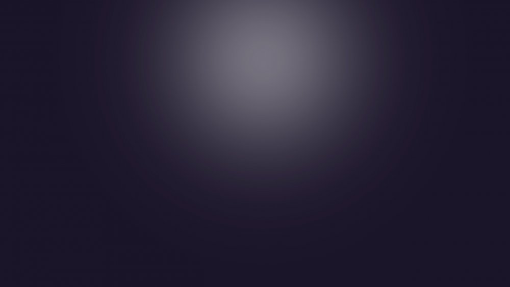
I need to achieve such nice gradient glow as in picture. I made this in photoshop and I tried to do same with CSS but I cant make it. With CSS you still can see edges of circle, I want it to fade 100%, like in picture. Also in picture center of the circle is more bright mine is all same. It is possible to make exactly same glow as in this picture? Or this is max what I can achieve with CSS? So maybe I can achieve this with GSAP?
Thanks,
Mantvydas
See the Pen RMoKzr by MantvydasBinderis (@MantvydasBinderis) on CodePen
-
2 minutes ago, Shaun Gorneau said:
Shaun, thank You so much! Didn't thought about this. You helped me a lot! Thanks
-
3
-
-
Hi guys,
I have issue on Mozilla with text animation. On Chrome and all other browsers works fine (in Microsoft Edge all animation in general is laggy, very low performance) but on Mozilla text animation is jerky and jumping. But div's/boxes animation on Mozilla works just fine, I don't know what is wrong here.
I added rotation: 0.01 but still same jumping on text.
How I can solve this problem?
Thanks,
Mantvydas
See the Pen KogKEB by MantvydasBinderis (@MantvydasBinderis) on CodePen

Animating not absolute positioned elements
in GSAP
Posted
Hey @Jonathan,
Thank You for Your answer. This is what I needed to know")